


For the start of our dashboard week, my cohort was provided with survey data of Slovakian children and adults ranging from 15-30 years of age. The data included demographic information, as well as, self-ratings regarding personality, interests, hobbies, preferences and phobias. I decided to narrow down my analysis and focus on only children and their phobias. With my initial analysis, I found that only children and non-only children appeared to feel the same way about phobias.
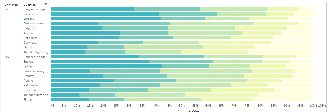
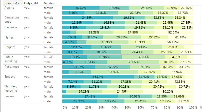
I then narrowed my analysis more, and focused solely on only children. My approach with analyzing data is to compare as many dimensions and measures as possible to see if there are interesting trends. I considered comparing only children across genders (male and female only), but felt that this analysis was too predictable. Based off my cursory observation, it appeared females were considerably more fearful than males.
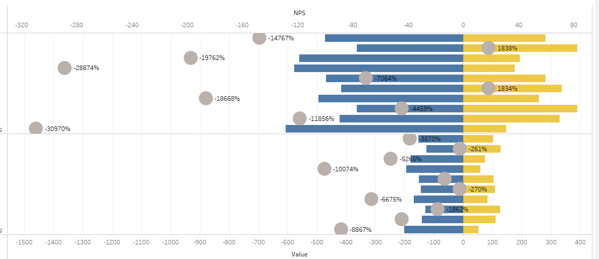
At one point, I also tried my hand at a likert chart after watching Andy Kriebel's video, "How to Visualize Survey Data on a Likert Scale and Include a Net Promoter Score" which can be found here: https://www.youtube.com/watch?v=DCIv_xNgENY. Though the video was easy to follow, I ran into a snag when adding percentages to my likert scale. I considered asking for help, but given I had an hour remaining to work on my dashboard, I decided to scope down further and to change direction slightly.
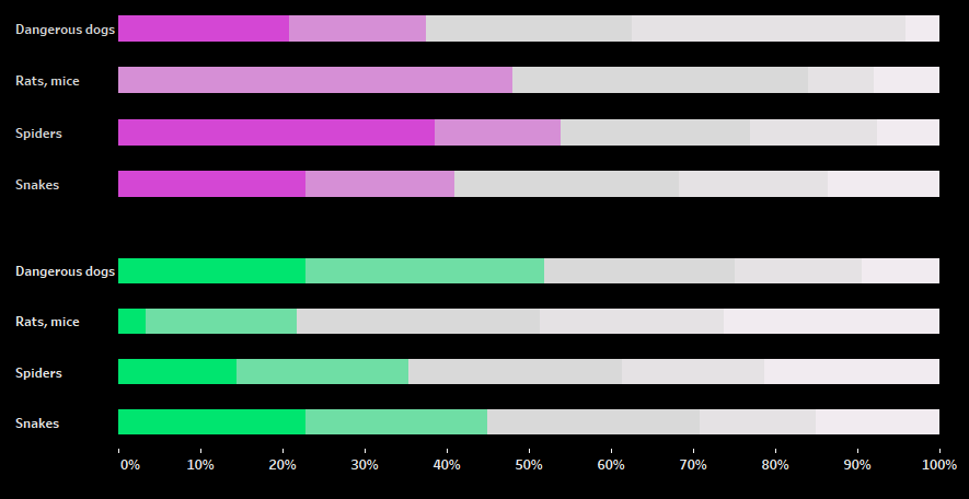
I scoped down further, and settled on a 2 stacked bar charts comparing left-handed vs right-handed only children with "creature" phobias. Right-handed people were more fearful of rats and spiders, while both groups were equally fearful of dogs and snakes. The trends between the 2 groups were noticeable, but the reasons for them remain unclear.
Though my first submission for dashboard week was still quite simple, I have noticed an improvement with my scoping. Additionally, I had a "near-success" with a likert chart, and would like to revisit this again. I'm cautiously optimistic about Dashboard Week Day 2...