


I couldn’t help but wonder, is the journey to data mastery really about the tools we use, or is it about the lessons we learn along the way? This past week was all about the fundamentals—data prep and the art of visualizations. While we didn’t dive headfirst into flashy dashboards or complex algorithms, we explored the “why” behind our choices. Because let’s face it, in data (as in life), it’s the foundation that keeps everything from crumbling.
The Friday Project: Fear vs. Freedom
Friday arrived with a challenge: our first real project. The goal? Clean and prep data for analysis. Our ever-charming "stakeholder," Ruth, was on hand to guide us as we pieced together insights from financial insurance complaints—think customers, products, and sales.
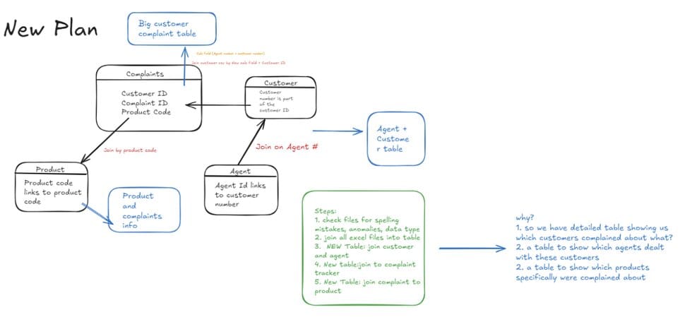
The technical tasks were manageable, but my biggest hurdle wasn’t a calculation; it was fear. Fear of looking foolish, fear of asking for help. It was Carl—kind, patient, and incredibly tall—who showed me that vulnerability isn’t weakness. It’s a strength. One quick lesson on leading zeros later, I realized something profound: everyone in this space is rooting for me. And sometimes, you just need to raise your hand and ask.
Top Tip: Ask for Help. Always.
Monday Musings: The Art of Visual Style
We spent Monday immersing ourselves in the aesthetics of data visualization—a world where colour, style, and form take centre stage. Think of it as dressing up your data for the red carpet: every hue, line, and shape has a role to play in telling a compelling story.
Here are the highlights:
- Colour as Communication: In data, colour isn’t just decoration; it’s dialogue. A soft blue whispers calm stability, while a fiery red commands urgency. Choosing the right palette is like choosing the right tone for a conversation—it sets the mood and directs attention.
- Less Is More: Like a little black dress, simplicity is timeless. Clean lines, uncluttered spaces, and intentional design keep your visuals sharp and effective. No one loves a dashboard drowning in chartjunk (the data equivalent of over-accessorizing).
- Typography Matters: Fonts aren’t just about readability—they’re about personality. A sleek sans-serif adds modernity, while a traditional serif whispers authority. Never underestimate the power of a well-chosen typeface.
- Balance and Flow: Your visualization should feel like a journey, not a maze. Symmetry, white space, and an intuitive layout create an effortless experience, guiding the viewer through the story you’re trying to tell.
- Pop with Purpose: Bright colours should be like sequins—used sparingly but with great impact. A single burst of orange or green can draw the eye exactly where it needs to go.
Data visualization, I realized, is a lot like interior design. It’s about making the most of the space you have, creating harmony, and using colour and style to elevate the ordinary into something unforgettable. Because when data looks good, it speaks louder—and isn’t that the goal?
The Vibe Chart: A Revolution in Data Feels
And then, there was the Vibe Chart (patent pending, obviously). It’s not just a visualization; it’s a mood. Imagine a table of categories, their profits and losses coloured by intensity—blue for soaring profits, orange for dramatic losses. While it’s not a tool for granular details, it’s a striking way to sense the energy of your dataset. Thanks to Carl’s creative spark, we realized this could be a new way to capture data’s essence.
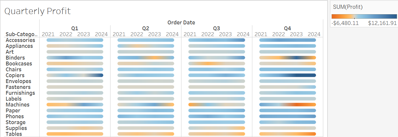
For a different take on this chart type, hit up my girl Luiza.
In the end, isn’t that what data is all about? Not just the numbers, but the story, the vibe, and the connections we make along the way.
Song of the Day:
~S xoxo