Last week, I had the privilege of leading my cohort as the project manager for a mock client project. Our client was Richard Roast (Jacob from cohort 11) and his company Rich Roast Coffee Inc. As a stakeholder in the company, Richard wanted analysis for 3 different metrics of performance:
- How the company was doing as a whole, where they were performing well, and where they weren't
- Possibilities for expansion, where there might be areas for new locations in existing states
- Tangible visuals to present to any investors, as they did not have KPIs on hand to reflect performance
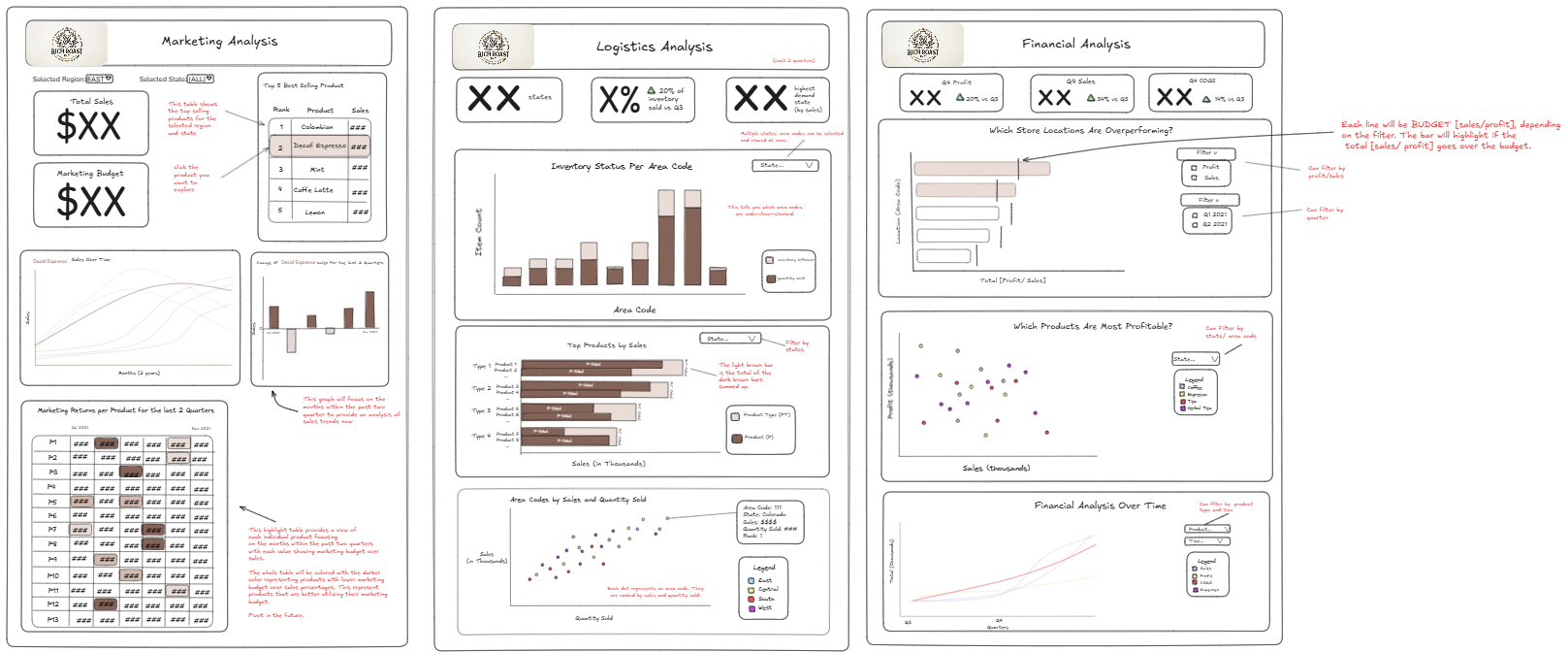
After understanding our stakeholder's needs, I tasked the group to begin finding user stories so we could plan out exactly what data sources we wanted to use, as well as figuring out how we wanted to visualize the data. As project manager, one of the first things I noticed was how chaotic it was to have all 7 people working on one task, so I made the decision to split up the group into 3 smaller groups, handling company finances, logistics, and marketing. These 3 groups would end up being the 3 final dashboard sketches we would create.
The team was able to work far more efficiently in their small groups, and we had fleshed out full user stories, as well as beginning to explore the data. While discovering data, we ran into a few problems, as many of the fields were not explained well, and were not labeled properly. As PM, I was able to reach out to our stakeholder via email, and get that information clarified.
As we started to build our sketches of the dashboard in Excalidraw, one of the big things I focused on was consistency across all 3 of the teams. Having multiple views of a dashboard is great for splitting up content based on categories and the user it's intended for, but if they are not visually consistent across all 3, it looks less professional and sloppy. As PM, I would constantly bounce back and forth between different dashboard views, reminding team members of our color scheme, design, font choices, and sizing. While making small adjustments, I also documented exactly what changes we were making, along with starting to write the content for the final presentation.
Much of this final information contained details about the handover of our files, as well as how to best use them. This would include software used, file names/file types, objectives completed, recommendations, and next steps for the stakeholder.
As the time ticked down, I was very firm towards my team members that we needed to have a finished final product by our pre-established timeline. This was so we had enough time to compile all our information, and also rehearse before our presentation. I had to count down from 10, so my team could make their final adjustments.
Luckily, with our preparation time, as well as the well structured dashboard and feedback given, we were able to deliver a succinct and detailed analysis of the requirements our stakeholder had asked for.
Our stakeholder had many questions regarding certain charts, but we were able to clarify and give further steps.
Excited to see how the next few projects go!