


I began this second stage of my personal project by throwing a couple of charts together and seeing if there are any basic insights.
Here are my findings so far.
So, of course I had to start this off with bar charts. Such a simple but effective method of visualisation.
One shows the different drug categories broken down by their total cost, and the other shows the same categories and the quantities.
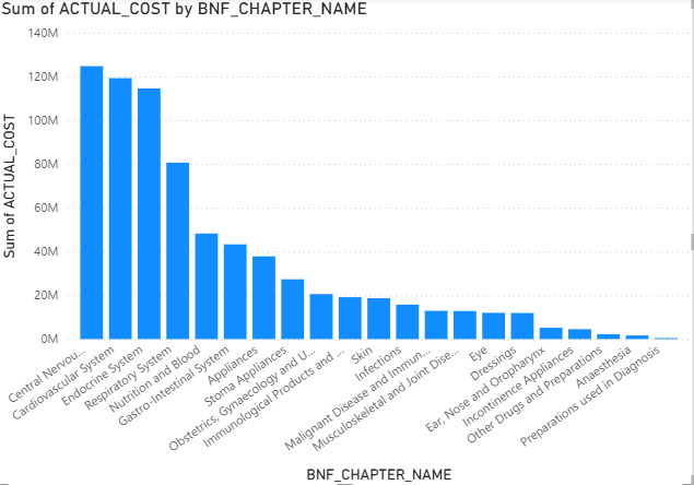
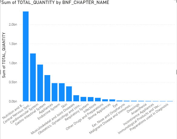
Something to highlight from these two charts is that nutrition and blood goes from having the highest quantity, to being the fifth most expensive cost for the NHS. Whereas, drug categories like cardiovascular system and the central nervous system (CNS) cost the NHS the most, but have lower quantities.
This could be because some drug categories involve items like vitamins and iron supplements which are bought in large quantities, but are relatively cheap.
Next we have a tree map that shows the same information as the first bar chart.
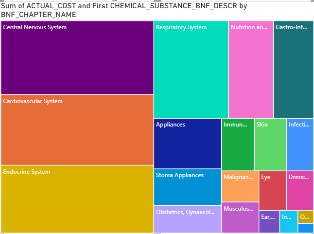
From this we can see that the CNS, the cardiovascular system and the endocrine system are the most expensive categories for the NHS.
The CNS in particular can potentially be linked to Covid-19 lockdown in the UK (remember this is data from November 2020). This massive spend on medications like antidepressants and anti anxiety meds, could be a direct link to the increased mental health pandemic that coincided with the virus.
For the third chart, I made a scatter plot which shows the total costs and total items broken down by the different chemical substances.
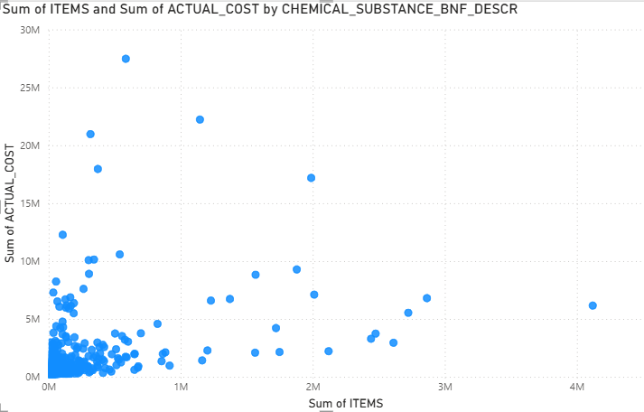
From this we can see that there is one particular chemical substance that has a relatively low number of items (<1M) but a grand cost of >25M. This substance is "Apixaban"; this drug is an anticoagulant that is used to thin blood and prevent strokes.
Despite this drug being so pricey, it was pushed to be given to elderly patients as it did not require constant blood monitoring and was easier to administer.
Finally, we have a map utilising the post codes in the dataset. This map is filter to the top 100 post codes that cost the NHS the most money.
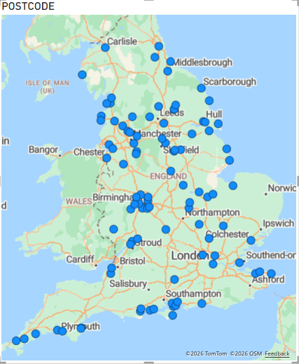
This map shows that the spread of cost is not just localised to London; it is seems to be scattered across cities like Birmingham, Manchester and the South Coast.
Next time i will be doing a more in-depth analysis, and soon, it shall be dashboard time!