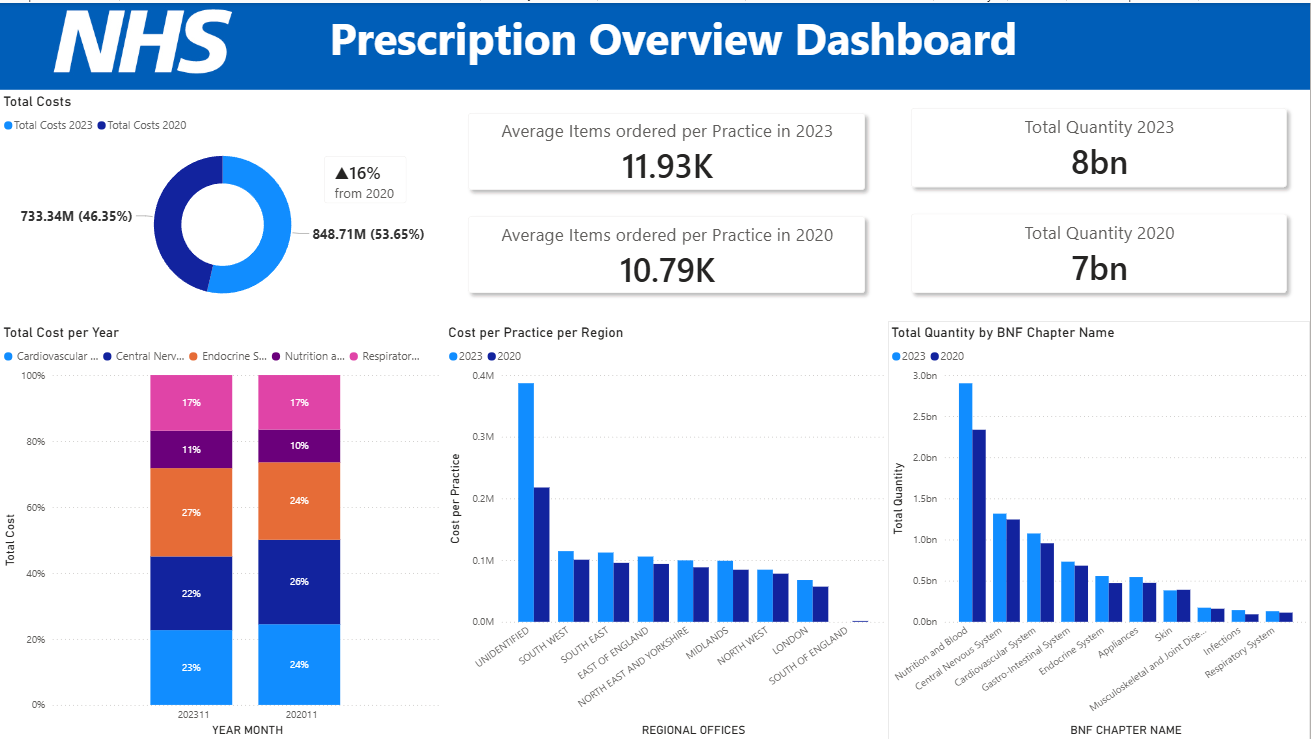
We have finally reached the end of this saga yippieee!!
Here is a collection of calculations I made to create this dashboard.
For the donut chart:
A simple calculate formula to get the sum of costs for that specific date.
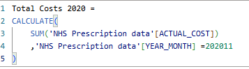
Repeat for 2023.
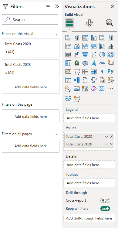
Using the donut chart option like this:
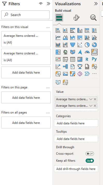
Next the AVG Items per Practice KPIs:
For this I wanted to show the average number of items ordered by each distinct practice for that particular date using a calculate within a divide function.
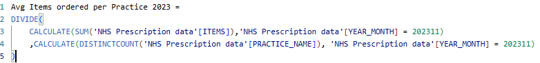
Repeat for 2020.
Using a card set up like this:
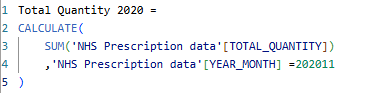
Total Quantity KPIS:
Again using a simple calculate function to find the total (sum) quantity for that specific date.
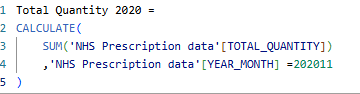
Using a card, set up like this:
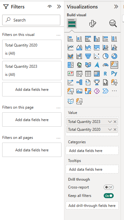
Total Cost per Year 100% stacked bar chart:
Set it up like this and on the filter pane, filter the BNF chapter name to top 5 by sum actual costs.
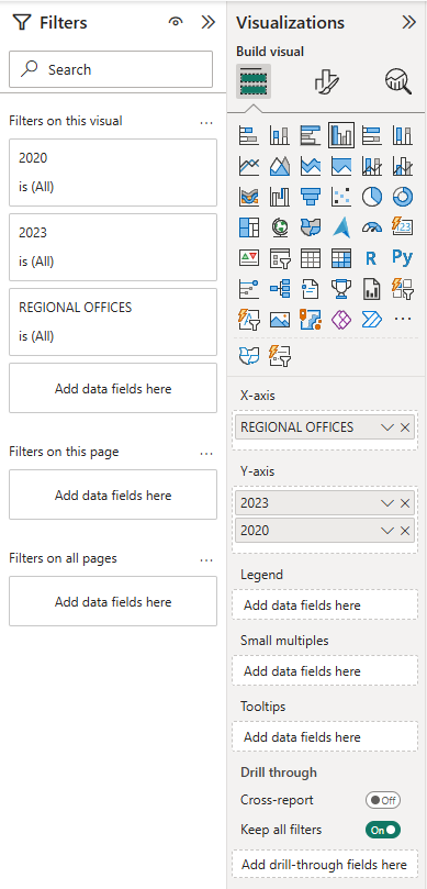
Cost per Practice per Region Clustered Column Chart:
First I calculated the Cost per practice for that date.
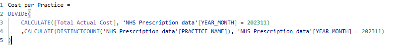
Then I set up my chart like so:
Lastly, the Total Quantity by BNF Chapter Name clustered Column Chart:
Utilising the same calculations for the total quantities KPIs.
Then I set it up like so:
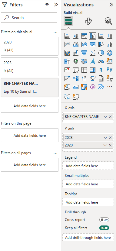
In the filter pane, I filtered BNF name to only top 10 by total quantity.
And then with a little more formatting and adding shadow effects to the cards, my dashboard is finally complete!