


While not as pertinent to quantitative analysis, plotting images as scatterplots offers a delightfully creative output for Tableau. Python's computer vision library can be used to analyze an image and generate a csv with generated x, y, and intensity values.
Starting Simply
I started by generating points based off of simple images that only used coordinates without account for value.
Since we're not working with colors we can start by converting the image to grayscale when reading it into the computer vision library cv2.
def image_to_csv(image_path, output_csv, target_points=2500):
    # I've currently hardcoded in the number of points, but that could easily be adjusted.
    img = cv2.imread(image_path, cv2.IMREAD_GRAYSCALE)
    if img is None:
        return "File not found"

    # Create a threshold for identifying where to put pixels based on dark pixels
    _, binary = cv2.threshold(img, 127, 255, cv2.THRESH_BINARY_INV)

    # get coordinates
    y, x = np.where(binary > 0)

    # Sample randomly if there are more coordinates than target points
    if len(x) > target_points:
        indices = np.random.choice(len(x), target_points, replace=False)
        x = x[indices]
        y = y[indices]

    # flip y so it aligns with plotting convention (bottom left not top right)
    y_max = img.shape[0]
    y_plot = y_max - y

    # export to csv
    df = pd.DataFrame({'x': x, 'y': y_plot})
    df.to_csv(output_csv, index=False)

    # preview with matplot lib (if you're feeling disloyal to Tableau)
    plt.scatter(x, y_plot, s=1, c='black')
    plt.gca().set_aspect('equal', adjustable='box')
    plt.savefig('preview.png')

    return len(df)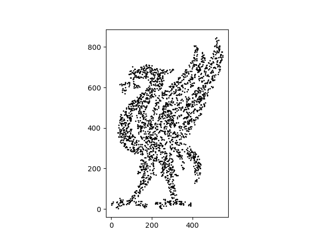
This type of processing works best on simple line or logo images and would struggle with more complex shading. Depending on the threshold and target points you would get some interesting results similar to the threshold filter in Photoshop, but your level of detail is limited.
Adding Intensity
When adding an intensity value that could be used in the color field when visualizing your scatter plot, you calculate the the intensity of each pixel.
After loading in the image, I also added check to ignore pure white values which are probably the background. This could be commented out if you want those included in your intensity scale. After those values are excluded then you can grab the values for the rest of the coordinates since the image is already in greyscale.
def image_to_scatter_with_gradient(image_path, output_csv, target_points=20000):
    # Load the original image in grayscale
    img = cv2.imread(image_path, cv2.IMREAD_GRAYSCALE)
    if img is None:
        print("Error: Image not found.")
        return

    # Extract coordinates and their corresponding intensity values
    mask = img < 245
    y_raw, x_raw = np.where(mask)

    # Get the actual grayscale values for those coordinates
    intensities = img[y_raw, x_raw]
Randomly sample to downsize your points to within your target and normalize the values from 0 to 1 for the most flexible color scale.
if len(x_raw) > target_points:
        indices = np.random.choice(len(x_raw), target_points, replace=False)
        x = x_raw[indices]
        y = y_raw[indices]
        # Keep the intensities for the sampled points
        v = intensities[indices]
    else:
        x, y, v = x_raw, y_raw, intensities

v_norm = v / 255.0
The you just have to flip your axis and save.
    # Flip Y-axis for plotting and save
    height = img.shape[0]
    df = pd.DataFrame({
        'x': x,
        'y': height - y,
        'intensity': v_norm
    })

    df.to_csv(output_csv, index=False)
    print(f"{len(df)} points saved with intensity data.")
And if you want to check your value in Matplotlib you can add a quick plot using an example color gradient.
plt.figure(figsize=(8, 6))
    plt.scatter(df['x'], df['y'], c=df['intensity'], cmap='magma', s=2)
    plt.colorbar(label='Brightness Intensity')
    plt.gca().set_aspect('equal')
    plt.show()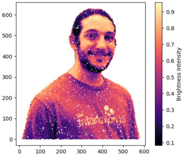
All together this is the function you need to get the points you're looking for!
import cv2
import numpy as np
import pandas as pd
import matplotlib.pyplot as plt

def image_to_scatter_with_gradient(image_path, output_csv, target_points=20000):
    # Load the original image in grayscale
    img = cv2.imread(image_path, cv2.IMREAD_GRAYSCALE)
    if img is None:
        print("Error: Image not found.")
        return

    # Extract coordinates and their corresponding intensity values
    mask = img < 245
    y_raw, x_raw = np.where(mask)

    # Get the actual grayscale values for those coordinates
    intensities = img[y_raw, x_raw]

    # Downsample to keep it manageable
    if len(x_raw) > target_points:
        indices = np.random.choice(len(x_raw), target_points, replace=False)
        x = x_raw[indices]
        y = y_raw[indices]
        # Keep the intensities for the sampled points
        v = intensities[indices]
    else:
        x, y, v = x_raw, y_raw, intensities

    # Normalize the value (0.0 = Black, 1.0 = White/Light Gray)
    # This is helpful for most gradient mapping tools
    v_norm = v / 255.0

    # Flip Y-axis for plotting and save
    height = img.shape[0]
    df = pd.DataFrame({
        'x': x,
        'y': height - y,
        'intensity': v_norm
    })

    df.to_csv(output_csv, index=False)
    print(f"{len(df)} points saved with intensity data.")

    # preview with matplot lib (if you're feeling disloyal to Tableau)
    plt.scatter(df['x'], df['y'], c=df['intensity'], cmap='magma', s=2)
    plt.colorbar(label='Brightness Intensity')
    plt.gca().set_aspect('equal')
    plt.show()
Open your exported csv in tableau, drag in your x and y values and put the intensity on color. Note that in Tableau the intensity by default will be inverted and so you'd have to make it negative to view non inverted values.
Enjoy!

https://public.tableau.com/app/profile/sita.pawar/viz/GeneratingImageBasedScatterplots/HeadShotPlot
Note: Code creation supported by Gemini