Today was the second day of dashboard accessibility training and here are some of the considerations that went into designing my dashboard.
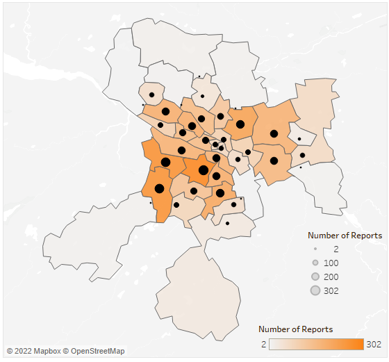
1. Colour choices
The colours that I chose for this dashboard was from one of Tableau’s default colour blind palettes. I wanted to keep it simple and stick to as few colours as possible while picking the ones that go well together. I chose black for text on white background as these colours produce the highest contrast. The orange was used to highlight important aspects of the visualization.

2. Double encoding
Double encoding is usually frowned upon but it is a crucial aspect of accessible dashboards. Users with colour blindness may struggle to see the differences between visual elements, thus adding a second way to encode visual information may enhance their experience. That is why I used colour and size to represent one measure on the map.
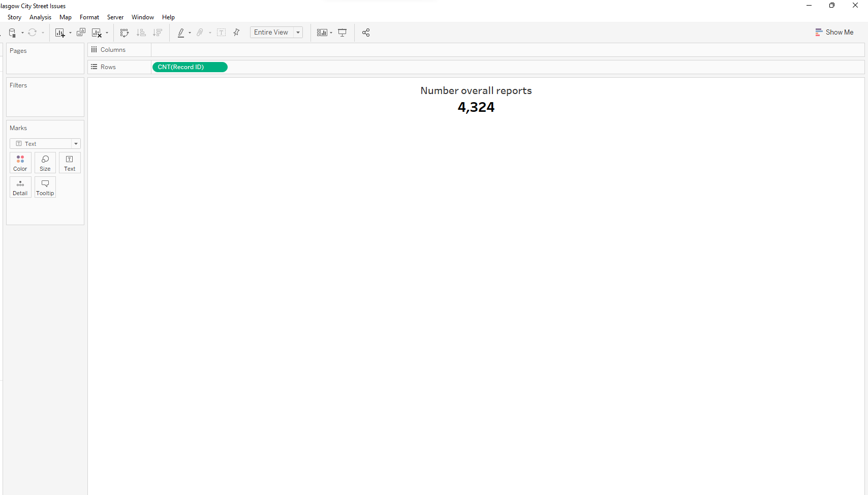
3. KPI’s placed within a title
Blind people rely on narrator apps to read out everything that is presented on the screen. Unfortunately, the default narrator app on a windows computer is not able to read out any Tableau visualizations. It can, however, read the graph titles. A simple trick to make sure your KPIs are read by narrator tools is to place them within a title of a graph and create the least visible graph possible.