


Dashboard Week: Accessibility Design Task
Glasgow City Council are trying to make their city’s data more accessible to residents, and have given us a sample of road repair data from FixMyStreet to show what we can do.
Create a product which enables users who are not well served by current interfaces to access data about their surroundings. Be prepared to explain every design choice on your dashboard.
Mandatory Requirements
Product outcome must utilise features we learned about accessibility and universal design.
Any products must have written credit to FixMyStreet on the final product.
Deadline for uploads to Tableau Public is 3.30pm today.
Presentations must be done from Tableau Public.
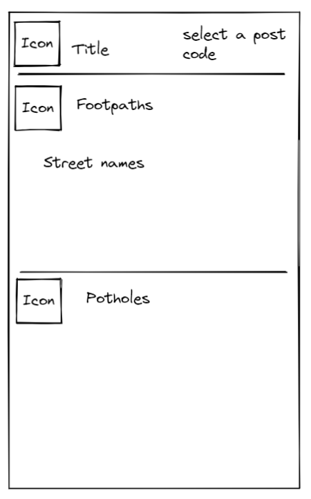
Planning my Dashboard
I wanted to provide an accessible dashboard to those who have dyslexia, are colour blind, or visually impaired. The bulk of my ideas involved have a simplified dashboard with not much clutter.
I focused on using the correct colours and fonts to achieve the optimal contrast to aid someone reading. I also wanted to use icons as visual aids to help the user understand what the titles were representing.
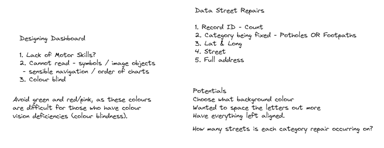
I researched the colours and fonts that worked well for both colour blind and dyslexic people. I found that there are multiple colours (pastels) that can be used and that people will prefer different things. This prompted an idea to let the user choose from a selection of colours that would change the background. This was unfortunately not possible in Tableau.
I also wanted to space out the letters to make it easier to read but Tableau was not able to do this either, but they did have some useful fonts.
(Good Research tool, British Dyslexia Association: https://cdn.bdadyslexia.org.uk/uploads/documents/Advice/style-guide/Dyslexia_Style_Guide_2018-final-1.pdf?v=1554827990)
I also wanted to change the icons to the same blue colour as the font but could not find the software.
My final dashboard
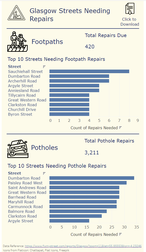
Some limitations:
I originally did not have any signpost that the download icon could be clicked.
It would have been more useful to have the numbers at the end of the bars to make it easier to read.