


Here I will be going over an example of how to use Tableau's spatial functions in order to map plant density in Central Park. By the end of this tutorial, we will end up with a point for each of the Central Park landmarks with circles around them sized and coloured to show the number of different plants found at each location.
The data
To map anything in Tableau, you need data with geographic coordinates - latitude and longitude.
I used data from this Github repository. Before bringing it into Tableau, I did some cleaning and joining in Alteryx. This left me with two tables:
- Landmarks - locations in Central Park with their latitude and longitude.
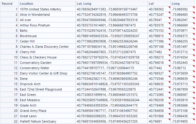
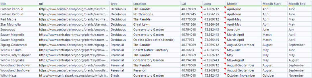
- Plants - plants found in Central Park, their location as well as other information like the type.
Making Points in Tableau
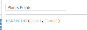
To make points in Tableau, you create a calculated field with the function MAKEPOINT. This takes the longitude and latitude to create one spatial point.
Let's first create points for each of the landmarks in Central Park. So by taking our longitude and latitude from the landmarks, we can create this calculated field.

Make sure you are using the coordinates from the landmarks data and not the plant data.
When we double click on that new calculation, it will bring out this map view. If we drag Location (the column that contains the landmark names) to Detail, it will help us see the names of each point.
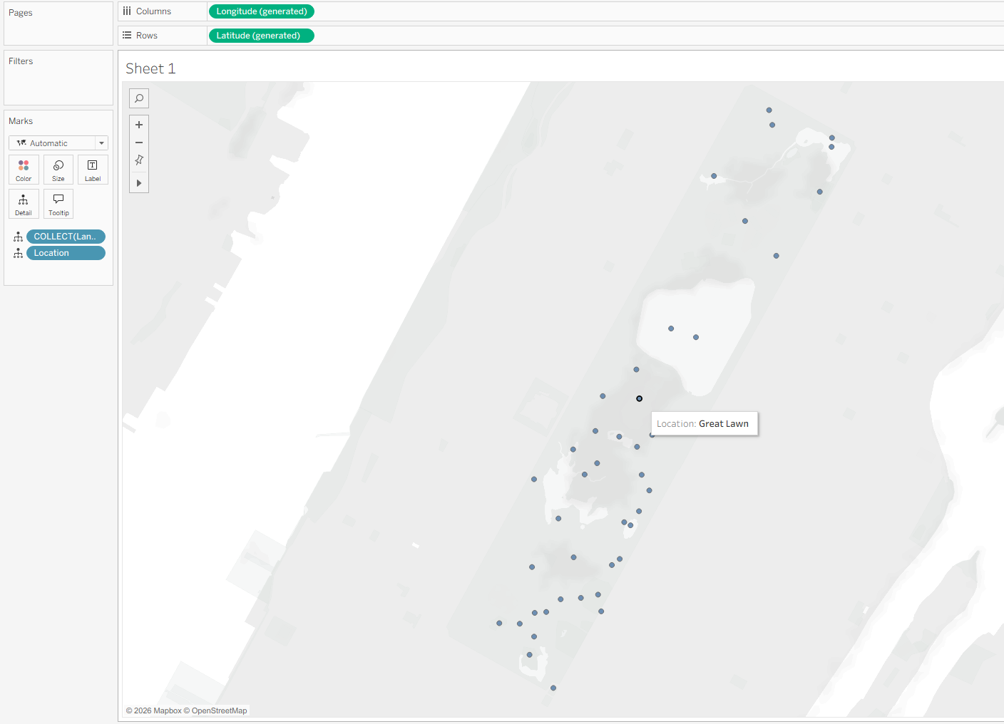
Now we have one point per landmark.
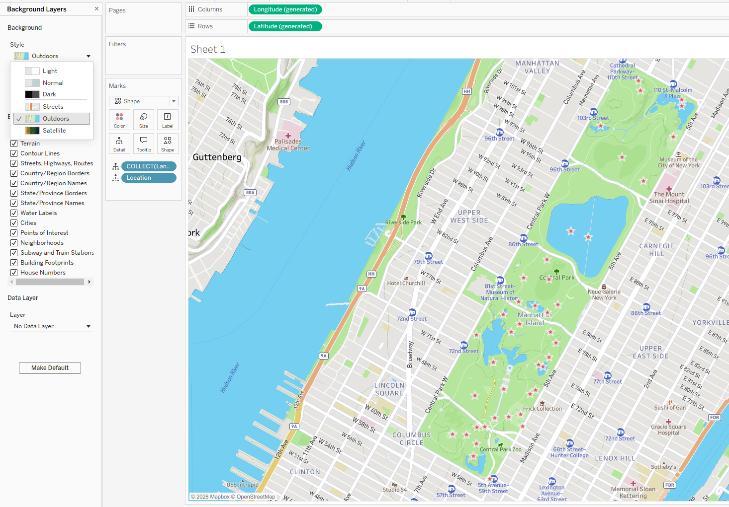
Note: Your map may look slightly different depending on your map settings. If I wanted this to look more like a map, I could choose the Outdoors style in Background Layers. I've also changed the marks to be a shape and changed the colour to help accentuate the locations.
Adding the plants
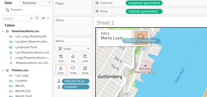
Next we want to add these points to the map. We can do this by clicking and dragging this new points calculation to the map and dropping it where it says 'Add a Marks Layer.' This overlays the plant locations on top of your landmarks.
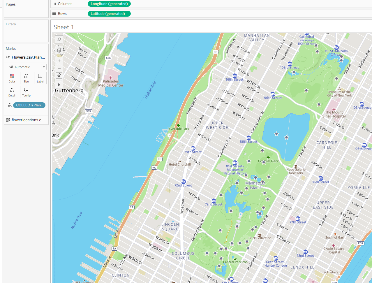
Now we have additional points for where plants are located. But it's not a very useful map. So instead, how about we try and change the colour and size of the dots to show how many different plants are located at each area.
- First we need to change the mark type to a Circle.
- Add location as a Detail.
- Drag a COUNT DISTINCT of plants onto Colour.
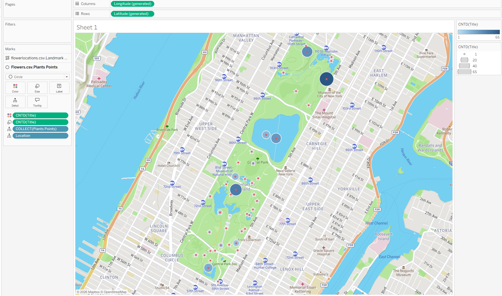
Now we can see clearly which area has the most amount of different plants.
Further Applications
- Retail: Mapping store or competitor locations and highlight areas of high concentration. This makes it easy to spot saturated markets as well as gaps where there is little competition and room to expand.
- Real Estate: Visualise property listings and show the price or availability density by neighbourhood. Buyers can see which areas fall within their budget while agents can spot neighbourhoods with high listing density and compare supply across the market.
- Conservation: Track habitat coverage or species sightings across a region to understand their distribution.