


Today we all got one topic and four techniques to create a Power BI report on.
My topic was Data Standardisation.
Before we dive into what data standardisation is and what it can be used for, a short summary of standard deviation and percentile rank:
Standard deviation measures the volatility of a set of values, i.e. how spread out around the average the data is.
A percentile rank measures the percentage of how many values lie below a given value.
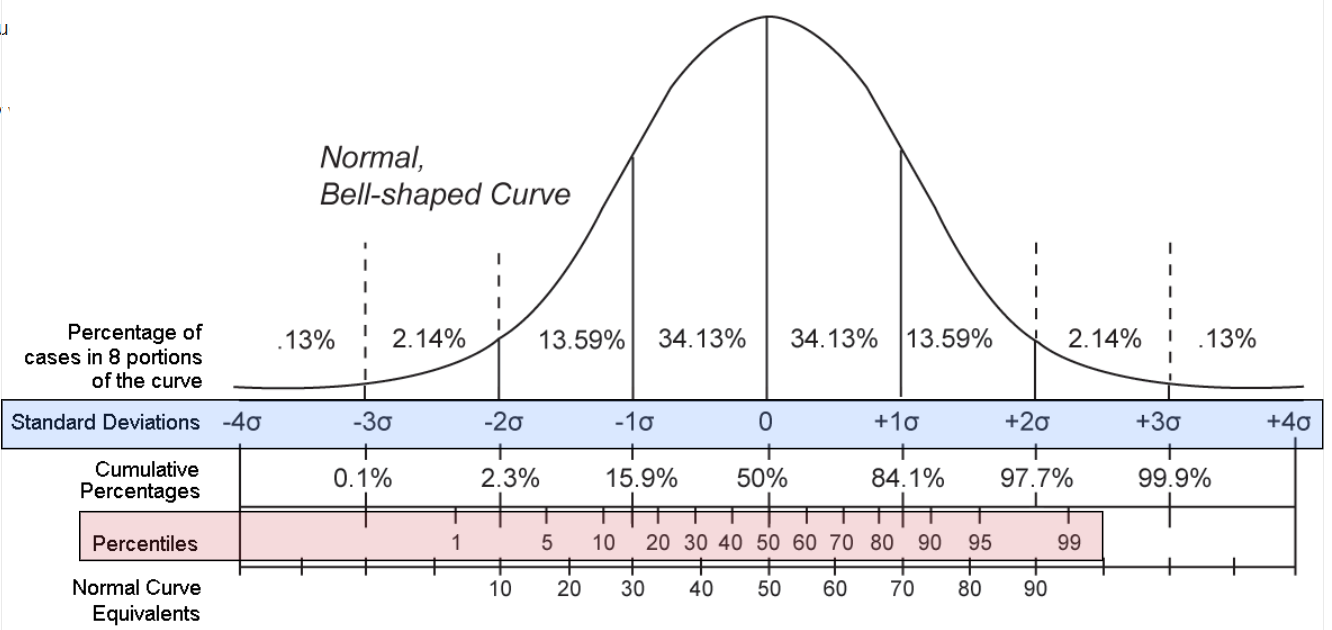
On the graph we can see a normal distributed curve.
In blue the standardised values (where σ stands for one standard deviation).
These values are often called Z-Values or Z-Scores.
In red we can see the percentiles.
To standardize our data set, we calculate the average and the standard deviation for the whole data set and for every value we calculate how many standard deviations it lies apart from the average.
This way we get a measure which is 0 for values that are exactly the average, negative if they are below and positive if they are above.
The standard deviation is a useful measure to identify outliers or anomalies in a data set and flag them automatically.
I created a mock data table for some sales managers and calculated the Z-Scores and Percentile Ranks for them:
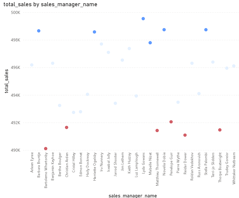
Here we can see a scatter plot with marks having a Z-Score higher than 1 colored in blue and below -1 colored in red.
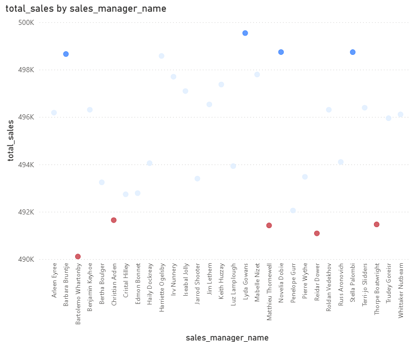
And here is the plot colored with the percentile ranks, where a value above or exactly 90% is blue and below 20% red.
You can check out my educational report here