


This guide details the steps to create a custom interactive button in Tableau using a custom shape (maybe a picture of you? 😉) to control other visuals on a dashboard.
A colleague of mine made a Blogpost about how to build a Button, but using bars instead of shapes.
You can check it out here -> Wie erstelle ich einen Navigations-Button in Tableau?
Phase 1: Basic Clickable Shape Button
Prepare Your Image:
First, obtain your button image. For a personalized element, a photo of your face can be used. For a clean appearance, the background of the image should be transparent. Various online tools are available for background removal (e.g., https://www.remove.bg/de). Save the prepared image (a .png file works well).
Add Your Custom Shape to Tableau:
- Navigate to your "My Tableau Repository," typically located in your Documents folder.
- Within My Tableau Repository, open the Shapes folder.
- Inside Shapes, create a new subfolder (e.g., "Custom Buttons").
- Copy your transparent image into this new subfolder.
Create the Button Sheet:
- Open Tableau and connect to a data source.
- Create a new worksheet (e.g., named "Button Sheet").
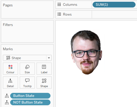
- In the Columns or Rows shelf, double-click and input 1, then press Enter. This creates a SUM(1) measure, providing a single mark for the shape.
- Set the measure to discrete, so you don't have to mess with axes.
- In the Marks card, change the dropdown menu from "Automatic" to "Shape".
- Click the "Shape" button on the Marks card, then "More Shapes...".
- In the "Edit Shape" dialog, click "Reload Shapes", if your Folder and Shapes do not show up.
- From the "Select Shape Palette" dropdown, find and select the folder you created (e.g., "Custom Buttons").
- Choose your custom image. Click "OK".
- Your image should now appear on the sheet. Adjust its size using the "Size" slider on the Marks card.
- Formatting:
- Right-click the SUM(1) pill on the Rows/Columns shelf and uncheck "Show Header".
- Right-click the sheet title ("Button Sheet") and select "Hide Title".
- Navigate to Format > Borders. Set "Row Divider" and "Column Divider" under "Sheet" to "None".
- Navigate to Format > Shading. Set "Worksheet" shading to "None".
- Optional: Click "Tooltip" on the Marks card and uncheck "Show tooltips" or modify the content.
You should now have something like this:
Create the Control Parameter:
- In the Data pane, click the dropdown arrow at the top and choose "Create Parameter...".
- Name: Button State.
- Data type: Boolean.
- Current value: True.
- Click "OK".
- Link the Parameter for Toggling:
- Drag the Button State parameter from the Data pane to "Detail" on the Marks card of your "Button Sheet".
- Create a calculated field for the opposite state:
- Name: NOT Button State.
- Formula: NOT Button State
- Click "OK".
- Drag NOT Button State to "Detail" on the Marks card as well.
Create a Chart to be Controlled:
- Create a new worksheet for the visual element the button will control (e.g., a bar chart with data from the Superstore Dataset).
Assemble the Dashboard and Initial Action:
- Create a new Dashboard.
- Add your "Button Sheet" and "Controlled Chart" sheet.
- Control Chart Visibility:
- Select the layout container holding the "Controlled Chart".
- Click its dropdown arrow and choose "Control visibility using value".
- Select the Button State parameter. The chart will now be visible when Button State is True.
- Add the Parameter Action:
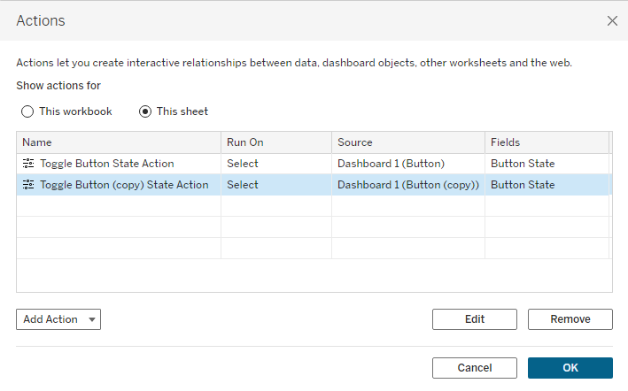
- Go to Dashboard > Actions...
- Click "Add Action >" and select "Change Parameter...".
- Name the action (e.g., "Toggle Button State Action").
- Source Sheets: Check your Dashboard, then specifically select only the "Button Sheet".
- Run action on: Select.
- Target Parameter: Button State.
- Field (Value): NOT Button State.
Click "OK", then "OK" again.
You should now have something like this:
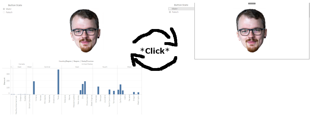
Test the button: Click your custom shape button. The chart should appear or disappear. You may observe that the button requires an initial click, then a click away from the button to deselect it, before it can be clicked again to trigger the next action, which is really annoying and thus not user-friendly at all.
Phase 2: Adjusting for Single-Click Interaction
The behavior observed in the previous step, where an extra click is needed for subsequent interactions, can be addressed. The following method uses two instances of the button sheet that alternate visibility to create a more direct single-click interaction.
Duplicate Your Button Sheet:
- Return to your "Button Sheet". Right-click its tab and select "Duplicate".
- Rename the original sheet to Button ON State.
- Rename the duplicated sheet to Button OFF State.
- (The marks and details (Button State and NOT Button State) remain the same on both sheets for now).
Configure the Dashboard for Swapping Button Sheets:
- Go to your Dashboard.
- Remove the "Button Sheet" added in Phase 1.
- Add a Floating Vertical (or Horizontal) Container to the dashboard where the button will reside.
- Drag the Button ON State sheet into this floating container.
- Drag the Button OFF State sheet into the same floating container, layering it with the Button ON State sheet.
- Control Visibility of Each Button Sheet:
- Select the Button ON State sheet in the floating container. Click its dropdown arrow > "Control visibility using value" > select Button State. (This sheet is visible when Button State is True).
- Select the Button OFF State sheet in the floating container. Click its dropdown arrow > "Control visibility using value" > select NOT Button State. (This sheet is visible when Button State is False).
- Hide titles for both sheets on the dashboard if they are displayed.
Update Dashboard Actions for the Two Button Sheets:
- Go to Dashboard > Actions...
- Delete the "Toggle Button State Action" created in Phase 1.
- Add New Action for Button ON State:
- Click "Add Action >" and choose "Change Parameter...".
- Name: Action ON to OFF.
- Source Sheets: Check your Dashboard, then select only Button ON State.
- Run action on: Select.
- Target Parameter: Button State.
- Field: NOT Button State (This sets Button State to False).
- Click "OK".
- Add New Action for Button OFF State:
- Click "Add Action >" and choose "Change Parameter...".
- Name: Action OFF to ON.
- Source Sheets: Check your Dashboard, then select only Button OFF State.
- Run action on: Select.
- Target Parameter: Button State.
- Field: NOT Button State (When Button OFF State is visible, Button State is False, so NOT Button State is True. This action sets Button State to True).
- Click "OK".
- Click "OK" to close the Actions dialog.
Test the updated button: When you click the visible button, it should toggle the chart's visibility and alternate to the other button state sheet. This provides a one-click experience, bypassing the previous selection issue.
For me it looks like this:
Phase 3: Using the Button as a Template
Once the button dashboard is configured, it can be reused in other workbooks:
- In your Tableau workbook, locate the navigation bar at the bottom (showing sheets and dashboards).
- Right-click on the dashboard tab containing your button setup.
- Select "Copy".
- Open a new Tableau workbook or navigate to another existing one.
- In the bottom navigation bar of the new workbook, right-click in an empty area or on an existing sheet tab.
- Select "Paste". Tableau will copy the dashboard and its dependencies, including sheets, parameters, and calculated fields. The data source or the controlled chart may need adjustment in the new workbook, but the button mechanism will remain functional.
In future Blogposts i’m going to show how to create a menu structure in Tableau in different ways. Using multiple Dashboards on the one hand and Parameter Actions with Dynamic Zone Visibility on the other, building upon the skills we gained in this Tutorial.