


What is Dynamic Zone Visibility?
Dynamic Zone Visibility (DZV) is a powerful feature in Tableau that allows you to control the visibility of dashboard elements, like charts or containers, based on user interaction. You can show or hide content depending on selected parameters. This is especially helpful when you have limited space on a dashboard.
Creating DZV Step by Step
First and foremost, it's essential to structure your dashboard properly. Make sure you're using containers correctly. These are the backbone of layout control and are critical for DZV to work seamlessly. (All the charts controlled by DZV need to be placed in a single container.)
1) Creating a Parameter
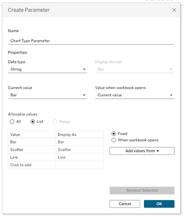
I want to switch between a bar chart, a line chart, and a scatterplot, so I create my parameter accordingly. Use the String data type with a List and add the appropriate names by simply typing them in.
2) Create “Buttons” for Visibility Control
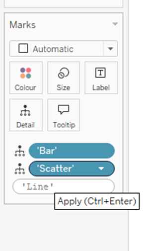
Once the parameter is in place, you'll need to create one sheet per chart type. Each of these sheets will serve as a button. Every sheet should represent a different chart type. Use a text field inside each sheet to label the chart—this can be done by double-clicking in the Marks card and typing your label. Then drag and drop that field onto both the Text and Detail shelves.
Also, drag the newly created variable into the data pane. Using the Text element in the Marks card, you can center the alignment of the label.
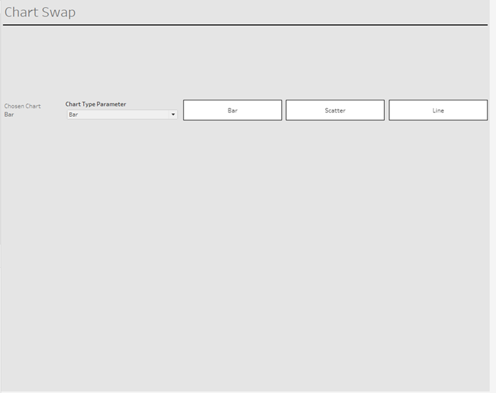
Next, place these individual sheets into your dashboard. For visual clarity, give each one a border so they’re easily distinguishable. These now look and function like buttons the user can click to switch between charts.
3) Dashboard Action
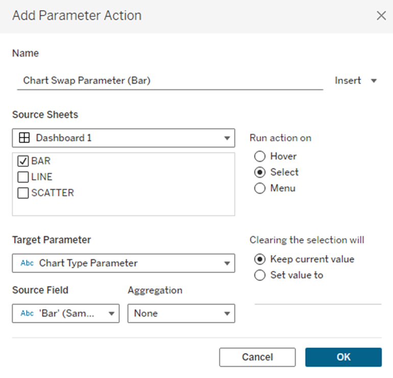
Now we need to make the buttons interactive. Go to Dashboard > Actions > Add Action > Change Parameter.
Create a separate action for each chart. The Source Field should correspond to the chart type (e.g., “bar” for the bar chart), and the Target Parameter is the one you created earlier.
4) Adding the Charts to the Dashboard
Now place all the chart sheets into a horizontal container on your dashboard. Click the dropdown menu on the container and select Distribute Contents Evenly. This ensures that each chart will take up the full width when it is the only one shown.
5) Calculated Field
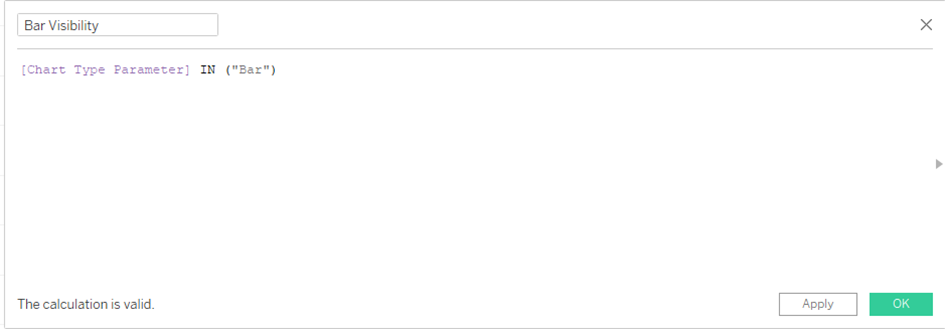
Next, create a calculated field for each chart. This field should return a Boolean value (true or false) based on the parameter value. For example, the bar chart’s calculated field should return true when the parameter equals "bar". Do the same for the other chart types. These calculated fields will control whether a chart is shown or hidden.
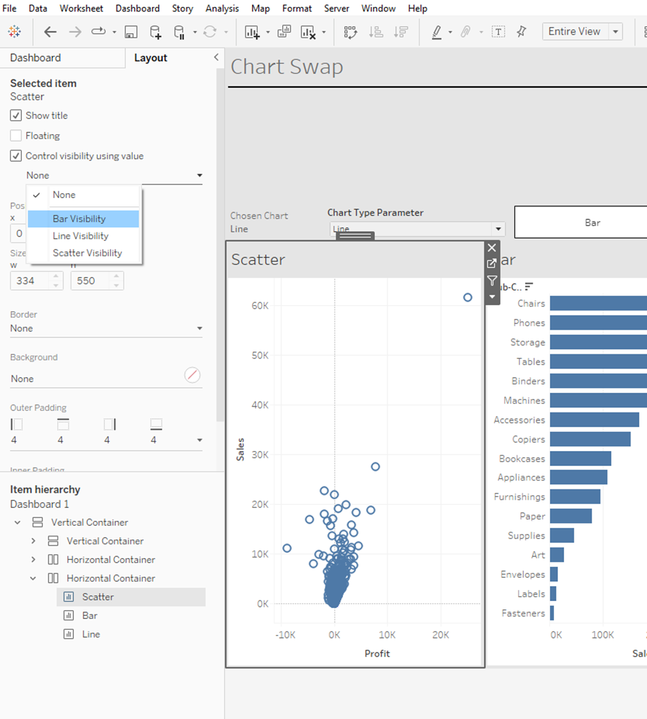
6) Control Visibility
Lastly, open the Layout pane. For each chart in the container, control its visibility using its corresponding Boolean calculated field. Go to the layout settings, enable Control Visibility, and link it to the respective field; so the bar chart uses the bar visibility field, the scatterplot uses the scatterplot visibility field, and so on.
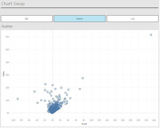
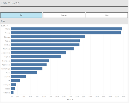
This is where DZV comes to life. When you click on the "bar" button, only the bar chart becomes visible. Thanks to the Distribute Contents Evenly setting, it expands to fill the entire space, creating a smooth, responsive experience.
You can also use icons instead of text fields for a cleaner look. By selecting Shapes in the Marks card, you can represent each chart type with an icon or even upload custom shapes for a more personalized interface.
With this setup, you now have a responsive Tableau dashboard that dynamically changes based on user interaction.