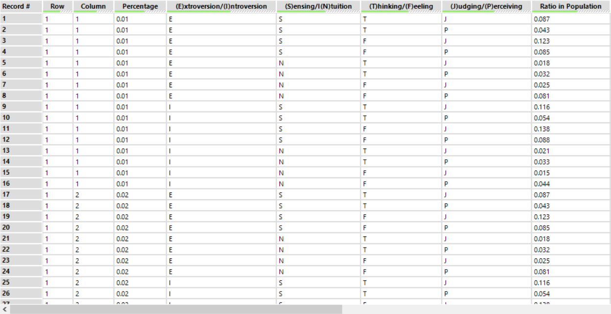
This week’s Makeover Monday (week 43) was about the % of people with each of the Myers Briggs personalities. You can find the data and original viz here if you want to give it a go yourself. The data had a line for each of the 16 possible combinations and a % or people that fit that category.
I love a waffle chart and decided this would be a great opportunity to use one.
Waffle charts are fairly simple to build in Tableau (especially if you follow one of the many great explanations of how, including Andy’s one that I used found here).
However, I wanted mine to empty and refill depending on a dashboard filter action, changing when the user clicked on a different combination of Myers Briggs traits. This was a little more complicated than I first thought it would be. This is because the two data sources I was using didn’t have a relationship.
I cracked it (with Andy’s help) and here’s how.
Step 1
Create the basic waffle chart (as shown in Andy’s video I linked above). You need to create a 10×10 grid, with a % value between 1 – 100% assigned to each square. I won’t go into detail about how to do this here as it’s covered well on other blogs.
Step 2
Next, create a calculated field in the waffle chart data source to colour the squares.
Here’s where the problem starts though.
When you drag a bar chart built with the Myers Briggs data and the waffle chart made with the waffle template onto a dashboard, using the bar chart as a filter won’t affect the waffle chart. This is because there is no relationship between the two data sources.
Step 3
In order to use the Myers Briggs data as a filter, the waffle template data needs to have a relationship to blend on. To do this, append each row of the Myers Briggs data to the waffle template data. This means you will have each of the 16 rows in the Myers Briggs dataset repeated 100 times, aligning with each row of the waffle data.

Step 4
Bring this amended waffle dataset into Tableau in place of the original waffle data source. Create the waffle chart as before, but adapt your ‘Colour?’ calculation. This new data source will now filter using dashboard actions. This is because the data sources have common fields and will therefore have a relationship to be able to blend.
You can see the full interactive version yourself on my Tableau Public profile. Download the workbook if you’d like to take a closer look at how it works.
Here’s a quick look at the final result.
