


When making time series graphs, it can sometimes be difficult to get your axes or headers to look how you want them to look. When left to their default configurations, Tableau often gives us a vertical header or odd tick marks. In some extreme cases, you get something like this.
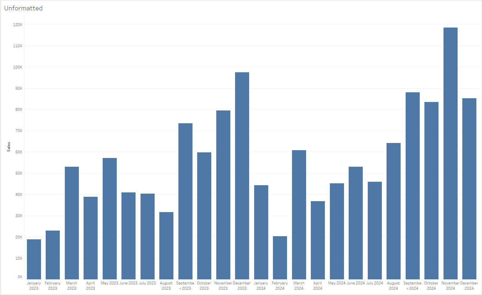
In order to avoid this, we can use Tableau's date formatting to create clean headers that do not distract our users from the key aspects of our visualization. In this blog, I am going to go through four useful and neat date formats for many different use cases.
1: First letter
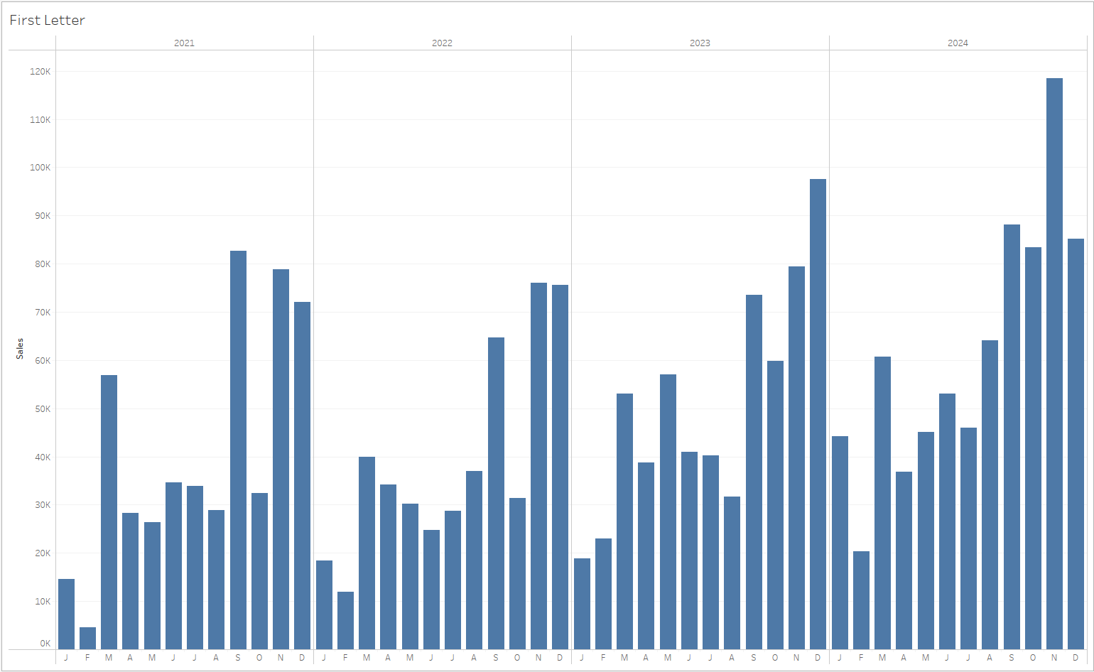
When using DatePart of month, First letter can be a clean way to visualize month headers. It is not a custom format and can be directly selected from the date formatting options. This formatting is useful when the objective of the chart is to show a large period of time in a relatively small space.
2: mmm 'yy
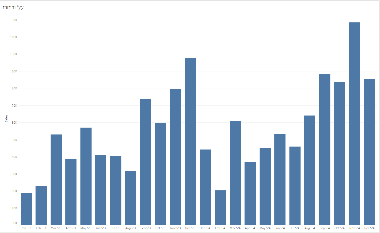
When using the DateTrunc of month, this custom format is a nice way to ensure that long month names do not crowd the bottom of your chart. It can be achieved by selecting 'Custom' on the list of date formats and entering " mmm 'yy ". This format is useful when there are enough marks in the view such that long month names such as 'September' start to take up two lines when horizontal.
3: "Q"q yyyy
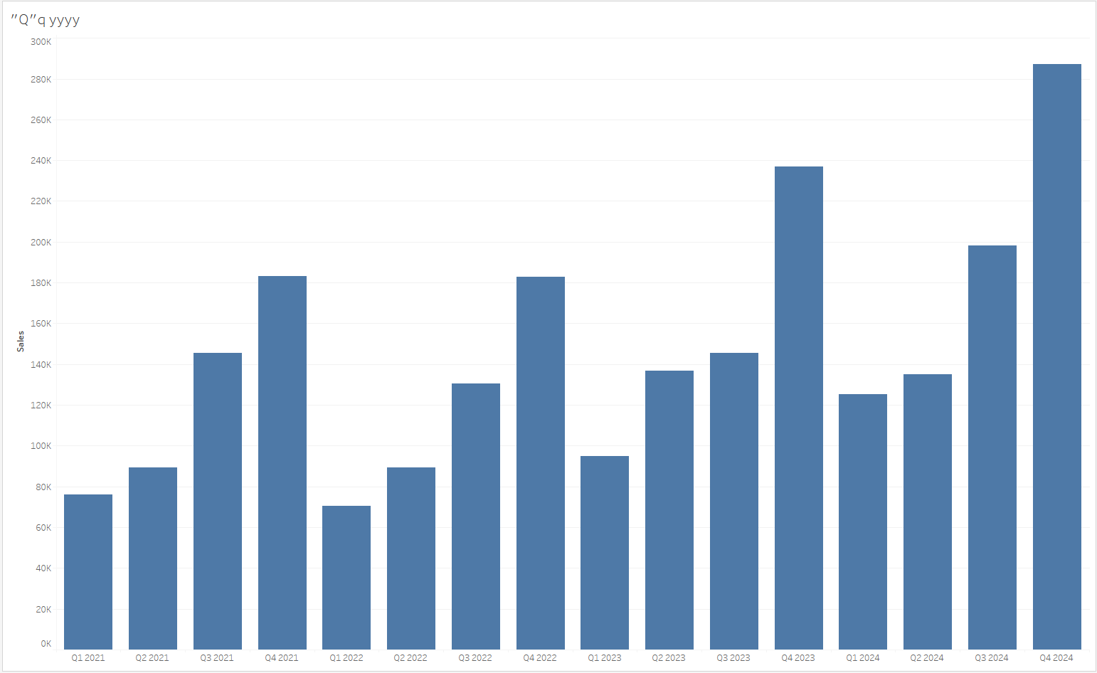
When using DateTrunc of quarter, this custom format is an easy way to make your quarterly charts more readable. It can be achieved by selecting 'Custom' on the list of date formats and entering " "Q"q yyyy ". This format is useful when you need to visualize measures on a quarterly basis but aren't satisfied by Tableau's default of yyyy "Q"q (Basically backwards).
4: ddd, mmm dd
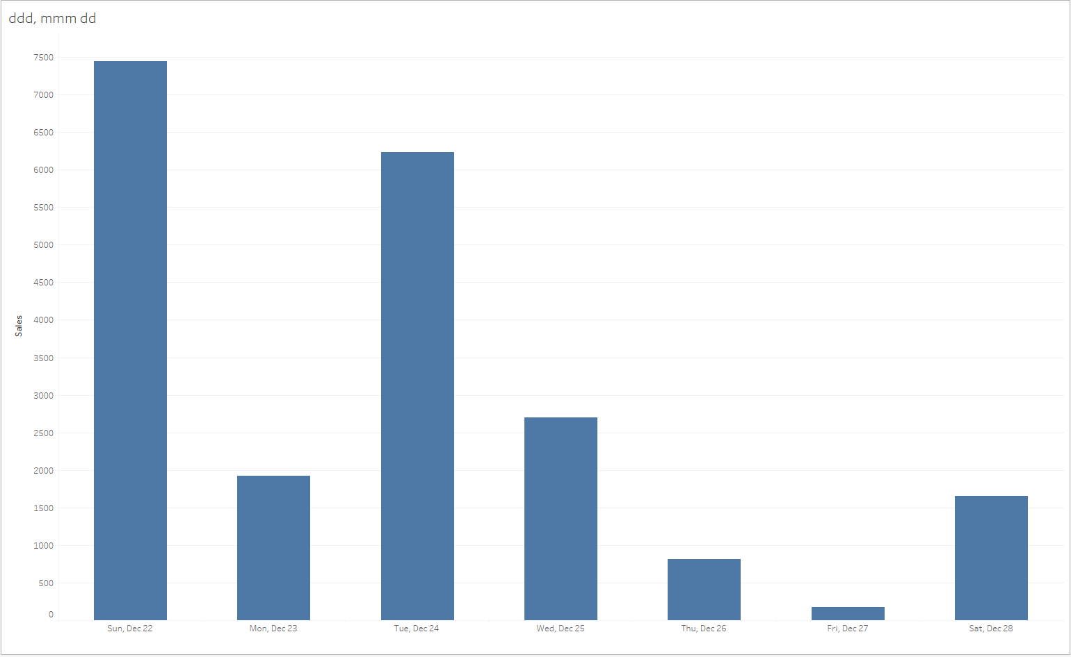
When using Exact Dates, this custom format is an easy way to add context to weekly charts or graphs. It can be achieved by selecting 'Custom' on the list of date formats and entering " dd, mmm dd ". This format is useful when a user requires the chart to display them the day of the week as well as the calendar date within the year.
These are just a few of the many options Tableau has for formatting dates in your headers and axes. I highly recommend trying these out as well as any of the other default or custom formats. No matter what way you want your dates to look on your charts, I guarantee you Tableau has a way to do it!