


When I started working with dashboards on a daily basis, I noticed that dashboards surrounded me. And it's not a hallucination!
Based on Tableau, Dashboard Definition:
Data dashboards are a summary of different, but related data sets, presented in a way that makes the related information easier to understand. Dashboards are a type of data visualization, and often use common visualization tools such as graphs, charts, and tables.
With that in mind, I found that many visual statistics are actually dashboards. And I invite you to explore my findings together in this series of posts 😉
Weather Forecast
Once I woke up and wanted to check the weather forecast, I opened the Iphone weather vidget and found out that it's a dashboard. And a pretty good one!
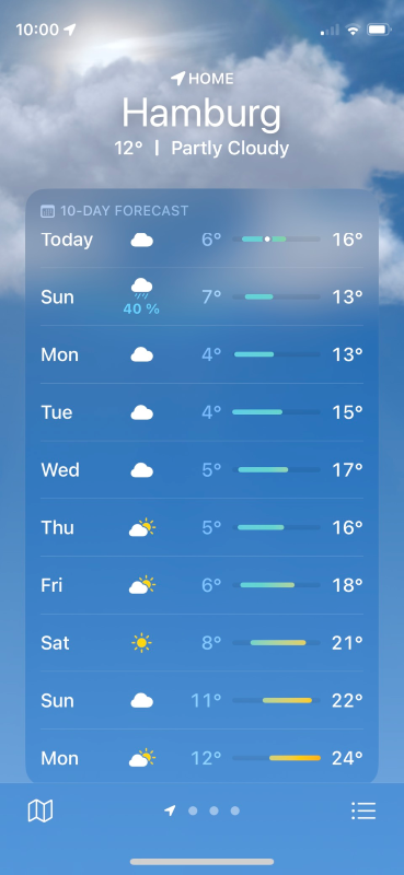
The first page looks pretty simple, but it's actually packed with information. It's also perfectly structured and clearly visualized. Let's dive in.
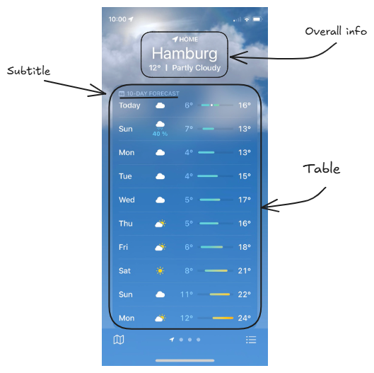
This page consists of 2 parts:
- Nice clear overall info on the top. At a glance I see my current location, temperature and weather conditions.
- Table with a 10-day forecast (I know this because of clear short subtitle). Rows of the table contain information for each day: day of the week, weather conditions, minimal and maximal daily temperature.
Let's take a closer look at this table. It's more complicated than it looks at first glance.
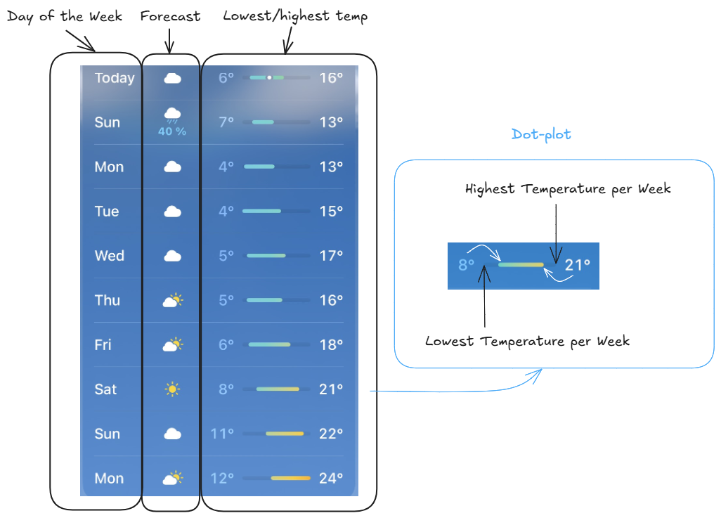
Weekday and weather icon are clear and useful, but temperature statistics is much more interesting. It shows temperature range for each day. The graph itself is a dot-plot, connecting two points (lowest and highest temperature per day). It's a great chart to show the difference between two values. Even more information we have from the X-axis range: it is limited to the lowest and highest temperature in the displayed 10-days period. Therefore for each day we can see both: daily and 10-days temperature fluctuation. Moreover, with the color of the line we can see changes from cold to warm weather. Impressive, how much we can get from a small line!
Cool Ideas
There're some ideas, that might be useful for business dashboards.
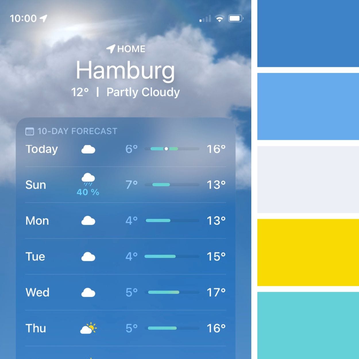
Colors
At first, color palette is very cool and neutral, it can pass for any topic.
Alignment
The table with a dot-plot is also a very useful element to show the range between values. It can be a perfect fit for KPIs, especially to illustrate changes in the "value vs target" pair over time.
Maybe I will implement some of these findings (maybe not 😅), but this analysis was really fun! See you in the next post! 💌