


After a brief break from the Makeover Monday Challenges, I'm thrilled to jump back in! Let's take a look at what I've done 🤗
Original Vizz
I found this nice visualisation representing different frequencies, from human heart rates to gamma rays. The data is very interesting and the dashboard is engaging!
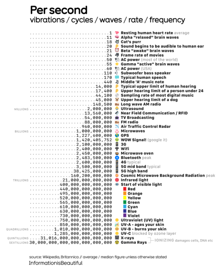
Source: https://informationisbeautiful.net/2024/per-second-vibrations-cycles-waves-rate-frequency/
The visualisation is extremely rich in information, and after reading it all, I found a lot of interesting facts. However, there are definitely some aspects that could be improved.
Advantages
- Structure
I love the sorting and these quasi-bar charts made of numbers. They're a great way to illustrate the difference between values without the problem of 'smashing' small values when comparing them to much larger ones. - Cool data
These are very interesting numbers, and it's a great chance to see the relationship between a cat's purring and the color red. - Engaging Visualisation
This is a combination of the previous two points, as numbers seem interesting and are well-structured, which makes me want to continue reading.
Disadvanrages
- Too much information
Yes, there are a lot of interesting facts, but perhaps too many. I wish there were some kind of focus or exact comparison. - Not all of the information is correct
There are some mistakes in the data. For example, I couldn't find proof that a cat's purr is 18 Hz. It's unlikely to be true because we can hear them. Also ultrasound starts at 20.000 Hz, not 2.000.000 Hz.
Improvements
- Focus
To reduce the amount of information, I decided to focus on sound. - Insight
I discovered that dogs' hearing limit is three times higher than humans'. I thought ultrasound was the highest sound they could hear, but they can hear frequencies more than twice as high! - Visualisation
To better represent the frequency, I decided to use a sinus graph.
Result
Here's what I've come up with visually:
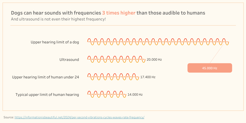
It tells the story implied by the title and subtitle. All of the presented numbers support the story by proving a point or providing context.
This visualisation seem simple, but it took quite work to prepare the data for it. What is behind this "sinus" graph, I will tell in the next post.
Stay tuned!