


Today is the fourth day of Dashboard Week and the dreaded day where we weren’t allowed to use Tableau *sobs*. We got to choose between Power BI, Qlikview, Google Data Studio, Flourish, or Looker instead, and I chose Power BI based on the fact that it was the most popular job related key word on LinkedIn (after Tableau).
It was pretty straight forward to create some basic charts and do some basic formatting, but anything more granular didn’t seem possible/looked like a mystery…
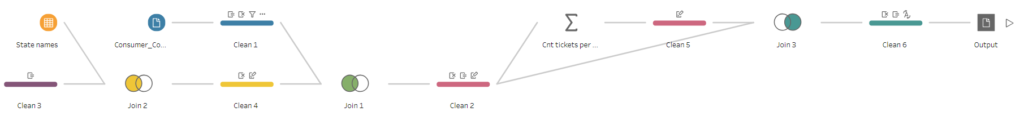
We were given some FCC Consumer Complaints Data on Unwanted Calls to work with and the data prep had to be done in Tableau Prep Builder. At first it looked like there wouldn’t be much prep needed, but then I realised that the dates were not in a workable format and I extracted the longitude and latitude just for the fun of it. I also did a fair bit of back and forth to add some further data such as state names, as Power BI was putting state codes in places like Australia and Venezuela, and state population (I also did the calcs I needed in Prep as I couldn’t figure out how to do that in BI).
The data was pretty straight forward and not knowing BI at all, I went for a simple dashboard with a little insight:

Disclaimer: I may have used Tableau to check that what I was showing was indeed what I wanted to show as BI likes to make assumption as to what you want to show but doesn’t make it very clear.