For this example I will break down each step for each task to show you how we got to the final results. If you want to know more about the Parameters in more detail you can see my other blog Parameters 101 to get a better understanding.
For this task this was what was required:
Build a scatter plot with:
1. Option to populate X&Y Axis by each of 10 measures
2. Option to switch detailed dimension by Team (team Name) or Player (name)
3. Add changeable reference lines to both X&Y
4. If view is by team, Colour the chart for home/away (team)
5. If view is by player, add colour highlighter for a Selected Player parameter if detail is by player (Name)
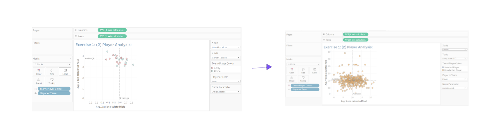
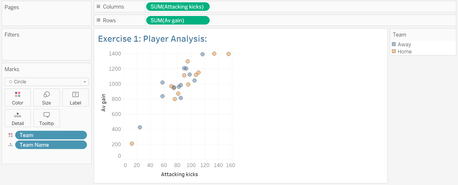
The exercise started with a basic scatter plot as shown below and we had to apply the following steps to it.
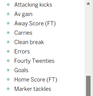
Step 1: Build a parameter which contains 10 measures for x and y ( for this we can make one parameter, then duplicate and change name from x to y). A measure is usually marked with a #. I chose my 10 based on alphabetical.
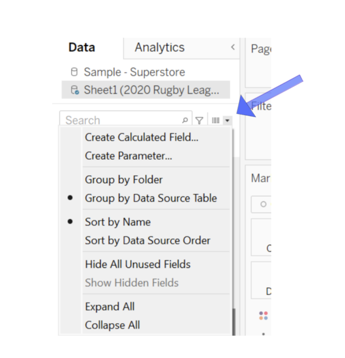
To build this parameter there is a little drop down in the left panel and this is where you press to create a parameter.
Below shows what the options are for parameters. For the X axis and Y axis this would be a string in which we can create a list and type out each measures.
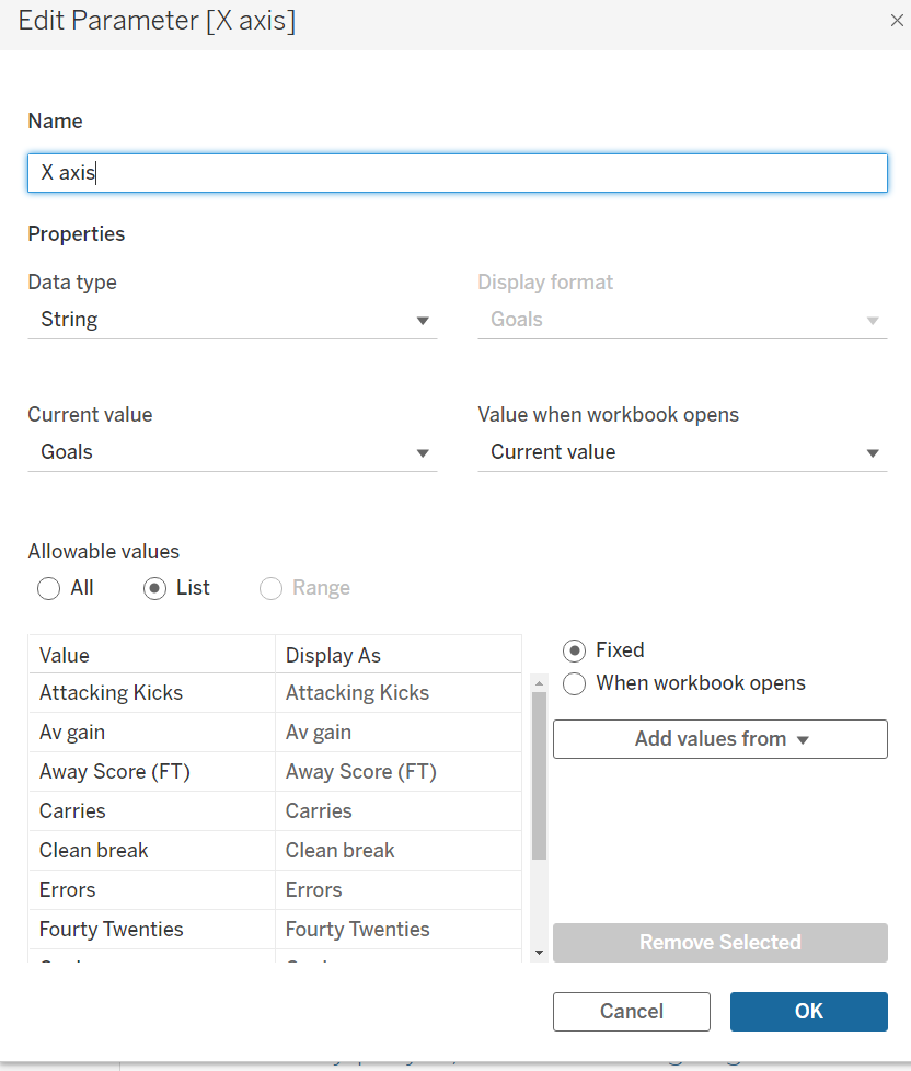
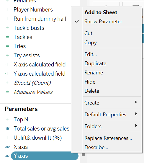
Before we move on remember to insert your parameter- to do this right click your parameter and then select show parameter.
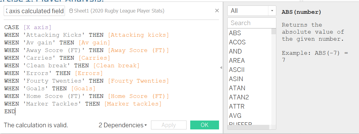
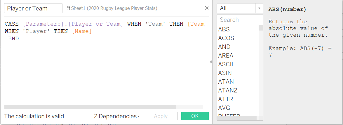
Next we need a calculated field to allow this to work with the data when placed in the same workbook. The calculated field for this can be either an IF statement or a CASE statement. For this I chose to use a CASE statement.
A Case Statement finds the first <value> that matches <expr> and returns the corresponding <return1>. An example of this is CASE [RomanNumeral] WHEN 'I' THEN 1 WHEN 'II' THEN 2 WHEN 'III' THEN 3 End.
For this example the formula is pretty long because it is including 10 measures. This is just linking the parameter with the actual measures- as you remember we gave the values to these parameters above. ( This once again can be duplicated and then renamed Y axis calculated field. Then replace [x axis] with [y axis] but the rest of the calculated field remains the same).
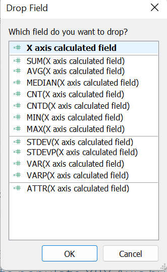
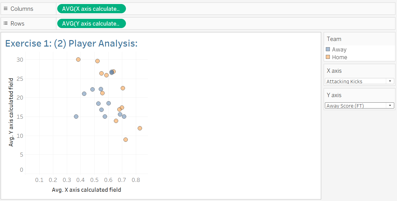
Once this is created we want to replace the original column with average x axis calculated field and average y axis calculated field for rows- If you right click and drag these to where they are meant to go you can choose how you wish to aggregate the data.
This is what your graph should look like:

We can now switch between parameters and the values on the graph should change which shows that the parameter is working. I have created another screen grab to display the change below:
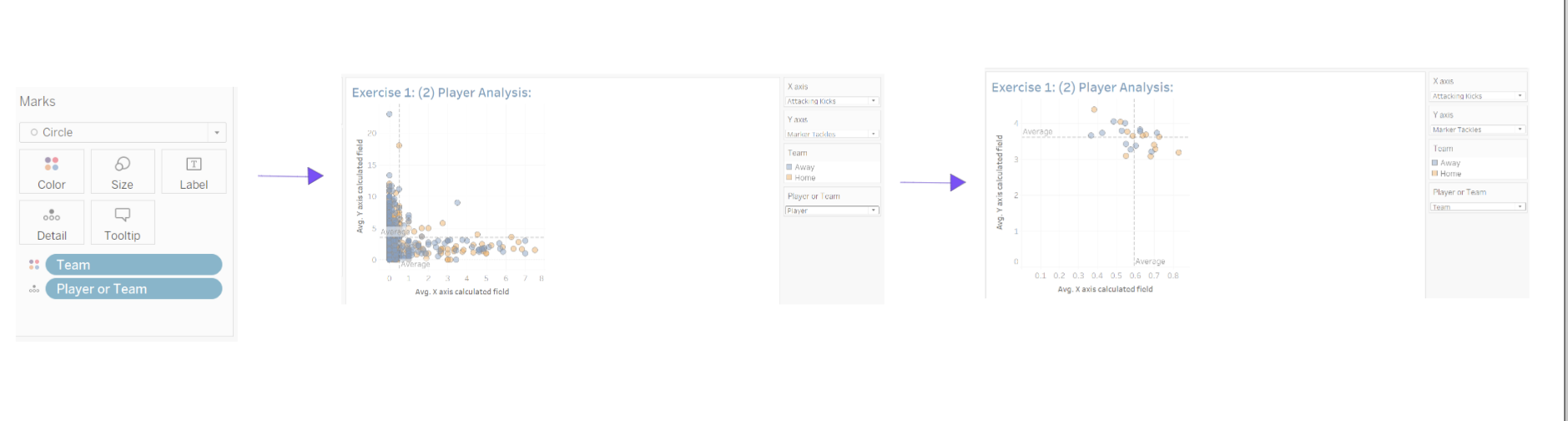
Step 2: Option to switch detailed dimension by Team (team Name) or Player (name). First we create another parameter for team or player. Then press show parameter.

Next we create a calculated field which says when the value 'Team' then return this as the measure team and when 'Player' then return the names.
Next we change detail to player or team so that the scatter graph can swap between the two as shown below- however at the minute colour is not clear on players. (Step 4 and 5).
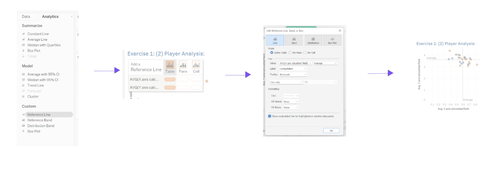
Step 3. Add changeable reference lines to both X&Y
To add the reference lines you go into the analytics panel then drag and place on table, confirm the editor and then we can see the results for the reference lines.
Step 4. If view is by team, Colour the chart for home/away (team)
step 5. If view is by player, add colour highlighter for a Selected Player parameter if detail is by player (Name)
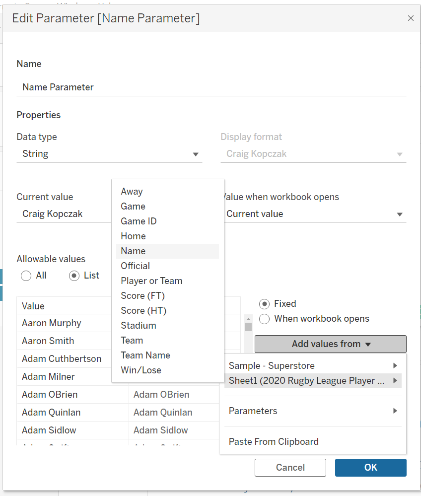
For Step 5 we need a new parameter called Name parameter because there are a lot of names I added the values Name to the list rather then me type every name. Don't forget to add parameter to the sheet.
These two steps link together as we can use the team or player parameter created earlier and name parameter so we can just create a new calculated field.
For this one I chose to use an IF statement. This just says IF this THEN return as this ELSEIF then this and finally ELSE which is any values THEN return as this.
For this example my calculated field is shown below:
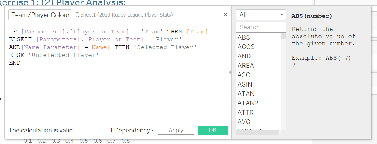
Now to change the colour we can just drag Team/Player colour on colour.
We can now sort by player or team and that is all the tasks completed.