


Dashboard week days 3&4 saw us building a summer-based dashboard from the Data+TV (https://www.tableau.com/community/tv?ref=thedataschool.co.uk) dataset challenge.
The challenge was set by Tableau, so we should use Tableau Prep for our data preparation needs and Tableau Desktop to build the visualisation. They'd like this to be an infographic dashboard. Infographics are usually highly stylised and static, they could be printed off and displayed in all their glory.
Initial Plan and later pivot...
Initially, once finding the data and accessing the workbook - it is an absolutely massive file containing IMDb data on almost every film/series you can think of. An absolute dream for a Film/TV fan...which I am not. This presented the first struggle as I wasn't really sure what to focus on. After delving into the data, I found that they had 'Race across the world' IMDb ratings and reviews - a show I really like!
So, I began to run with the idea and had a look through the data available. It started so promising, however I ultimately discovered that the data wasn't available for 3/6 of the seasons, especially the most recent 2 years. I had a look at bringing in this data and managed to find some good sources and what I needed, however trying to model the data how they had modelled the data in desktop, in prep, was an absolute nightmare. There were so many extracts, all unnamed and all containing different tables often with just one part of data and with no explanation of how to relate the data, I unfortunately left this idea.
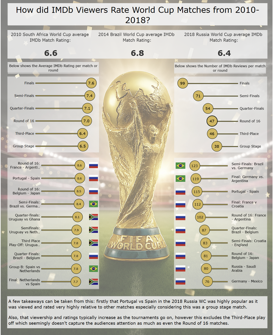
Next, came another idea - why not use the available FIFA World Cup data they have available. They had data from most of the world cups so I began to play around with the data and found it to be much more friendly and actually complete! This gave me confidence I could create a nice viz within the short time frame as I could focus just on viz and not too much prep. I decided on the 2010-2018 World Cups as these are the ones I remember the most and excluded Qatar 2022 as this was held in UK Winter... not in the Summer theme as specified by the challenge!
The Process
The dashboard is fairly straightforward and clean and given the data available from IMDb, I think I did a fairly good job - although I think I may have focussed a bit too much on design elements and the appearance of the dashboard as opposed to an analytic approach (which I typically much more prefer).
I did gain experience with Figma to do this, in order to get the background of the world cup and the containers - so that was a bonus as I wouldn't say graphic design or being artistic are one of my main strengths.
Playing around with Tableau and using hacky habits in order to get the appearance you want is good fun though (if you manage to make it work). For example to get the flags next to the lollipop chart, I had to set their value as min(1) and then change their image as a shape mark type and then remove all headers and put them in the same container as the lollipop chart which was a separate chart - in order to get them to look like they were a part of the same chart (sorry - there not actually!
The Dashboard
Slide Deck
The Challenges
The main challenge was that the data was very limited from IMDb - I was pretty much exclusively left to either the rating of the match or the number of ratings left - as there was no seasonal data etc. Also once diving into the data, I felt like I wanted to bring in external data to aid my storylines and analysis, for example why did Portugal-Spain (Russia 2018) rank so much higher than the South Africa WC Final for example? Likely because Ronaldo scored a hattrick in a 3-3 thriller..., but I wanted to prove this with external data - for example a scatterplot of rating against goals scored in the match or number of cards received etc.
This would definitely be some extra steps I would like to do to improve the viz if I have time in the future. I collected some pretty good external data in an attempt to provide this, so just need some more time to be able to bring things all together. Another example would be to add a sunburst radial chart, which I have been working on and will hopefully get the chance to make another viz and post to my Tableau Public so be on the look out for that!