


So, Day 2 of Dashboard Week and today we were thinking about accessibility of dashboards for those who make have accessibility requirements.
The Brief:
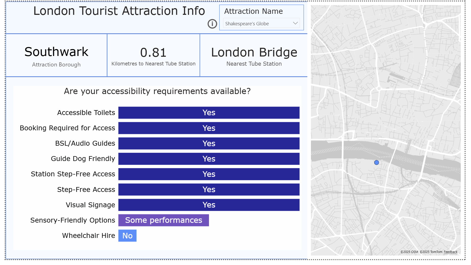
I was tasked with designing an existing dashboard for someone with neurodiversity in mind—focusing especially on dyscalculia and dyslexia. They find most city planning dashboards overwhelming or unusable, particularly those filled with icons, percentages, and colours that blur together.
Deliverables:
• Minimise cognitive overload (no heavy grid layouts or dense legends)
• Use plain English and icons with alt text
• Offer voice-over summaries or toggles for simplified views
• Show rankings visually rather than numerically when possible
Context:
•Dyslexia is a common learning difficulty that mainly causes problems with reading, writing and spelling.
•Dyscalculia is a specific learning difficulty that affects a person's ability to understand, learn, and use mathematical skills. It impacts various aspects of number sense and arithmetic, including recognizing numbers, understanding quantity, performing calculations, and applying math to everyday tasks.
Plan:
• Minimise cognitive overload
- Avoid cluttering dashboards or reports with too much information or numbers at once. Keep it clean and focused.
• Pictures are Better Than Numbers
- Visual representations like icons, bars or images can make concepts clearer than a row of figures.
• Use Dyslexia friendly fonts
- Good options for this is Verdana or Arial. There are even specific ones you can download such as OpenDyslexic or Monospace fonts
• Leave Space Around Numbers
- This helps the numbers stand out and prevents overwhelming the reader with too much at once e.g., adding a blank line in tooltips between two metrics
The Dashboard:
Slide deck:
Key Takeaways:
Redesigning with neurodiversity in mind is about removing barriers so everyone—regardless of how they process information—can engage with the data. To ensure this, in the future I will:
- Don’t assume “shortcuts” like ‘K’ or ‘M’ are helpful—they often just create confusion - often it is better to write out Million or the full number - check with the client and proceed
- Keep things aligned, consistent, and uncluttered.