


Today marks the first day of dashboard week, which was focused around accessible design, and more specifically to our context, how to ensure your Tableau Dashboards are designed in a way that allows all different types of users, such as neurodiverse users, users with impaired vision or colour blindness, or users with mobility issues, to interact with and take key insights from them.
For my challenge today however, I had to focus on improving on a current dashboard, related to TIL data (so I cannot show screenshots), to allow it to be easily accessed and utilised by a business consultant who is a keyboard-only user. As a result of this, there were many things which had to be taken into account, which I will go through, along with how I tried to tackle each one.
Planning
To initially plan how I would improve the dashboard I decided to create annotations surrounding, to highlight any notable accessibility issues for keyboard only users that I could improve on. These included things such as rearranging the dashboard, labelling charts with values, labelling reference lines, and adding instructions of how to use the dashboard with only a keyboard. Below I have included a screenshot of my annotations, with the original dashboard hidden. Annotations highlighted in green were those that I successfully addressed in my final dashboard, and those in orange indicate accessbility issues I did not fully address.
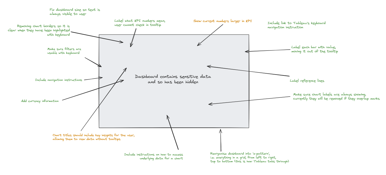
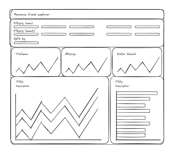
Following on from this, I then created a sketch based of my suggested improvements which appeared as follows:
Creating the dashboard
After the initial plan, I then recreated the original dashboard, addressing all the accessibility issues for non-keyboard users I found. In general, if I were to summarise all the improvements I made into categories, these would be.
- 1. Allowing selection using only the keyboard
The key method for navigating around Tableau dashboard on Tableau Server without a mouse is using the tab key. This simply involves pressing tab until the aspect of the dashboard you want to select with the enter key is highlighted. Therefore, one key consideration to take into account is the order in which things are selected, something that is not considered in the original dashboard. Currently, the dashboard both does not select any charts, and does not select filters in the correct order. This is due to Tableau automatically configuring tab selection order in a z-pattern (left to right, top to bottom), which was therefore a design choice we implemented in our improved dashboard design.
- 2. Moving information out of the tooltips
Another key consideration in keyboard only dashboard accessibility is not being able to hover over any data points in a chart. This means that it was important that I included any key metrics for charts as labels, so they can be easily read without the use of a mouse. Examples of this include labelling the last point on any line graphs with the value, labelling every bar on a bar chart with the value, and labelling every reference line with its value and what the line is actually showing.
- 3. Providing instructions for the user
Without the option to intuitively click on what you want to select with a mouse, it was imperative that clear instruction were included throughout the improved dashboard to tell any keyboard only users how to access all the necessary functionalities with only the relevant keys and shortcuts. Moreover, we also created a button, which, when selected using the tab key, would open up Tableau's own guide on shortcuts and tips for interacting with dashboard using just a keyboard.
- 4. Allowing the user to view more information if they want to
Finally, something which was very important to include, despite use not having to directly do anything to implement it, was the ability for a keyboard only use to open the underlying data if they wanted to view it in more detail. As previously mentioned, this feature could already be accessed by pressing enter twice on a chart within the dashboard, but it was important to inform the user that this was an option.
Testing
Finally, on key aspect of redesigning a dashboard with accessibility in mind is testing. This involves making sure every implemented accessibility feature works, and has the intended effect. It is important to note that this testing was not left until the end, but was done so iteratively, making sure each individual feature worked before implementing the next.