Today I will be going through how to design a waterfall chart in tableau. I’ve been told that the waterfall chart is often something that clients are looking for out in the real world, so for my own sake and hopefully to help you learn I’m going to go through how best to make one.
The purpose of a waterfall chart is to allow you to see how constituent steps contribute to an overall outcome through a running total. In my case I will be aiming to show how the sum of profit changes over the course of a month to reach a sum of profits at the end of that month.
I will be using the sample superstore data, in my waterfall chart if you want to follow along with me. The first step is to drag profit to the rows shelf, by default this will aggregate to ‘SUM(Profit)’. Then you will need to choose which dates you want to show. We want to show each day within a month for this exercise so I will right click drag order date to the columns shelf and then clicking on the #MONTH(Order Date) this will bring in the discrete month where each month is plotted as a header. Do this step again but this time clicking on #DAY(Order Date). Now you’re view should look like this.
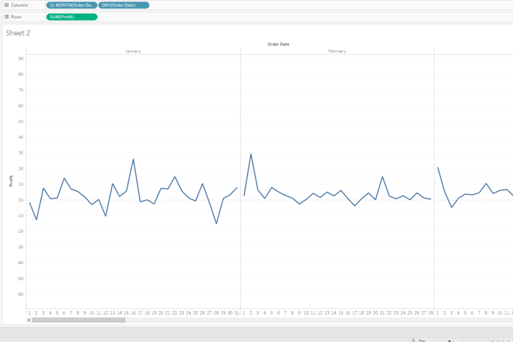
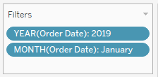
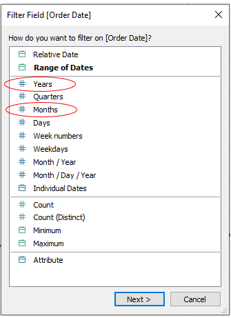
This is currently showing a sum of the profits on every day of every month for every year in the data set. We want to look at one year and one month. You do this by right click dragging ‘Order Date’ into the filter section, this time put discrete year and discrete month onto the filter pane. I will be ticking this 2019 and January boxes to include only January 2019 in the view.
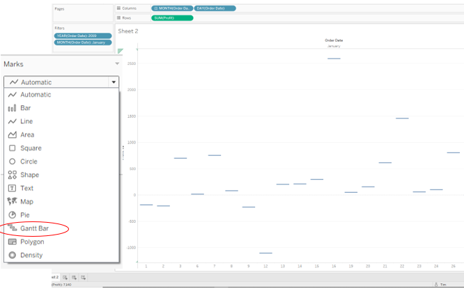
The next step is to change your chart from automatic to gannt bars as shown in the picture below.
Next thing on the agenda is to make a calculation to make bars above or below our gannt bars. This calculation is just the -ve of whatever you’re trying to measure in my case its profit.

Drag this calculation to the size tab of the marks card
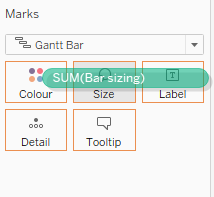
This will then plot all of your bars around the gannt lines and should leave you with a view that looks something like this.
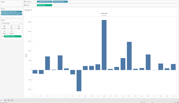
This doesn’t look much like a waterfall at the moment but we’re about to make it look much more waterfall-ish. Do this by right clicking on the sum of sales and going into the ‘Quick Table Calculation’ and clicking on running total.
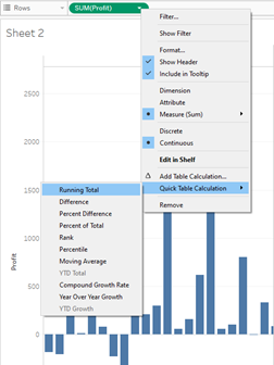
This will then show you how each bar changes the overall total from where the previous bar finished. This will make your viz look something like this. Your waterfall chart is now formed, there are some extra steps we can take now to add to clarity. We can add a grand total to help show more clearly what the grand total is, do this by going to the analysis tab at in the top toolbar of tableau, and selecting ‘totals’ → ‘add all subtotals’
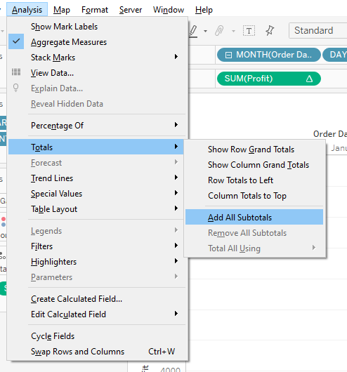
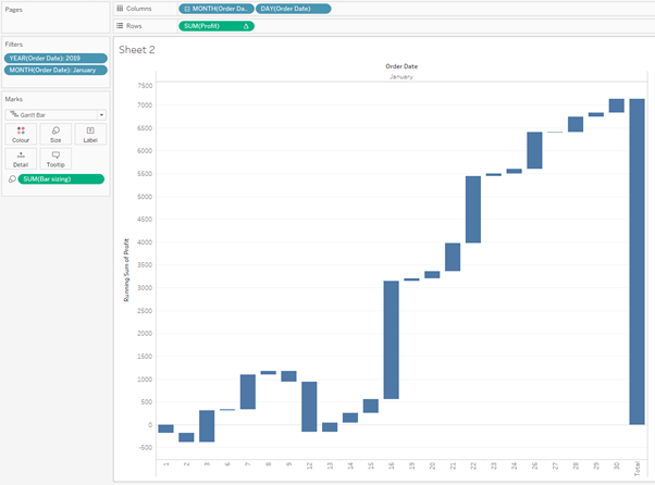
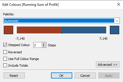
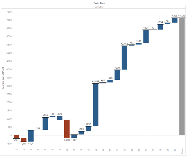
This calculation will give you the overall total a the end of the month and allows you to see essentially the total change over the time period you’re looking at. We can do a couple more things to improve the looks of our chart even more. Then add the sum of profit to the colour, click on the colour card and change to a diverging colour palate, then change the colour palate to stepped and reduce the number of steps to 2, this means that negative values will have one colour and the positive values will have a different colour. I chose red for negative values and blue for positive values.
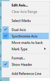
You can also bring the sum of profit to the label section of the marks card, this will then label the ends of the bars formed. Still though it’s a bit unclear where the bars finish. To rectify this I like to ‘Ctrl + left click’ the SUM(PROFIT) that we have on the row shelf and drop it again onto the row shelf, this will duplicate the chart. If you then right click the pill on the right of the rows shelf and clicking dual axis. You will need to right click one of the axis and choose the synchronise axis option.
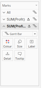
Then go ahead and find the new chart which you have just made and drag everything off of the marks card. This will then just leave you with the gannt bar. Click on the size section of the marks card and drag the size all the way up and change the colour to make it stand out to show much more clearly where the bars are ending.
You should now have a nicely formatted waterfall chart, it should look a little bit like this.
And that’s all for the blog, I hope you’ve found it helpful and can use it to make some insightful analysis with your own data. If you find any mad use cases feel free to get in touch with me on twitter @thenumberstim.
Cheers for reading.
