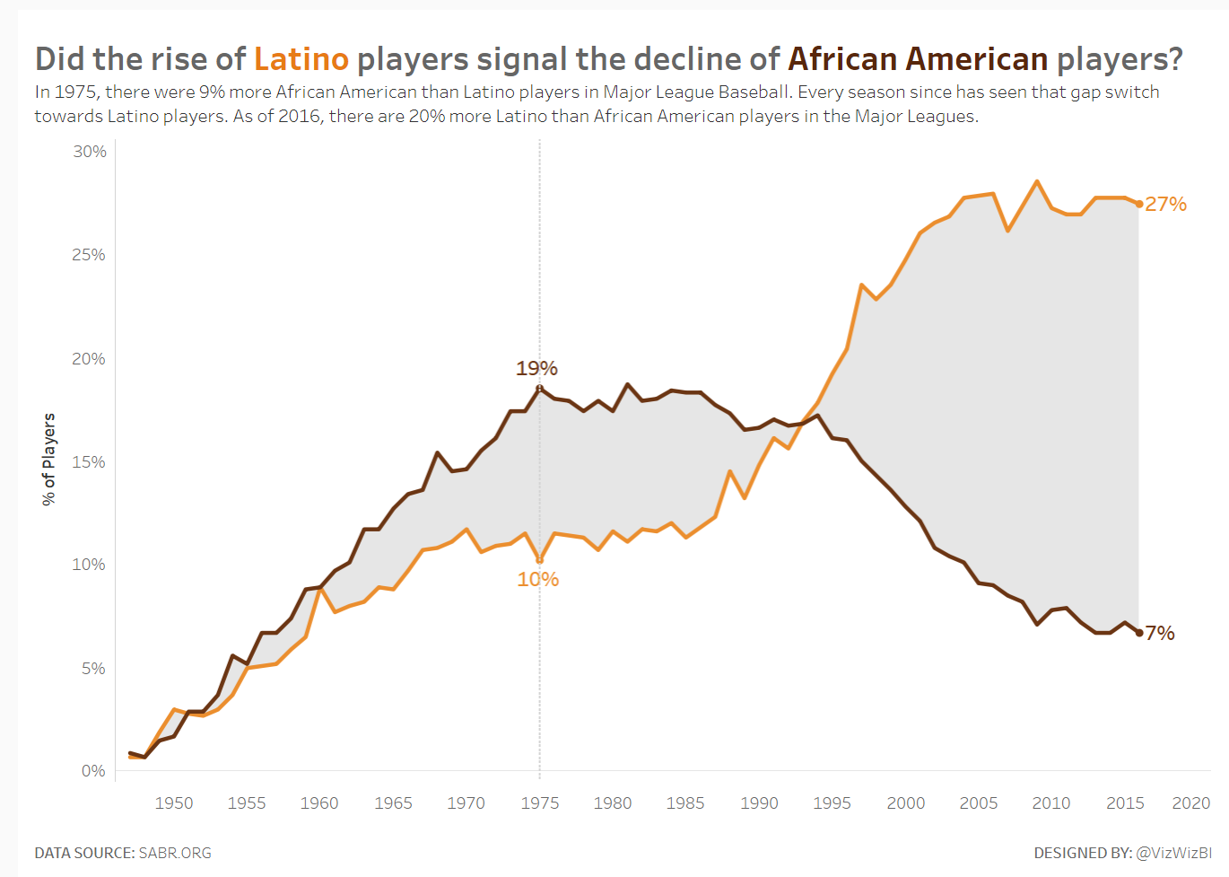
For Makeover Monday, week 6 (2018), Andy Kriebel made the following chart, showing how the percentage of Latino and African American players changed over time in Major League Baseball.
Mike Cisneros then ‘remixed’ Andy’s viz:
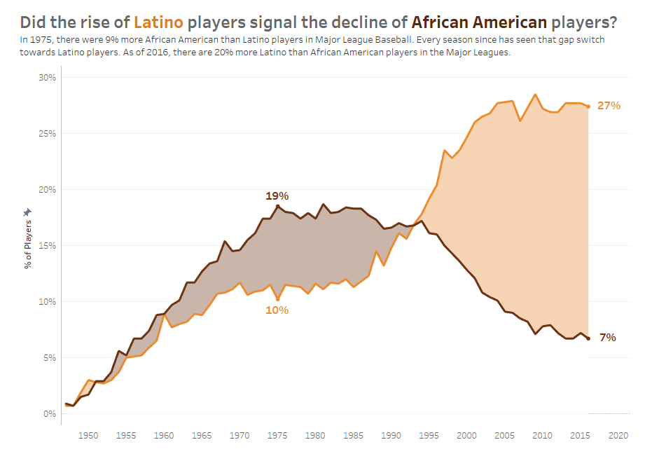
I thought this was really cool, so I asked Mike if I could write a blog on his area chart technique which he kindly agreed to. I’ll describe and explain how to remake his viz from scratch; you can get the data set here if you would like to follow along.
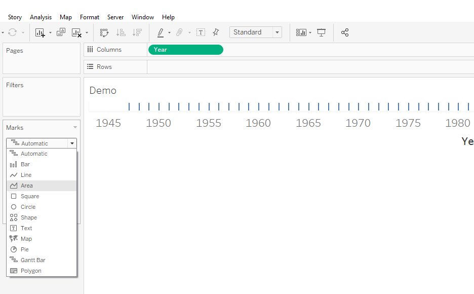
1. Year On Columns, Chart Type To Area
Firstly, drag Year onto columns and change the chart type to an area chart:
2. Ethnicity On Filter And Colour, Percentage On Rows, Stack Marks Off
Now, add Ethnicity to the filters shelf, selecting Latino and African American, leaving White and Asian unselected.
Let’s then add Percentage to rows and Ethnicity to colour. If you would like to copy the colours, here are the hex codes (I also put opacity to 100%):
- Orange: #ea8d31
- Brown: #6a3413
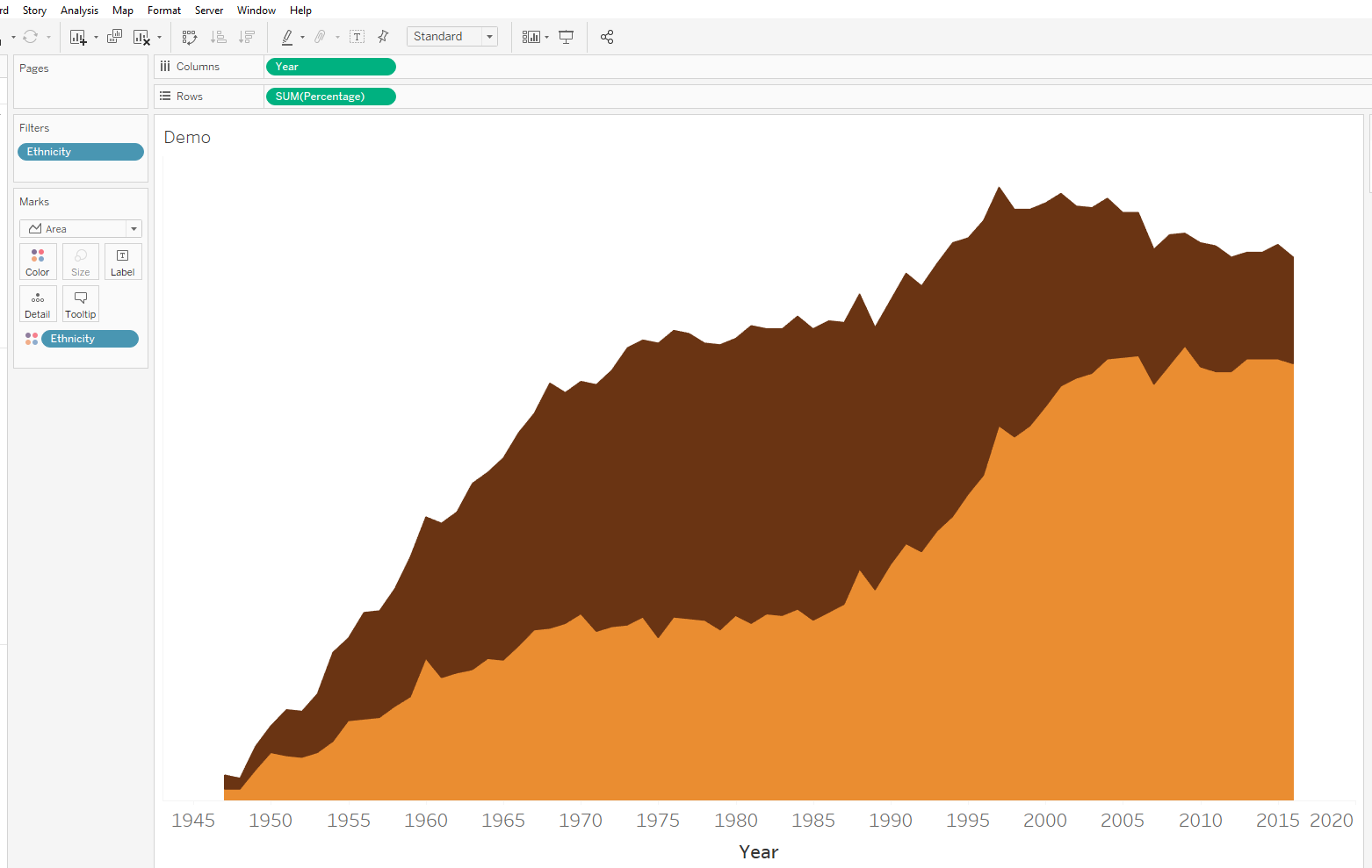
As we want the areas to match the corresponding lines, we need to turn stack marks off in the analysis drop-down menu:
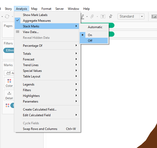
resulting in this:
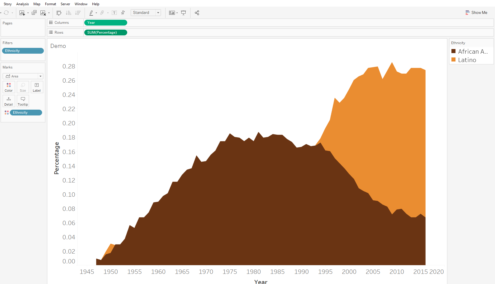
3. Find The Minimum Percentage For Any Given Year
The next step is to get the white space between the axis and where the bottom line will be. To do this, we simply need to find the smallest percentage at any given year, irrespective of the ethnicity. The calculation looks like this:
{ EXCLUDE [Ethnicity]: MIN([Percentage])}

A) Why Does This Calculation Work?
Let’s look at the table below to understand why we need the exclude LOD function. The first column is [Percentage], the second column is MIN([Percentage]) and the third column is { EXCLUDE [Ethnicity]: MIN([Percentage])}.
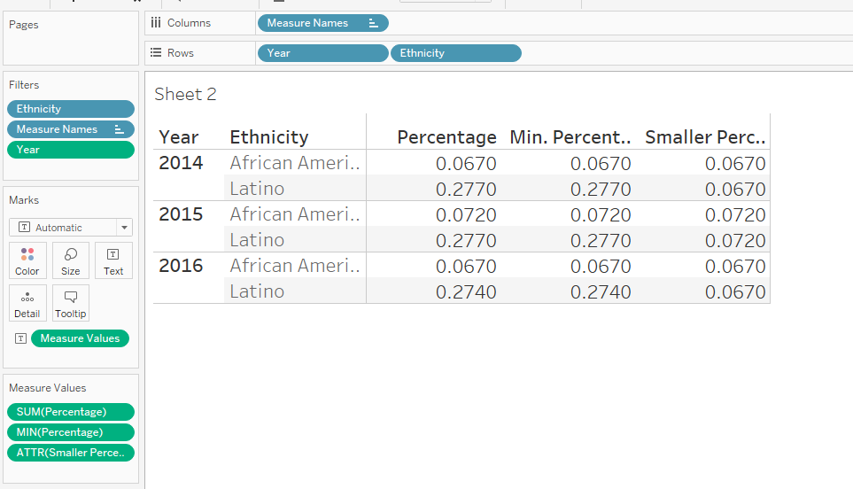
Ethnicity (on colour) is our lowest level of detail in the view; there are two ethnicities within each year.
Just doing a minimum of our percentage (column two) returns the same percentage as in column one because we’re at our lowest level of detail. Finding the minimum percentage of each ethnicity is therefore not what we want.
We want to find the smallest percentage at the year level i.e. for each year, what is the smallest percentage. If we exclude Ethnicity, Tableau now thinks that Year is our lowest level of detail, so it finds the minimum of the two percentages within each year. Another calculation that would work (assuming that you add the Ethnicity filter to context) is:
{ FIXED [Year]: MIN([Percentage])}.
because we are fixing our lowest level of detail to be Year rather than Ethnicity.
B) Create A Combined Axis
Next, drag the ‘Smaller Percentage’ calculation we just created onto the Percentage axis to create a ‘combined axis’.
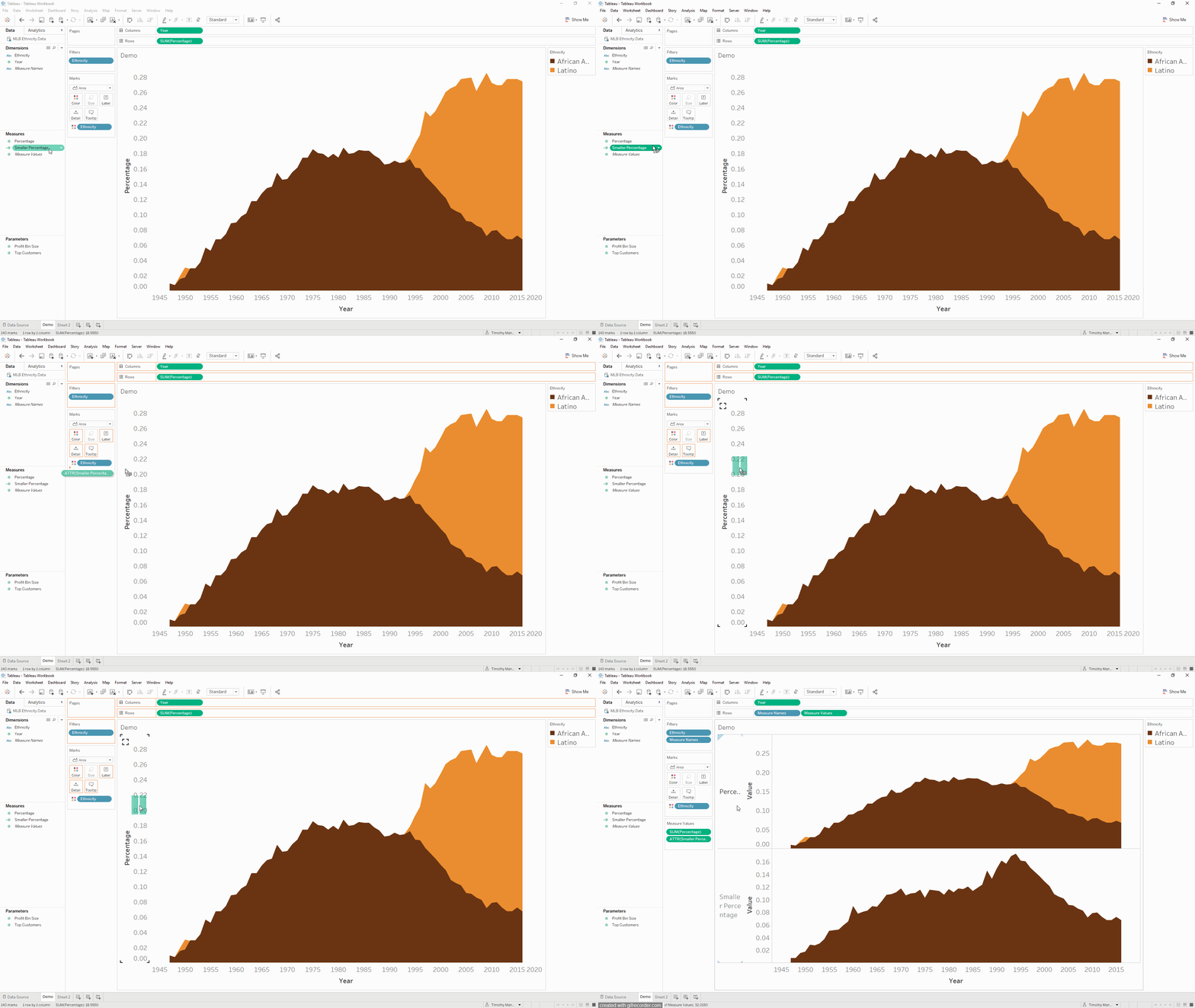
Drag Measure Names from Rows onto Detail, click the detail icon, and select colour. We now have two fields on colour in the same marks card, creating a variety of colour combinations of Ethnicity and our Measure Names. Here are the four choices (hex codes for the colours are provided):
- African American, Smaller Percentage – #ffffff
- African American, Percentage – #c9b5a9
- Latino, Smaller Percentage – #ffffff
- Latino, Percentage – #f7d5b4
Both combinations with the Smaller Percentage calculation will of course be white, so they don’t look any different to the sheet background. The other two are just lighter shades of the brown and orange from earlier. The final thing to do in this step is to move the Smaller Percentage calculation above the Percentage field in the Measure Values marks card so that the white area is brought to the front.

4. Overlay The Lines With A Dual Axis
All that’s left to do now is to add the lines. The Percentage field has our ethnicity percentages by year in it, so we can just add that to rows, change the chart type to a line, remove Measure Values from colour, and create a dual axis by right-clicking SUM(Percentage).
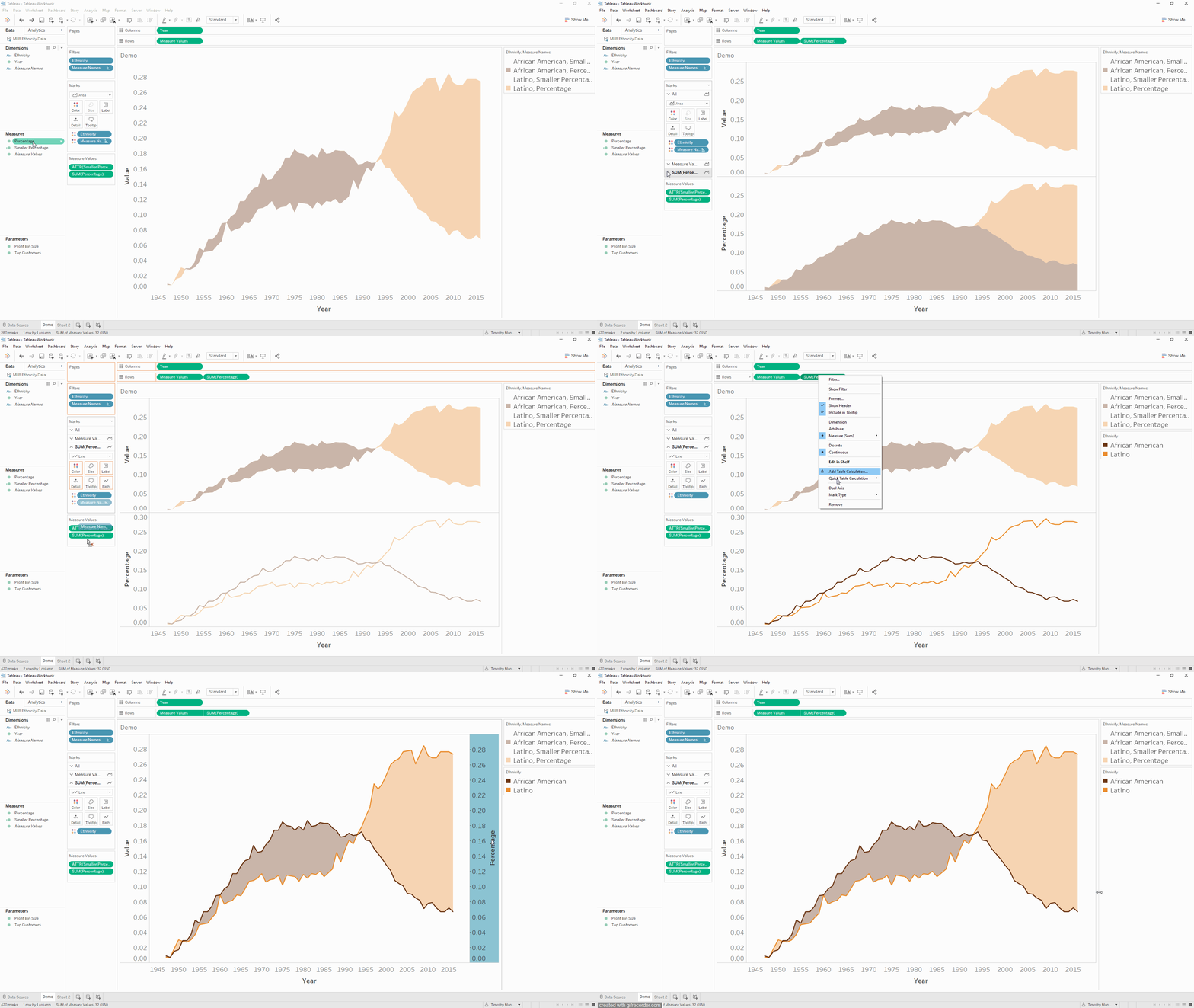
And there you have it! Shading between two lines using area charts. Thanks again to Mike, check out his awesome Tableau Public profile here.
I hope you enjoyed this blog! For more from me, check out my Twitter and LinkedIn pages.
