


Hello everyone! Welcome to part five of the dashboard design series, which is already the last part. So far we discussed the advantages of applying whitespace, proper text use, chart choice and color choice in your dashboards. Moving on, this blog post will be about the elimination of noise in your dashboards , which is also an integral part of the best practices with respect to dashboard design.
What is noise on a dashboard? Simply put, noise is anything, which is for no reason on your dashboard. That can be gridlines, labels or an axis. Anything that is superfluous to understand your visualizations.
Why should you remove noise? First, as we define above, noise does not add information to the dashboard. Second, on the contrary, noise can distract the user from the information on the dashboard. Thus, eliminating noise can support the user on focusing what is essential.
How can you find noise? Go through the dashboard and ask yourself about every element if it exists for a reason. If there is no reason, it is noise and you can simply remove it from the dashboard. You will quickly notice how speedy you become at this task with some practice.
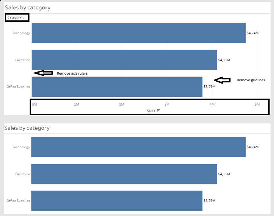
Below is an example that shows a bar chart in a noisy version (upper one) and in a cleaner version (lower one). The category and sales header can be removed since the chart title already reveals what is shown. Also is not necessary to show the sales values on the x-axis since the bars are labeled with the sales values. Furthermore, the axis rulers and column gridlines can be removed since they do not add anything to the chart (besides noise). And voilà, you have a clean chart.
If you need to remember one sentence then this one should do: ask yourself whether each single element has a purpose and remove it if does not. That is already it for this post and the dashboard design best practices series. As always, practice makes perfect (or close to it). Happy vizzing!
Cheers, Tobias