Keep It Simple, Stupid!
KISS – this is a principle I have come across in past work and life in general before joining The Data School and entering the world of data analytics. I forget who it was in particular who introduced me to the acronym, but I thank you whoever you are! Essentially, it boils down to not over complicating things. Something which is easily transferable to data visualisation. Let’s have a look at how to apply it to our world of work.
Simplicity
Simplicity is key to any good visualisation. If you see a viz and don’t know what it’s message is in 5 seconds, then (in my opinion) it hasn’t done its job. I have always taken this approach to my visualisations, check my Tableau public gallery to see. I often see work on Tableau public and particularly through Makeover Monday which is visually stunning, however misses the point. Tableau art is nice to look at, yes. However, what is it telling me? This blog post came about after watching the Makeover Monday viz review on Wednesday. I don’t want to post images or name names, but hopefully a lesson in simplicity can help improve peoples visualisations.
What is simple?
Simple doesn’t have to mean basic. It just means that things are clear. A chart or dashboard should stand out and be obvious to the reader. In the modern world of twitter, your viz will appear in a flood of others, especially with Makeover Monday. If someone can’t understand your viz within 5 seconds, they will move on. And yes, Tableau art as I like to call it will stand out. But is it effective? Let’s have a look at some best practices when it comes to planning and structuring your viz.
1. Title
A title is key to your viz. You may think of a title as an afterthought. A pain that you can’t be bothered with. But a simple and clear title is essential to a successful dashboard. It is where the reader looks first and we all know how important first impressions are. A title should both inform the reader of what they are looking at, as well as leading them towards something in the graphic. I like to use a question as my title, that way the reader knows what the subject matter is and the relevance to the viz. Look at the example below, it is clear to you without knowing anything about the subject matter what I want to tell you through the viz.

2. Space
Give your charts room to breathe. And keep the number of charts to a minimum. I use to take the approach of trying to find lots of information in a dataset and then present all of it in one go. But that doesn’t work. Find a simple story and tell that. I like to keep to 2 charts, 3 at a push. Give those charts some room, using blank layout containers and text boxes so that they can achieve their full potential. If everything is crammed into the view then your eye is constantly being dragged around. Draw the reader into your story, and tell them something useful. This leads me nicely onto my next point.
3. Colour
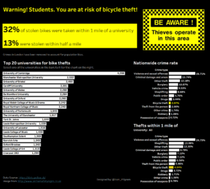
Colour is crucial. It is perhaps more important than the viz itself. How the brain reads colour is incredibly interesting, and I recommend you to read up on it if you want to take your visualisations seriously. If you use monochrome, the eye is not dragged anywhere. Yet using too much achieves the opposite. Try to keep colour to a minimum and think about if you need it or not? Take the example above, I use red, the colour of Malta, to identify it in the chart. It is instantly clear what Malta is doing relative to other countries, and the increase in the bar chart is even more evident due to the colour. That is where I want the reader to look, so I use colour to draw their eye there. Imagine if the line chart was labelled instead of coloured, would it be as powerful? Here is another example of how colour can be used to highlight fields in the view.

I hope these three points help you design your vizzes in a simple and effective way. If you take one thing away from this blog, it is that simple is good. I use to do some popular science writing, where I had to take an academic research paper and write it in a style that a 8-year old could understand. I think that this principle is something that you should apply to data viz. So: KEEP IT SIMPLE STUPID!
Hope you enjoyed the post, feel free to reach out on the usual channels. Twitter & Linkedin
