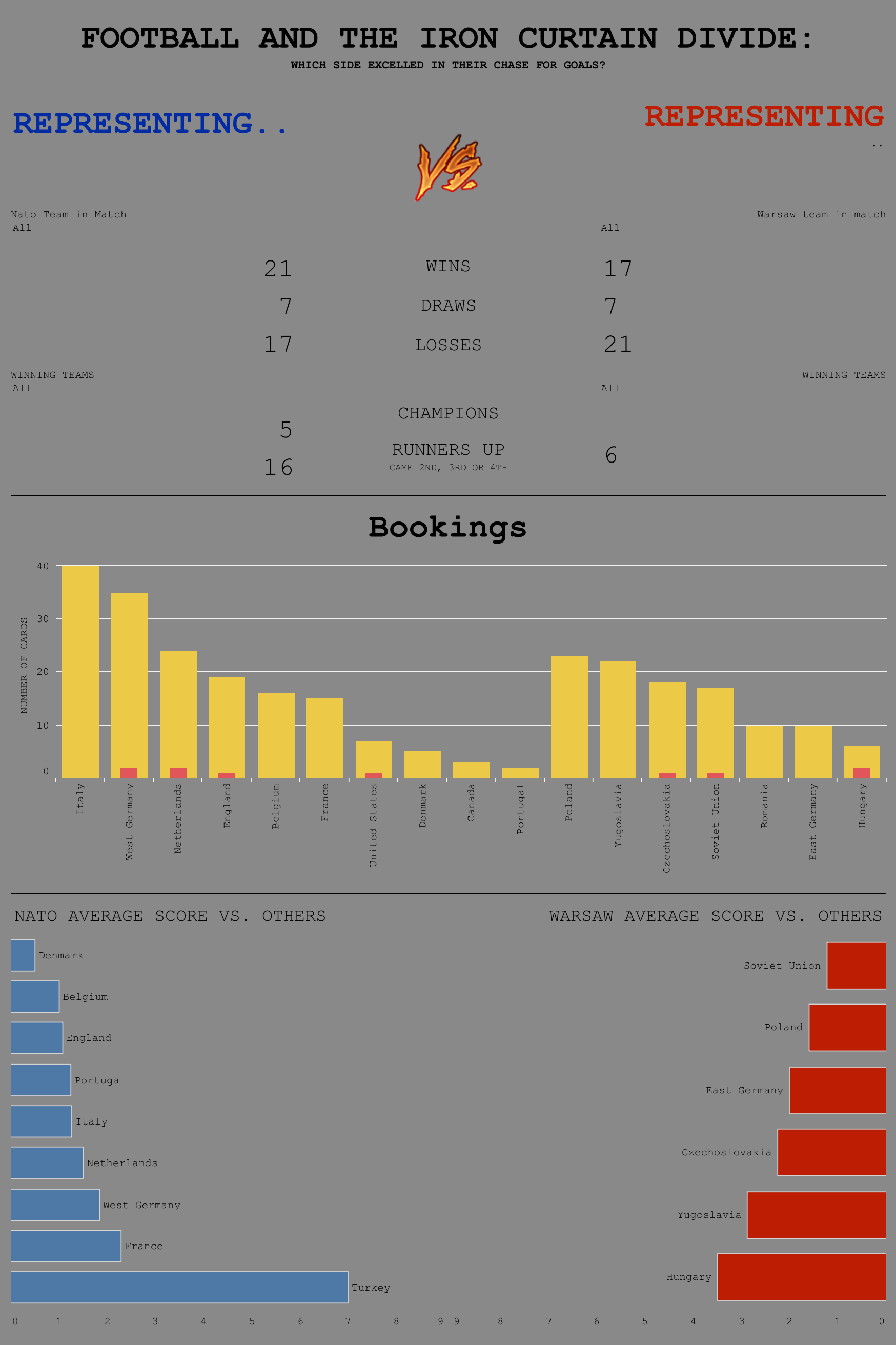
Day 2 of dashboard week was the creative day. A day where we were given football data and nothing else. 'Let your creative juices flow' was the idea. Fast forward 7 hours and I'm presenting a dashboard about the successes of teams on either side of the Iron Curtain during the Cold War. A natural line of progression.
The idea of open concept is an interesting thing. You could make something amazing, or could chase something that just won't work. you can also build a simple bar chart, or go down the rabbit hole of unleashed free thought and create a masterpiece. After my experience today, I would air on the side of caution and head somewhere down the middle. This could be a delicate balancing act, but you'll likely get the best of both worlds and end up with something that engages the audience, yet still holds analytical water.
Really, the main problem is that you have to find the right idea to chase. Try to find something that entertains you, yet still has meaningful conclusions for most people. Any more creative than that, and you start heading for the uninformative cliffs, any less and in my mind you end up presenting a bar chart that represents everything and yet isn't informative about anything (too high a view).
However, this is all my opinion, so take it with a metric tonne of salt, and, whatever you do, don't make this dashboard: