


If you want the text in your label to change dynamically based on a condition, this is a simple way to approach it.
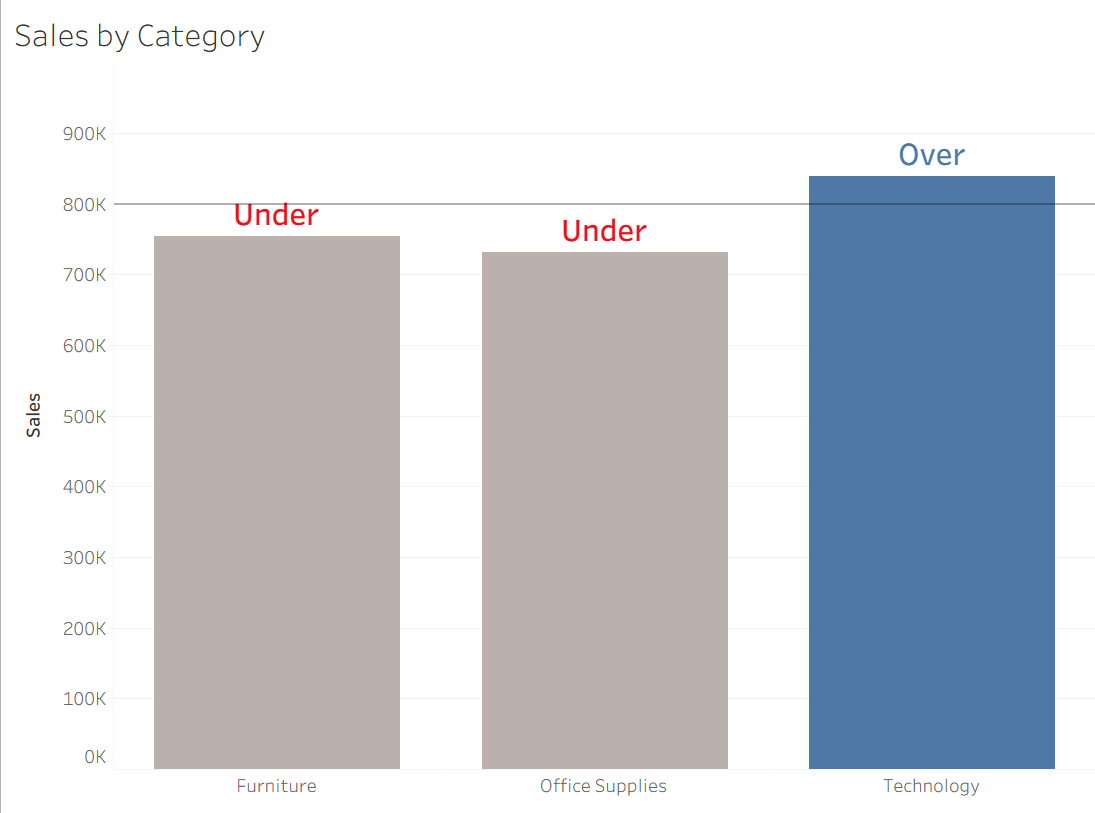
For example, take this chart below that colors the bar if the sales is over 800k.
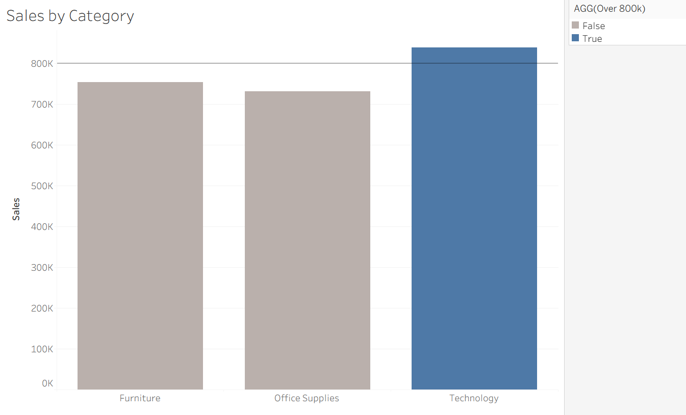
On top of color, you want to add a text that says "Over" or "Under".
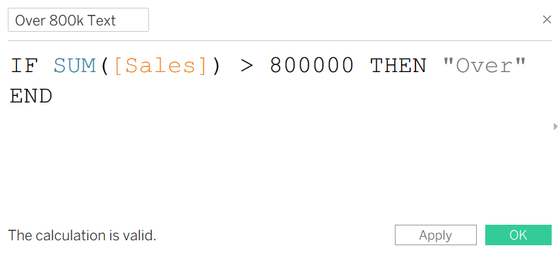
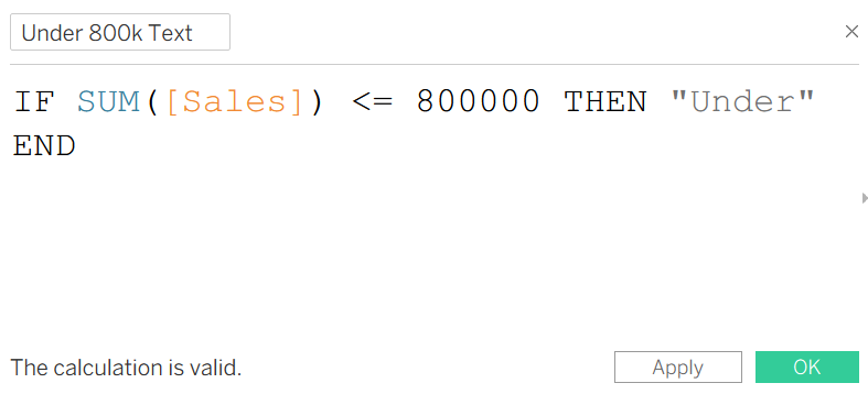
To do this, you just need to make two calculated fields
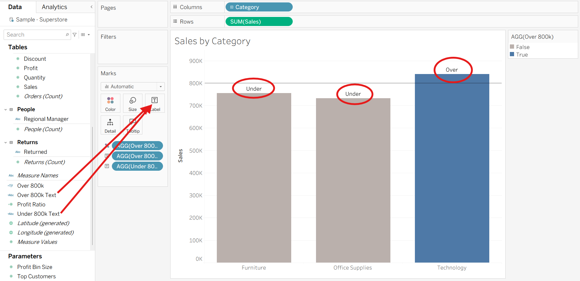
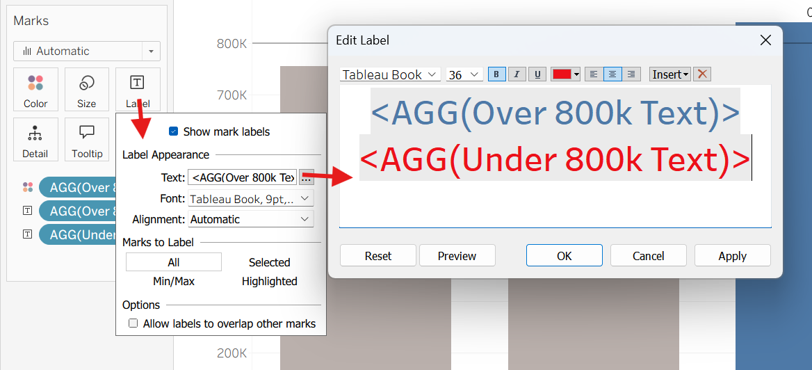
Now if you drag the two fields into the label, you will see the text label pop up above the bar!
The cool thing about this is that you can change the color of the text to match the condition. For example, if you want the "Over" text to be colored blue and the "Under" text to be colored red, this is something you can edit within the Label.
Now you can see the final result where the text is dynamically updating!
You can do all kinds of cool stuff with this: if you ever see a KPI with up triangle (▲) and down triangle (▼) that dynamically updates color, the chances are the it is using the same logic!