


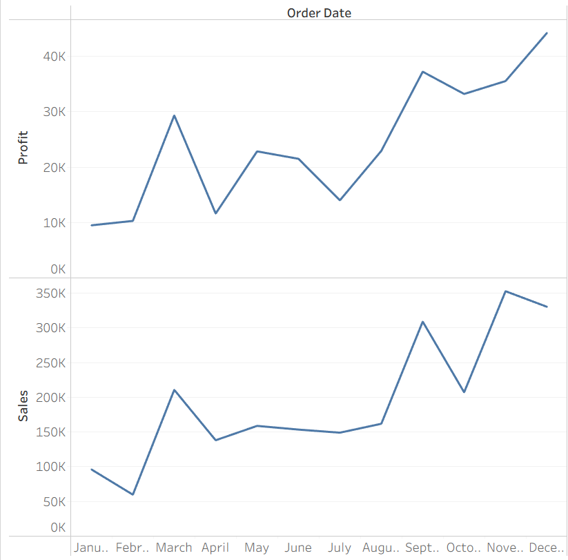
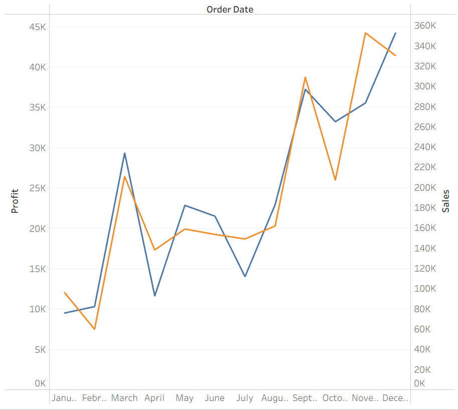
When you want to see the change over time of two measures like Sales and Profit, there are few options to show them together:
But if you want to just see one at a time or see more than two measures, using parameters are a great option. Here is a easy way to make that happen.
Step 1: Choose your measures
Start by choosing the different measures you want to display. For my example, I am going to stick with profit and sales.
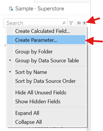
Step 2: Make a parameter
Click on create parameter, then populate the necessary fields.
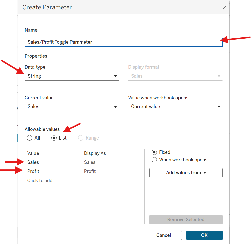
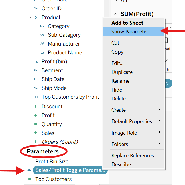
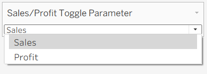
Now you will see a new parameter pop up, and if you click on "Show Parameter", you will be able to see the values that your parameter can take on.
Step 3: Set up calculated fields
Make a calculated field that returns the same measure as the parameter value.
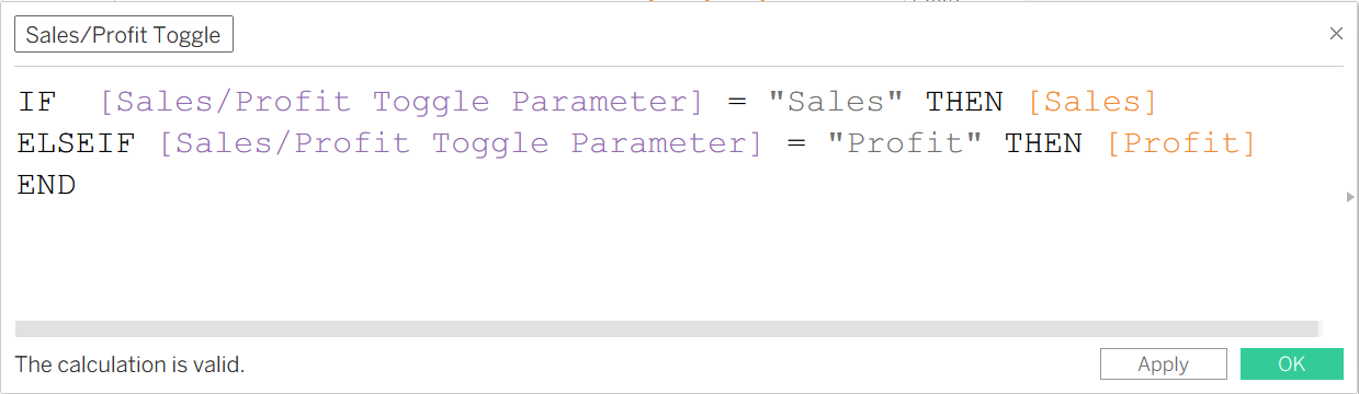
Note: If you have more measures that you want to toggle between, you can also add more to the parameter and the calculated field.
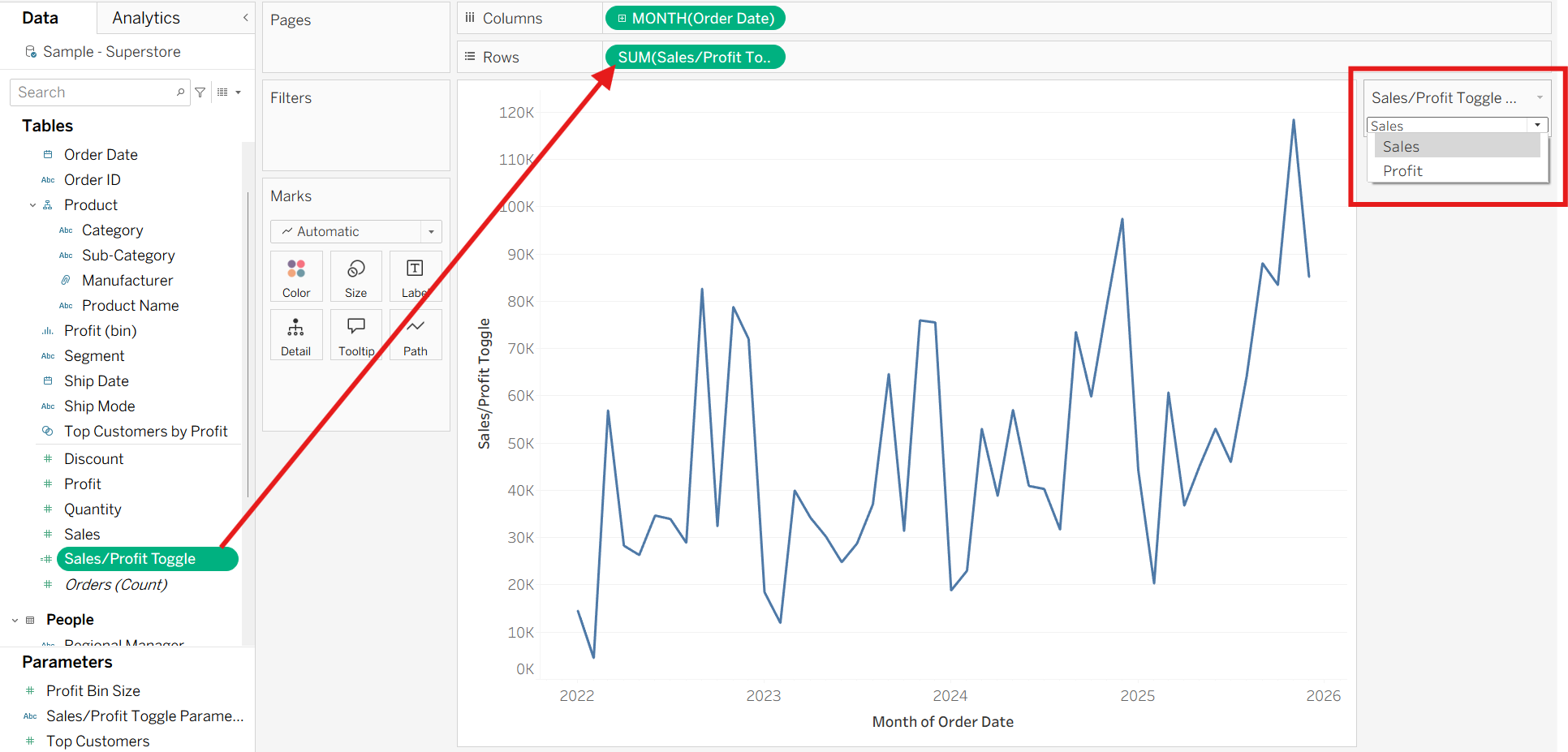
Step 4: Make a chart using the new calculated field
Now if you toggle the parameter, it will update the chart accordingly!
Additional Tip:
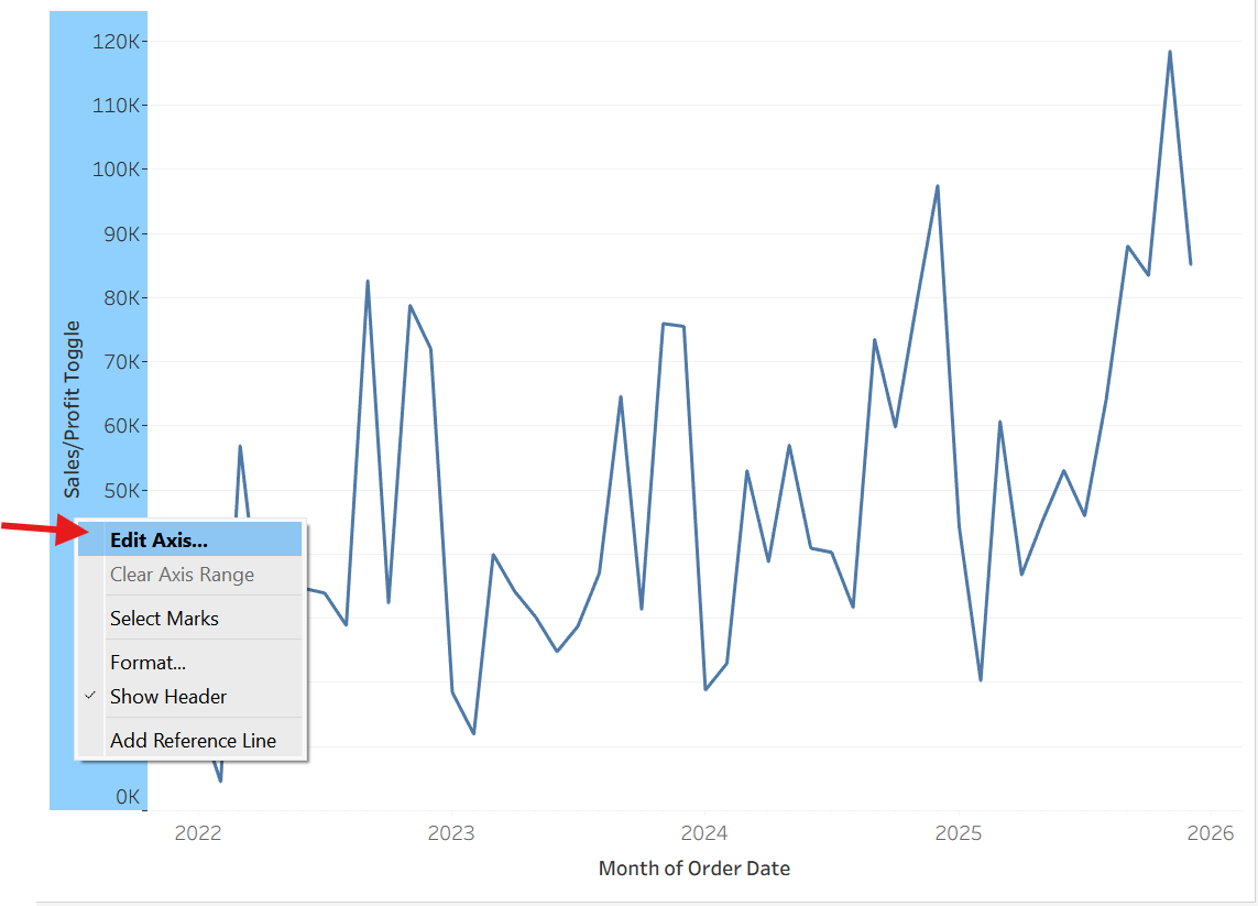
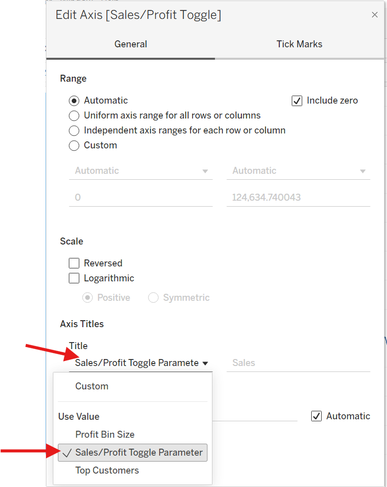
Click on the axis and click on edit axis, and you can dynamically update the name of your axis to match what is being shown.
Hopefully this was an intuitive way to be able to dynamically change the measure that is shown on the axis of the chart!