


Two weeks ago I created one of the main financial statements, Profit & Loss Statement in Tableau. Thought that this topic might be of high demand, today I’m writing this blog to tell you the process to do it.
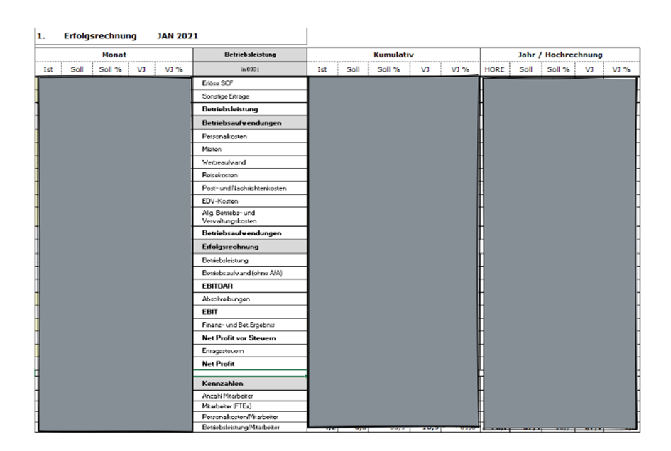
The original file looks like this:
The values for each account are categorized into 3 big sections:
· Month (Monat)
· Accumulation (Kumulativ)
· Year(Jahr/Hochrechnung)
Under these 3 sections there are 5 subcategories:
· is current value (Ist)
· Soll (planned)
· Soll %
· Prior Year( VJ)
· Prior Year % (VJ%)
Each of the excel file delivers data for each month.
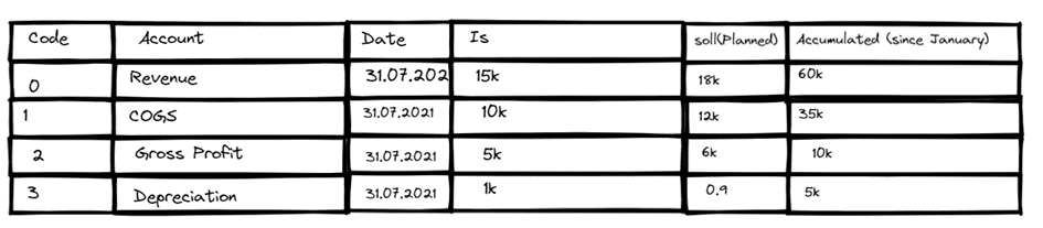
Depending on the visualization requirements and the raw file structure, there are a couple of output structures after cleaning that might be useful:

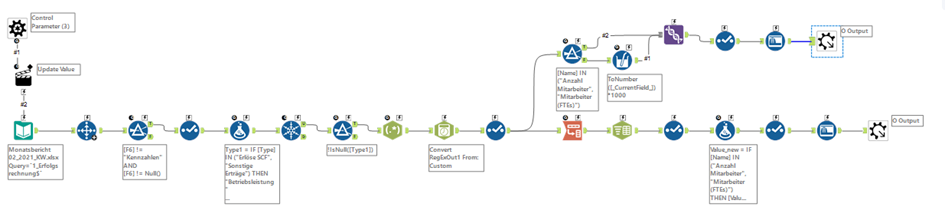
In addition, it also up to you to decide whether you want to do the calculation (prior year, accumulated year-to-date, month-to-date, moving average…) in Tableau or use directly the already made figures from the original file. If you decide to do the aggregated calculations in Tableau, you just need to keep the single value for each account and exclude every aggregated level such as Gross Profit, or EBIT. Nevertheless, it is difficult to recreate the accounts in predetermined order as you can see in the standard P&L statement. In order to tackle this problem, aggregated accounts have to be kept in the dataset.
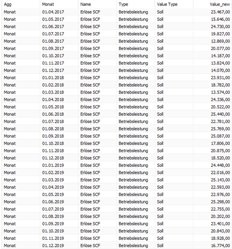
Next, you can see below the workflow to produce 2 output files, which I call “LongData” and “WideData”.

I went ahead to Tableau with the LongData format. The goal of visualization this time is to give the viewer an answer to the following questions:
1. If actual KPI metrics falls behind or exceed the planned/budget
2. What would be the trend of these KPI metrics over time?
3. What would be the result this year compared to the same period last year?
In stead of presenting the metrics in number (Table format), it’d be more dynamic and profound to visualize them in chart or diagram without loosing the initial information. Each chart would then present a single account with the three different metrics such as cumulative metric (YTD), prior month, and same period last year. The focus would be the current month figure which changes as time goes by.
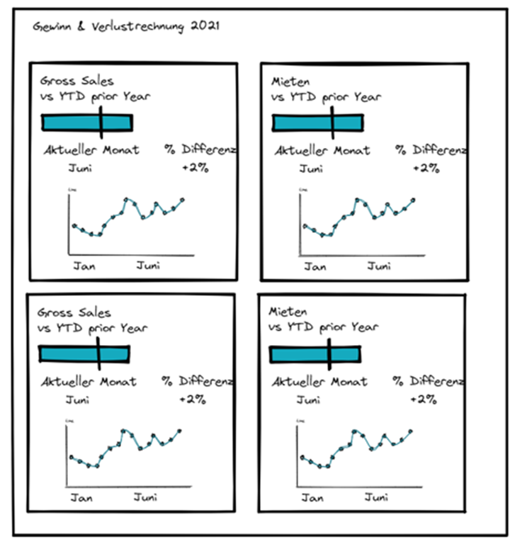
Here is the sketch of my ideas:
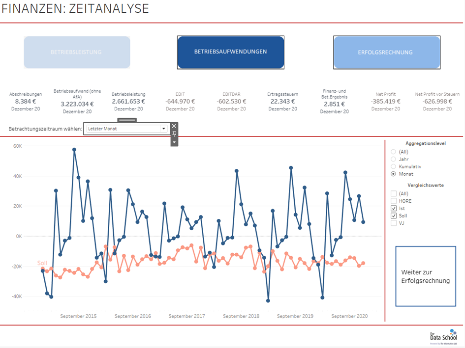
Here you can see the final work:
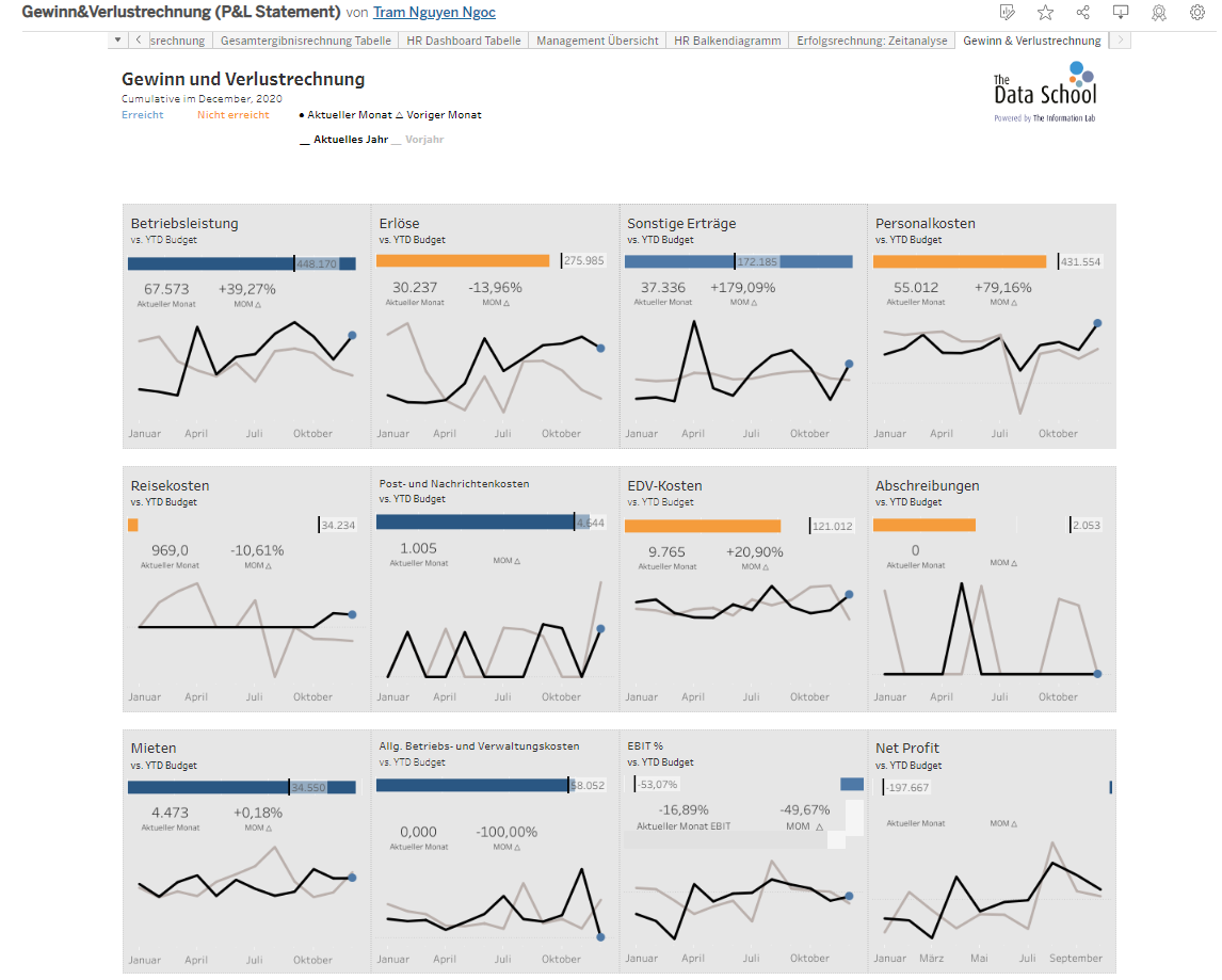
Because this is just a mock dataset, the trend does not look normal as usual and the profit figures are even negative (the budget is on the left to the current figures in the last cards).
My team colleagues also created super intuitive dashboards which give overview at the management level over time.
The HR report captures the attention by directly providing the KPI BAN card in a clear manner, so that the users could gain quick insights into the business situation of the company.

If someone is familiar with the table structure, this dashboard offers a new hybrid look of the traditional account order with bar chart incorporating colors to distinguish between different KPIs.
Here is Klaus Schulte’s blog, which captures a few other useful techniques of visualizing finance data for reference.
I hope that this blog might be helpful.