When working on the initial application, you are undoubtedly going to want to stand out among the crowd. The application can be competitive so this is entirely understandable, but do yourself a favor and avoid the fancy charts! There are many ways to stand out but for the reasons below, getting into extremely advanced visualizations will only hurt you. When it comes to the application, it is all about KISS!

Why Do We Want To Avoid Advanced Visualizations?
- It is already challenging
The Data School application is already a decent challenge and will require some personal investment. Apart from the two dashboards you need to create, there is a phone screening and in-person interview as well. To make things more difficult, most of us have usually never even used Tableau when deciding to apply. That said, it is incredibly important to focus on the fundamentals, especially when creating your initial dashboard. The more you try to emulate those amazing visuals you see on Tableau Public or Twitter, the more stressed and exasperated you will feel as you create your dashboard. Advanced visualizations require the use of advanced tools within Tableau. Why would you be expected to learn all that when The Data School will be teaching you everything you need to know once you are accepted?
2. Is it really conveying what you think?
As noted earlier, if you are applying for The Data School then you are likely new to the field of data visualizations. This is not a problem as most of us have started with little knowledge of this industry, but this is all the more reason to keep it simple. Initially, most of us, including myself, will not have had a clear understanding of how people may interpret the variations of shape, color, and size within a visualization. The more advanced the visual, the greater the chance your message may be unclear. One of our coaches' favorite things to say is, "This super fancy chart looks great, but why can't it just be a bar chart?" Always focus on creating a clear and concise message. Remember that your goal when it comes to the dashboard is to...
3. Impress with the story, not the complexity
The dashboard exists to tell a clear story that the audience can easily understand. By focusing on exactly what you want to tell and relying on simple visualizations to do that, you are keeping in line with the main objective of the application. The questions you are trying to answer guide the charts you are choosing, not the other way.
The application is more than just a visualization
You can make an amazing dashboard, but if you can't explain it to an audience or have no idea what a visual means then you are just hurting yourself in this application process. Take a balanced approach when dedicating your time to the application. Of course, you should focus on making a nice dashboard that answers engaging questions, but equally as important is developing your soft skills and analytical skills in preparation for the interview. Practice explaining your visualizations to people, develop your presentation skills and learn to admit when you don't know the answer to something. People have created great dashboards for the application but struggled to advance when they couldn't present them effectively or answer basic questions from an audience.
Remember that this is a challenging but worthwhile process. Don't spend hours torturing yourself trying to make the coolest visualization you saw on Tableau Public. It will only make you pull your hair out and make it more difficult to present. The dashboard is only part of your application process, so just KISS! Good luck with your application and always make sure to reach out if you need help.
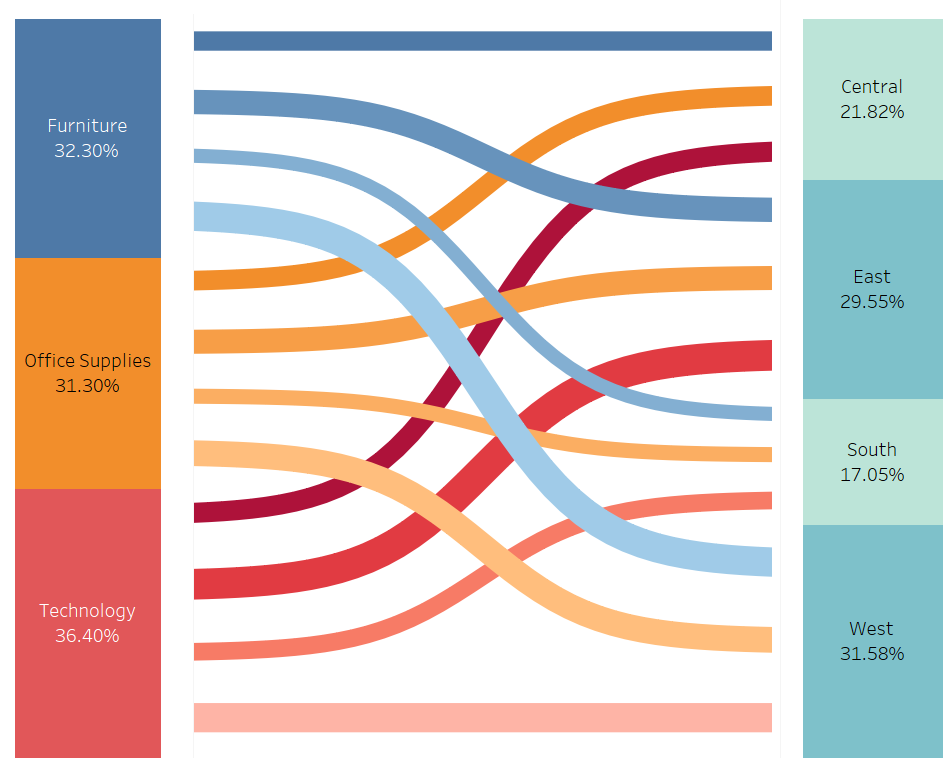
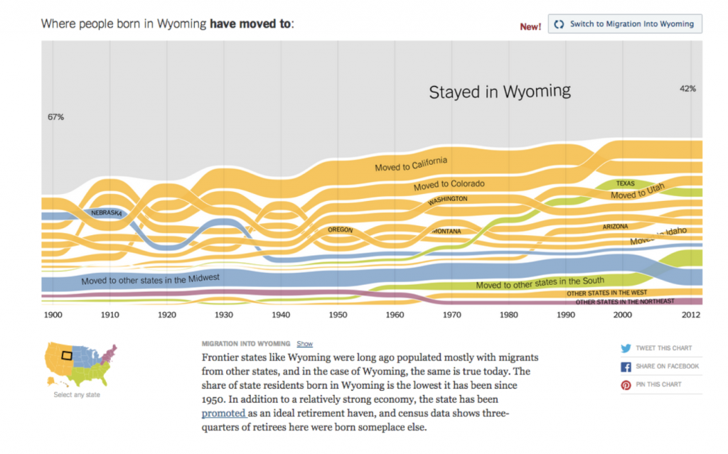
Sources for the advanced visualizations seen above: