Hello and welcome to Day 4 of Dashboard Week! Today we were working with Breaking Bad data that was pulled from a very neat API. Don't judge me but I have never watched the show so I had no clue what was going on but I still very much enjoyed working with the data.
Compared to yesterday the end goal was a lot simpler. All we had to do was pull the data using the API and create a dashboard. Step one was to get everything I would need from the API, so I began by reading the documentation and familiarizing myself with the different data available.

There were four key data categories you could pull using the API: Characters, Episodes, Quotes, and Deaths. I had little idea of what exactly I wanted to visualize so I started by pulling everything and seeing what I could bring together.
As you can see below the steps for pulling the data from the API were relatively similar for each data category.
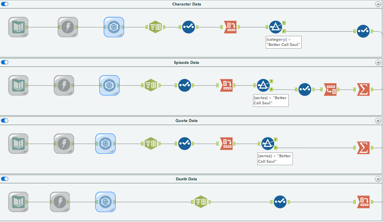
There are a few things to note about this part of the workflow. The data could have all been pulled using the same text input with multiple APIs listed and downloaded together. This would have been more efficient but initially, I didn't know exactly what I would be doing so I did it separately so that I could easily look at the data one by one and determine how I wanted to use it. You may notice that the episode data was subjected to a crosstab like all the other data sources but I later transposed it before using a summarize tool. This was done because I decided to pull the number of episodes each person appeared in and it was more efficient to summarize that data once it had been transposed.
The next step taken was to bring all of the data together and output them as text files for Tableau.
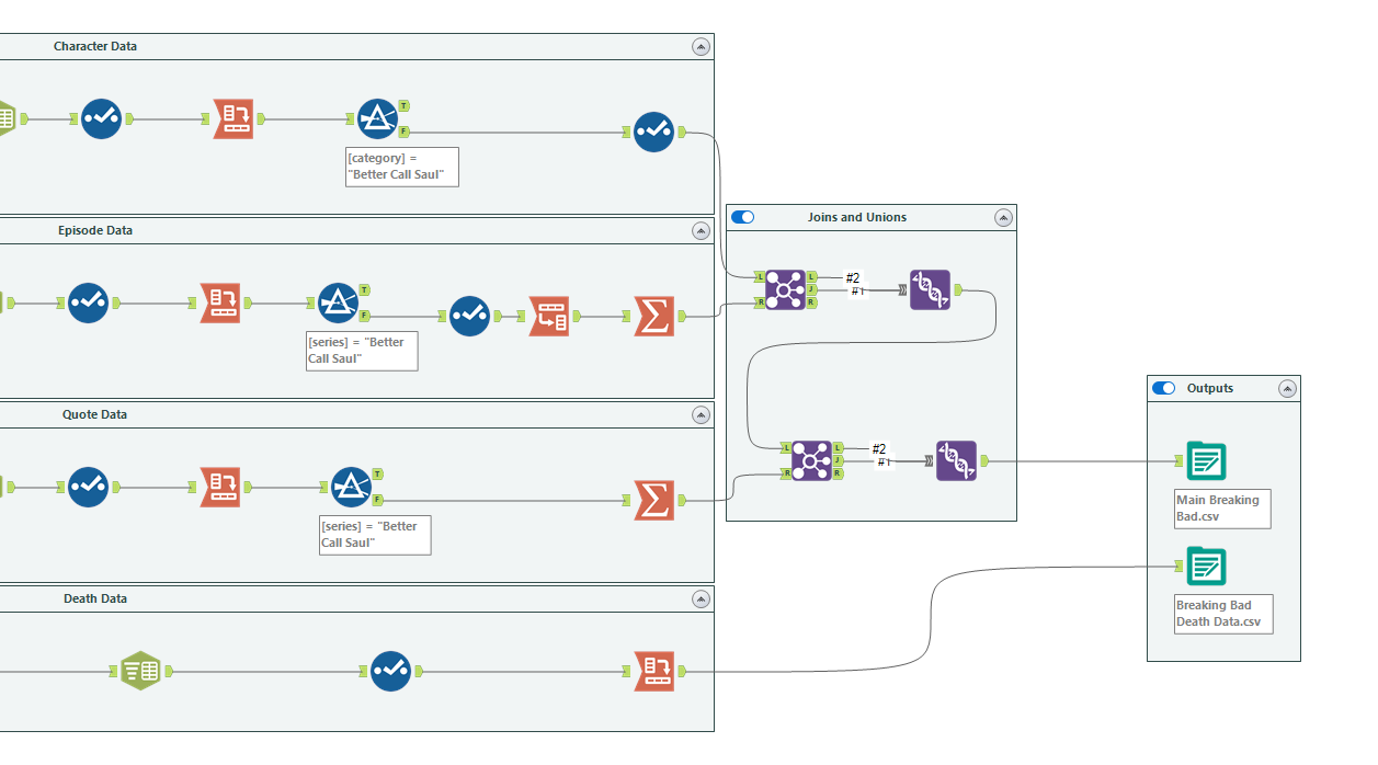
The character and episode data were joined together and that center join was unioned with the left join so I could keep an accurate list of characters even if they weren't named in the episode data. That output was subsequently joined with the quote data which once again was unioned with the left join to maintain that character list. Initially, I thought about bringing in the death data to the row level of the character data but I decided I wanted a full list of death data so I gave it a separate output. With my two outputs ready it was time to head over to Tableau!
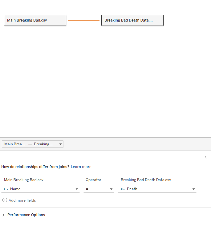
In the data source menu of Tableau Desktop, I related the two data sources to the characters' names in case I needed a connection when I started visualizing.
We had now arrived at the exciting part: visualizing. I decided that I wanted to focus on a few key questions: What were the occupations of all the characters? What characters appeared in the majority of episodes? How and when have characters died in the show?
I also wanted to take some time to explore my creative side through colors, images, and fonts. A few members of my cohort are great with graphic design, creating cool images in photoshop and using Figma to beautify their dashboards, but this is an area I have little skill in. With this in mind, I thought it would be a good challenge to explore that side of creating dashboarding and try some new things. Here was my final result for Day 4 of Dashboard Week:
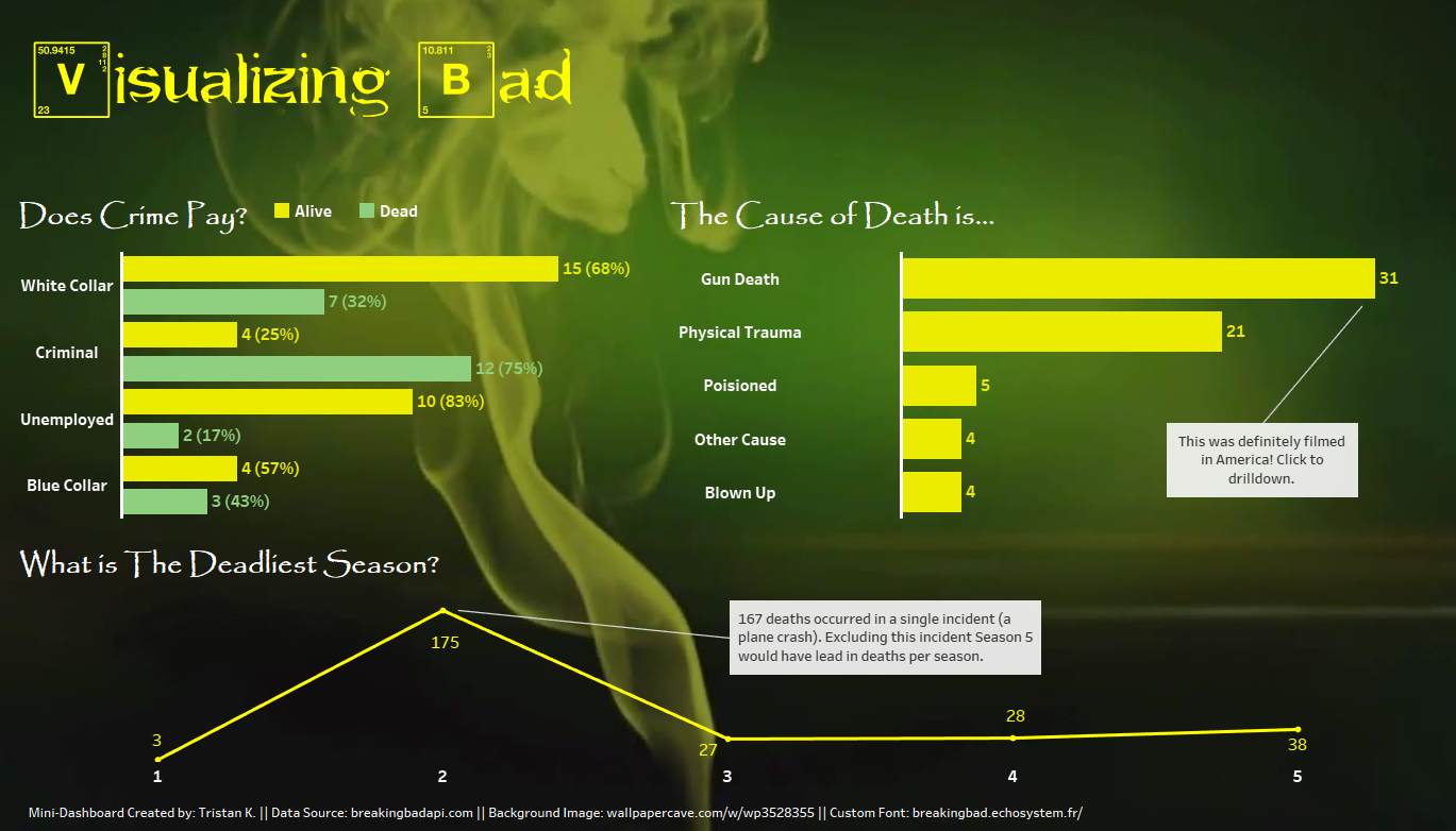
I found a super cool font that emulates the one from Breaking Bad so I was able to create my own custom title. I also used a background image that has Breaking Bad energy, a first in my dashboarding career. I ended up creating three visuals that have some interactivity and drill-down ability.
Overall I was happy with the final product and I want to continue to explore how I can bring my creative skills to my dashboards. As usual, reach out if you have any questions and have a great day!
One day left!