


When preparing a table for visualization in Tableau, its structural layout may make it difficult to effectively visualize the data. This week at the Data School New York we discussed this common problem and the easy solution that can be found in Tableau Prep. Take a look at this popular spreadsheet detailing rates of fertility, population and life expectancy by country.
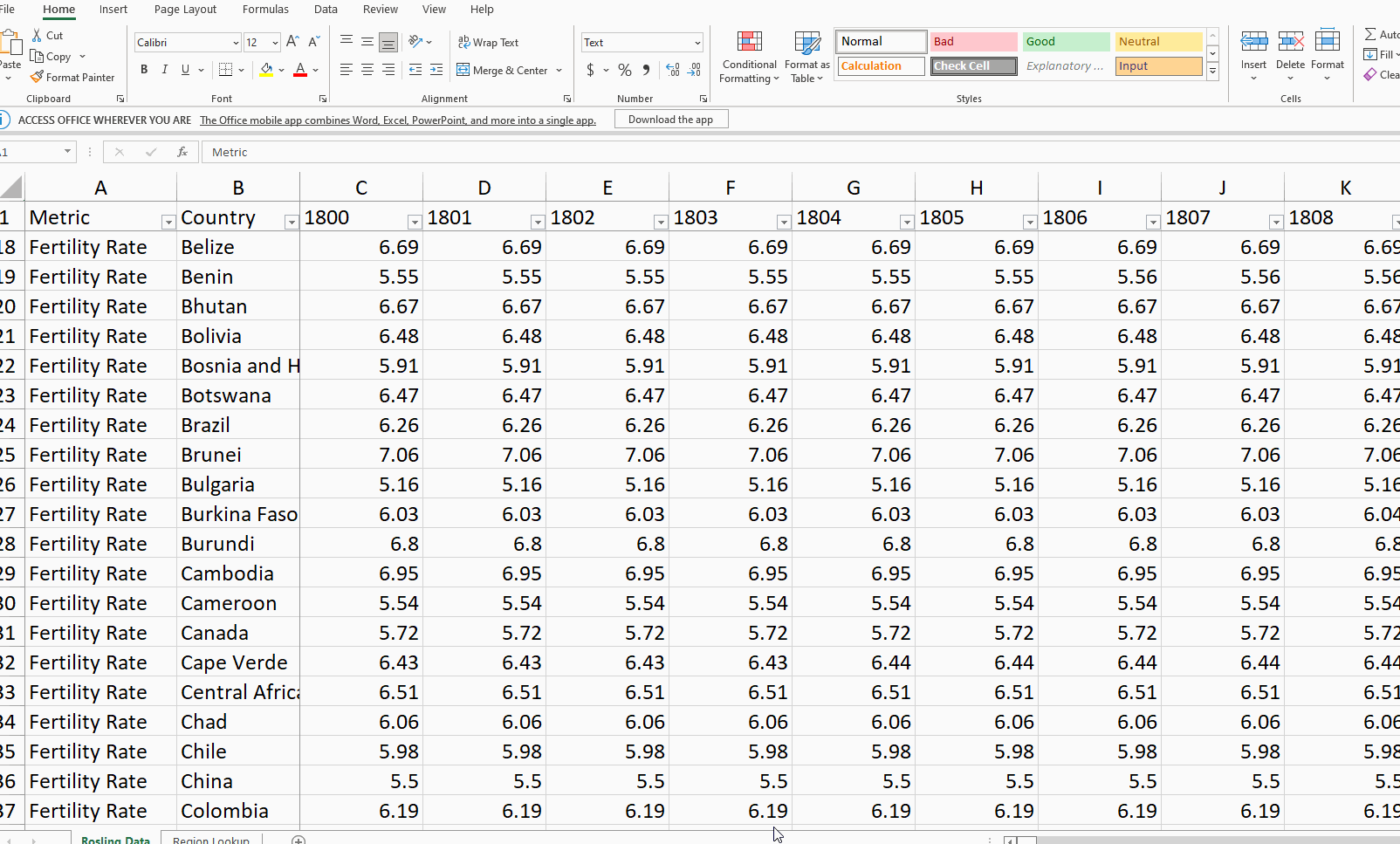
As you can see the spreadsheet is made up of huge amount of columns! Apart from the country name and metric being tracked, there is a column for every single year (from 1800 - 2100). While this is an easy spreadsheet for a human to read and analyze at the individual row level (Such as comparing Albania year over year), the overall structure of the sheet makes it very difficult to visualize the data as a whole (Such as comparing Albania vs the U.S. year over year). Instead of a 'Year' column listing the data for all years by country, we have an infinite amount of columns that will make comparison between years very difficult!
If we want to get into Tableau Desktop and easily create something beautiful and informative such as Rosling's famous dynamic visualization that this data was used to make, then we need to pivot the data to make it long and wide (aka easily readable by Tableau). Fortunately, Tableau Prep has all the answers we need!
Open up Prep and load up your data. We will be using the pivot tool. If the headers on your table are looking basic, it may help to tick the 'Cleaned With Data Interpreter' box on the left hand side when you are clicked on the data source.
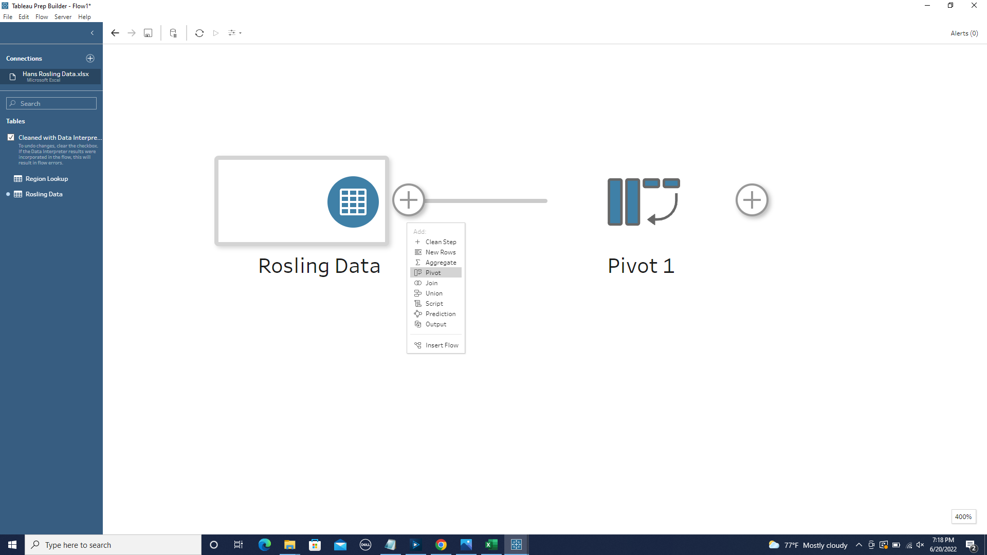
The initial goal is to turn all of those year columns into just one column for 'Years'. After clicking on the Pivot tool, familiarize yourself with the interface. On the left side we have a Pivoted Fields section and on the right a Pivoted Results. As a default, the Pivoted Fields Section starts set as 'Columns to Rows' and is also empty.
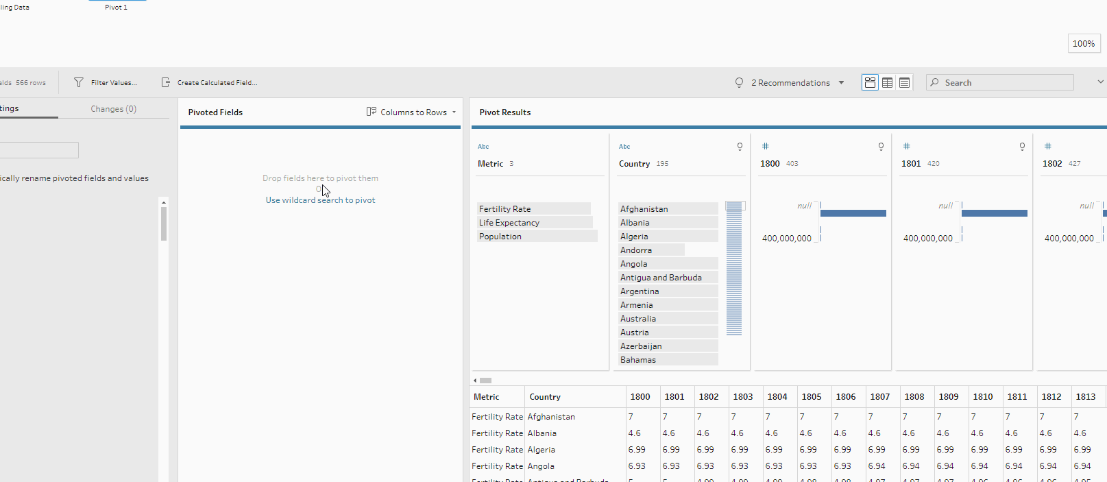
This works for us because we will be taking all the many year columns and turning them into many rows.
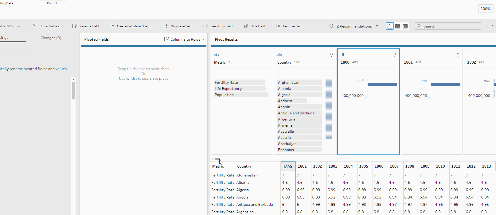
Holding down shift click on the first year. Drag the scroll bar all the way over and click on the last year. This is a quick way to highlight all of the columns that we will be pivoting. Grab one of the year columns and drag it into the Pivoted Fields section. Double click on Pivot 1 Names and change the column name to 'Years'.
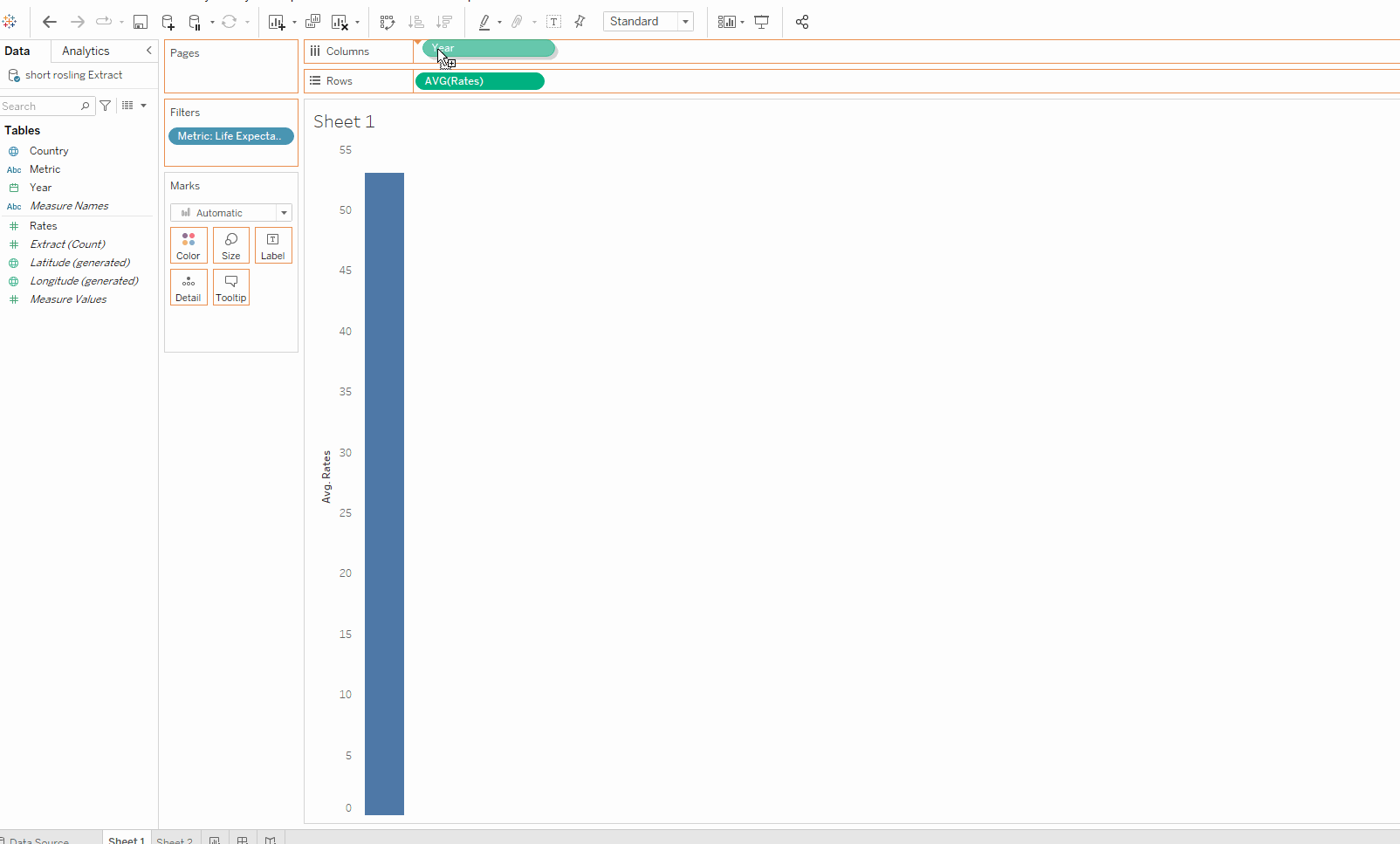
Congrats! You have successfully pivoted hundreds of column into one, manageable one that can easily be used to visualize years in Tableau Desktop. Check out the data below and try it for yourself!
Data Source: https://data.world/missdataviz/wow2021-w11