


For Day 3 of Dashboard Week, we were tasked with analysing 18 months of Social Media Campaign Performance data for a fictional marketing agency in PowerBI.
The brief was clear: The Head of Marketing needs a high-level, executive-ready dashboard to understand yearly performance. They didn’t want row-level detail; they wanted to know if their budget was working and where to invest next year. The core challenge was transforming granular post-level data into a strategic narrative that answered:
- Did we make money? (ROI)
- Which platforms drive efficiency?
- Who should we target next year?
With this in mind, I created this user story to guide my project:
AS A Head of Marketing I NEED TO access an executive-level dashboard that synthesises yearly social media campaign performance. I CAN DISCOVER which marketing initiatives are profitable, which platforms drive the highest efficiency, and where budget is being wasted or optimised BY ANALYSING key financial metrics (ROAS, CTR) and performance trends across different platforms, campaigns, and target audiences.
My Approach
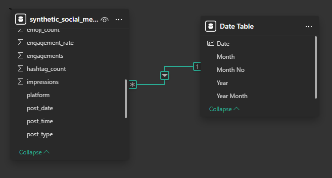
Data Prep & Modeling (Power BI) The dataset was clean, containing metrics like Spend, Revenue, Impressions, and Clicks across various platforms (TikTok, LinkedIn, etc.) and specific campaigns. My first step was establishing the correct Data Model. Since the "Campaign Name" field contained years (e.g., "Summer 2025") that didn't always align with the actual Post Date, I created a dedicated Date Table. This allowed me to perform accurate Time Intelligence calculations without getting confused by the campaign labels.
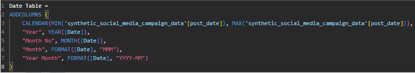
I also avoided using the pre-calculated rate columns (like CTR or Engagement Rate) provided in the source data. Averages of averages can be problematic in Power BI, so I wrote explicit DAX measures (e.g., DIVIDE(SUM(Revenue), SUM(Spend))) to ensure accuracy at every drill-down level.
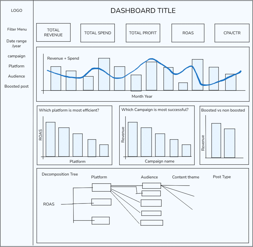
Building the Dashboard I designed the dashboard with a "Top-Down" hierarchy, ensuring the Head of Marketing could get the headline numbers in 5 seconds, and the deeper answers in 5 minutes.
Here is the sketch I designed in the morning, after having familiarised myself with the brief and dataset:
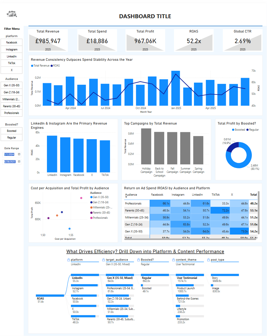
The Final Dashboard
Here is the finished product. I opted for a clean, single-page layout that moves from high-level financial KPIs at the top to tactical segmentation at the bottom. I've also added a Heat Matrix crossing Target Audience with Platform, coloured by ROAS. This helps to highlight which combinations of audience and platform are driving efficiency the most, and which may be draining expenses with low returns on ad spend.
Reflections / Things I Learned
Truncated axis: During the presentation, I received feedback regarding my axes. Due to time constraints, I overlooked the axis settings on my charts, leaving Power BI to automatically scale the Y-axis (meaning it didn't start at 0). While this highlighted the trends, it was flagged as misleading for stakeholders because it inadvertently exaggerated minor differences. Lesson learned: Always double-check axis formatting before publishing; financial charts should strictly start at 0 to honestly represent magnitude, regardless of how tight the deadline is.
Revenue vs. Spend vs. ROAS: I initially struggled with how to visualise financial performance over time. My original plan was to plot Revenue against Spend to show the margin. However, because our ROAS was so high (averaging ~51x), the Spend values were minuscule compared to Revenue, resulting in a flat line that offered no insight. I decided to plot Revenue against ROAS instead. This proved to be a more valuable comparison, as it allowed stakeholders to spot some important trends - specifically, identifying periods where Revenue was increasing but ROAS was decreasing, which signals that we are "buying growth" rather than scaling efficiently.