


Did you know that approximately 24% (that’s 10.2 million people) of the UK’s working-age population report having a disability under the Equality Act 2010? Of those, around 41% experience mobility impairments that affect how they interact with technology, and 7% of the working population face severe dexterity difficulties, meaning they’re unlikely to use a mouse and instead rely entirely on keyboard navigation.
This emphasises the importance of designing dashboards with accessibility in mind—especially for keyboard-only users. This was also the exact focus of Challenge 2 of Dashboard Week (actually in dashboard week now).
The Challenge
For my challenge today, I was tasked with making one of our existing dashboards on our internal Tableau Server fully accessible to a user navigating solely with a keyboard. How did it turn out… well unfortunately, I cannot share the initial dashboard or my final result due to privacy reasons (as this is some sensitive company data and I would like to keep my job 😅) but I have provided my designs and some mock up designs of the dashboard (minus the graphs).
Having also spent the morning learning about all the accessibility requirements and best practices/ watchouts, this meant that we only had 4 hours to create the dashboard which also put in rushing the dashboard building and designing but I believe that this went fairly well all things considered.
Step 1: Analysing the Existing Dashboard
The first step was to use the exiting dashboard with only the Keyboard and find out some of the pain points and limitations.
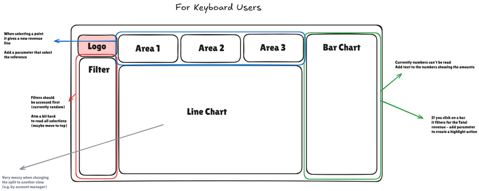
Some of the key points identified:
· Tab order was all over the place – filters didn’t follow a logical flow, jumping in unexpected directions.
· Filter positions weren’t intuitive, making it harder to get context before diving into data.
· Tooltips weren’t accessible – many visuals relied on hover interactions, which you just can’t do with a keyboard.
· Line charts were cluttered, especially when split by category—again, without tooltip access, key info was lost.
· Interactive filtering by clicking on bars wasn’t possible with a keyboard, removing a major interaction point.
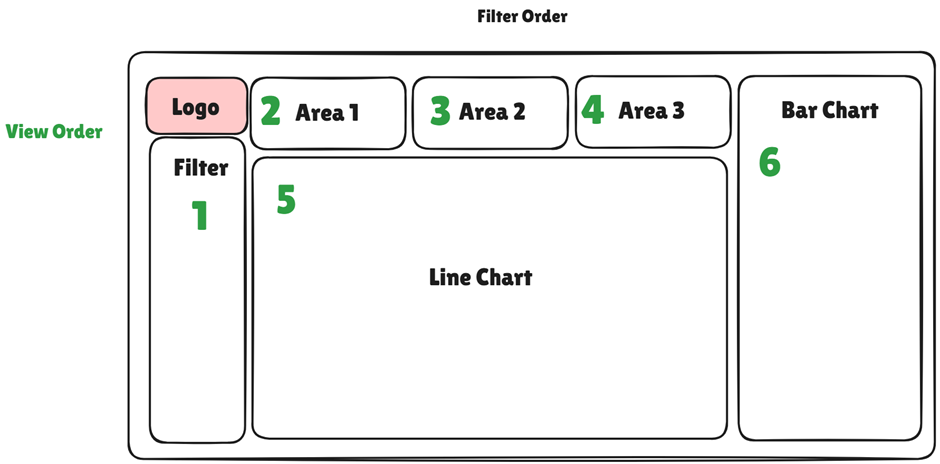
As I did this review, I also thought about how someone would read the dashboard—top to bottom, left to right—and took notes on layout adjustments I could make to improve flow.
Step 2: Designing a Keyboard Accessible Dashboard
Following on from my investigations, I came up with the following design that addressed the issues.
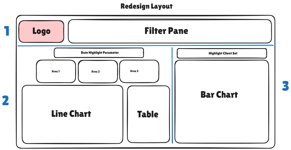
Here is what I focused on:
· Logical tab order: set custom tab sequences so users could flow through filters, visuals, and text in a way that made sense.
· Replaced hover interactions with visible data labels and textual context (navigated through sets and parameters) so info is never hidden behind mouse-only functionality.
· Laid out content in a clean, grid-based structure, following reading logic—filters on top, key numbers on the left, trends on the right.
· Added buttons dropdowns instead of chart-based filters, since buttons can be focused and selected via keyboard.
· Included a Crosstab Download so the graphs underlying data can be read through excel
Challenges & Reflection
Not everything was smooth sailing. One of the tougher bits involved using parameters with table calculations. When I tried to overlay the graph with the point shown by the parameter, the calculations would sometimes go haywire, requiring a lot of trial, error, and more trial (with a bit of internal screaming 😅) to ensure the right numbers were being returned.
There was also a limitation on the visual for a comparison table—I couldn’t build a standard table view, so I had to get creative and use a mini line chart broken down by category to replicate the comparison for that date selected
One big learning: I should’ve added clearer navigation guidance for the user. Since I built it, I knew where to go. But a new user? Not so much. Adding even a quick “how to navigate” note at the top would’ve made a difference.
Despite the time pressure and some technical hiccups, I’m happy with how the dashboard turned out. It’s not perfect, but it's way more usable for keyboard-only users now, and I definitely learned a ton about accessibility in Tableau.
That’s it for Challenge 2—on to the next one. Only three days to go… let’s do this 💪