


Alteryx Apps are powerful because they allow you to put control in the hands of your end users. Instead of building static workflows that require manual edits every time the inputs change, you can create flexible, interactive tools that adapt the output based on user selections. Whether it's selecting filters, uploading a file, or choosing a region on a map, apps make your workflows dynamic, scalable, and a lot more user-friendly.
And that brings us to today's challenge: Build an Alteryx App using crime data.
The goal was to build an Alteryx App that allowed users to:
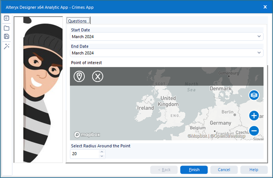
· Select a specific date range, category, and area via a map interface or postcode.
· Update the data source on Tableau Server, Tableau Public (using Google Sheets), or Power BI Workspace.
· Visualise the updated data in a Tableau or Power BI KPI dashboard.
The app’s functionality was centred around user interactivity:
· The user runs the app.
· They select their area of interest and desired timeframe.
· The visualisation updates accordingly, reflecting their selections.
So… how did I approach this challenge?
Step 1 - Plan
First things first—planning the day. With only a few hours to build the entire solution (plus present it), I wanted to be smart with my time. I spent the first hour scoping the data, mapping out potential KPIs, and sketching a rough layout for the final dashboard. Having this upfront structure made it easier to avoid going down rabbit holes later.
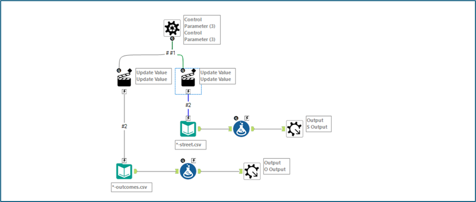
Step 2 – Building a Macro to combine the data
Here’s where things got very interesting (and caused some headaches)
The crime dataset came as 1,114 CSV files - one for each police force, per month. These were stored in monthly folders, each containing both street and outcome data. Not only were the files split inconsistently, but they also had different structures, so blindly unioning them wasn’t going to work.
Solution - I built a Batch Macro that:
· Looped through each folder
· Wildcarded unioned based on whether the file was "street" or "outcome"
· Retuned two outputs – All the “street” data and all the “outcome” data
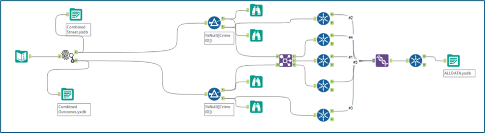
Step 3 – Combine the data together to 1 consolidated data file
With the macro output in place, it was time to join the street and outcome data into one unified dataset.
I run into a few issues here however, mainly surrounding duplicate rows after joining which caused the number of rows to explode. The fix? I used the Unique tool to clean up post-join. In hindsight, I could’ve done this earlier in the process, but as I caught this after the join, I thought it best to just add here instead. As a bonus, this step also allowed me to export a .yxdb file, meaning the app wouldn't have to re-run the macro every time (saving some precious time).
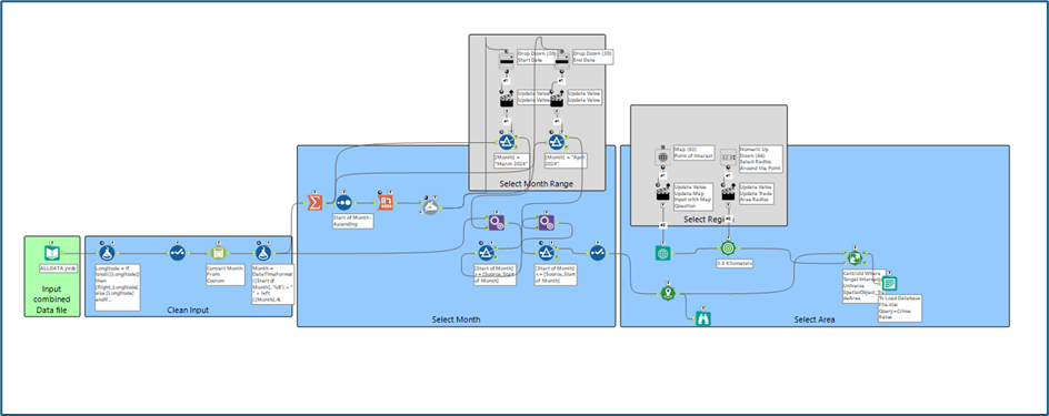
Step 4 – Creating the app
Now we have the data all into one file, it was time to build the app. The main feature of this app was to allow the user to select a start and end date for the data, as well as selecting the region and the surrounding vicinity they would like to investigate the crime statistics for. Again in hindsight I could have tidied this up a lot better as well as done some of these stages a bit more efficiently, however, it did work in the end.
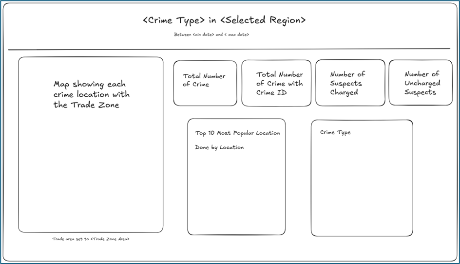
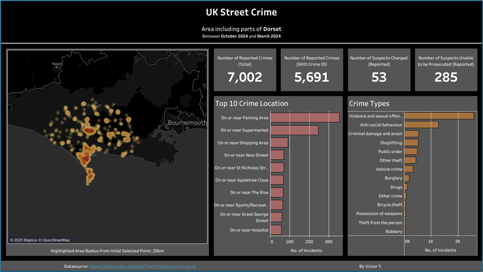
Step 5 – Creating a Tableau Dashboard
Now with the dataset created based on the selections created from the app, it was time to use this data to build the KPI Dashboard. As a reminder, as this dashboard should reflect any selection a user selects in the app, it means that this dashboard should be dynamic and not hard coded to give users insight into the specific slice of crime data they care about.
The link to the dashboard can be found here
Reflections
Overall I would say that I am pretty happy with how this challenge turned out. I’ll be honest, when I heard we were building an app (and saw the mountain of files involved), I felt a little overwhelmed. But once I broke it down step by step, it all came together.
Despite this, there was defiantly a lot of stuff I could improve on
· Time management – I started with a plan… then mostly abandoned it 😅.
· More thorough data investigations – I fixed the issues I found, but didn’t fully explore why they happened. For a more robust workflow, I’d dig deeper.
· Chaining Apps – This could’ve elevated the user experience and modularised the process, but fell out of scope given our tight 6-hour window.
Only 2 more to go. Let’s see what tomorrow throws at us 👀