


We’ve all probably dipped our toes into some sort of in-game economy, whether that’s auction houses, loot trading, or some chaotic barter system. But few do it as creatively (or as brutally) as Path of Exile … or so I have been told.
The challenge today was to build a dashboard that allows a user to ‘dive into a slice of the Path of Exile economy’. As this is a game I have never played (and hadn’t heard of before – sorry Robbin), a lot of research was needed to give myself enough context of first, what the economy is like, as well as what would be key areas of interest for players of the game to use this dashboard.
So... what was this all like?
Step 1 – Plan
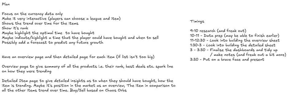
As always the first step is to plan the work. This time round, I also recorded the plan for the whole day and had it written out so that I’d more likely adhere to it (this again, didn’t really work though 😅).
Step 2 – Research the data
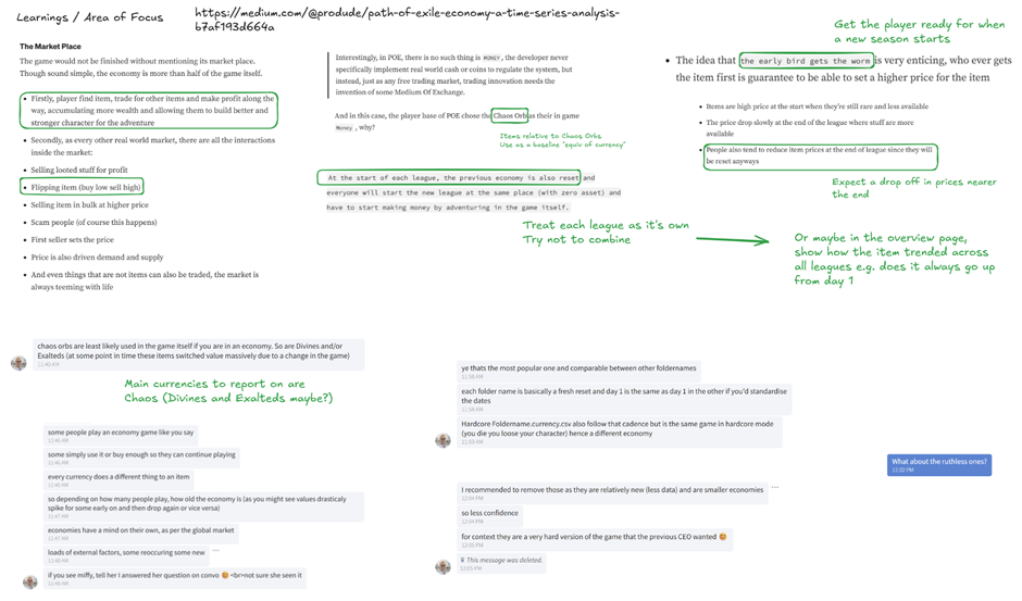
This step went in line with Step 1 however, after the initial plan, I spent some more time to research the about the game and its economy as this was something I was very unfamiliar with. I found this useful blog which helped guide me on some key user stories for the dashboard as well as areas of focus. I also used our Coach Robbin's expertise in the game as this was something he was very familiar with.
Step 3 – Building out the dataset
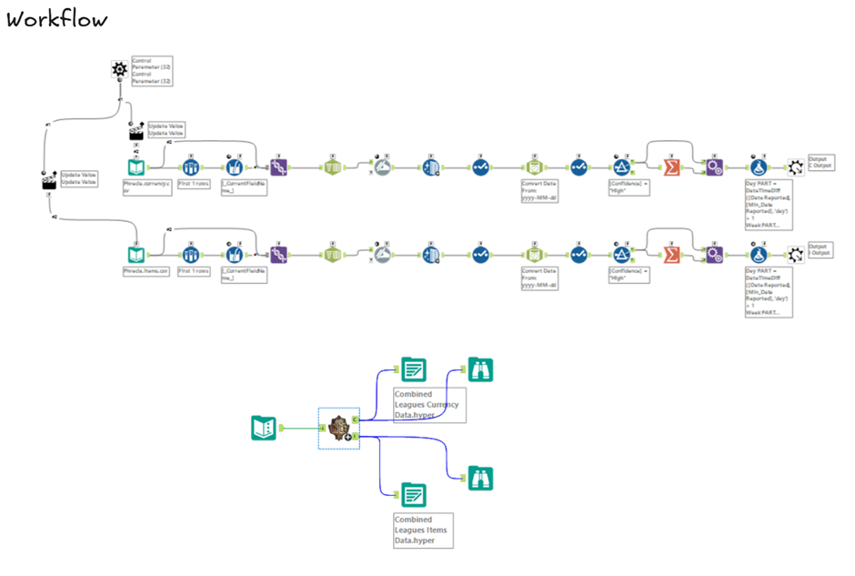
Using the data provided by poe.ninja, again, there was a need to download data and do some wrangling to combine the dataset together. I opted again to use a Batch Macro to load in the correct files. Within the macro, I also did some data cleaning and parsing to get the data in a suitable condition for load.
Step 4 – Designing the Dashboard
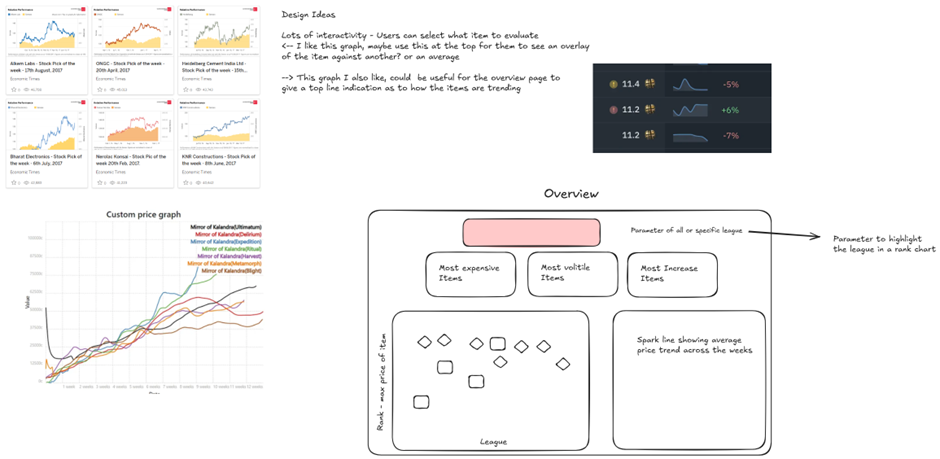
With the data all parsed out, it gave me a chance to plan out further the design of the dashboard. I did some browsing online and on Tableau Public for some graph ideas that could relate to the analysis (e.g. existing analysis on Path of Exile, stocks/economies, etc.).
Step 5 – Building the Dashboard
This step was by far the most difficult - and honestly, the most enjoyable too. I spent a lot of time wrestling with Table Calculations to build out a KPI, and let’s just say they weren’t that friendly.
The issue was that I was trying to isolate a single value from a visual made entirely with table calcs. The problem is, table calcs are dependent on what's in the view, so every time I tried to filter down to a clean, final KPI number, the calculations would break or return unexpected results. It felt like every fix unravelled something else, and it became a bit of a loop of trial, error, rework... repeat, before I came to the decision to move onto another section conscious to the time remaining.
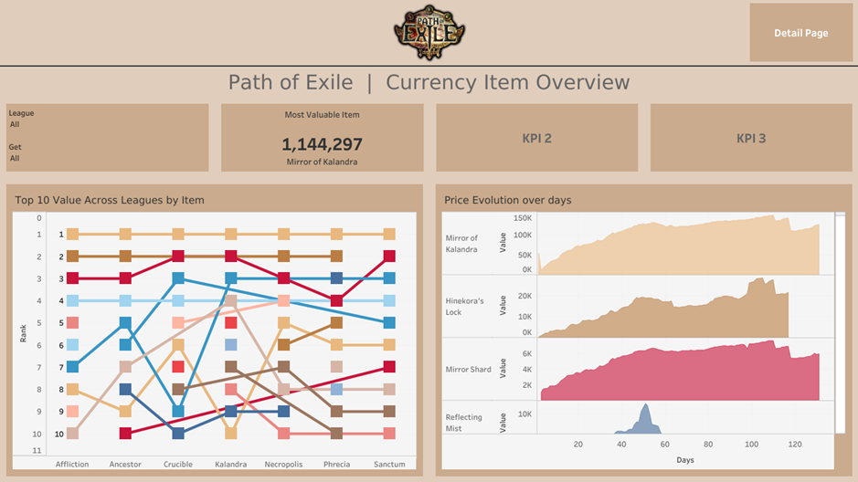
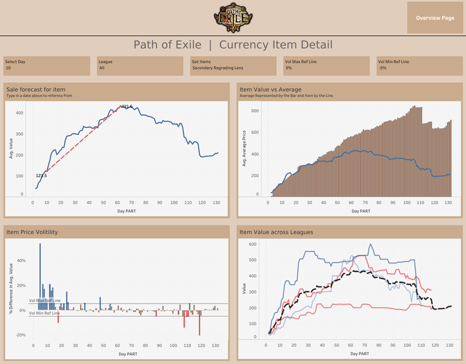
Another big challenge I ran into was being too ambition in what I could deliver within this short timeframe. I decided to build two dashboards simultaneously - one where players could get an overview of the most profitable items and another where they can deep dive into an item to be used as a predictive model as and when to sell based on historic trends. Sounds nice, right? In reality, it was a mistake.
One of the key bits of feedback I got from my coach was that I’d unintentionally split my focus between two different audiences. That broadened the scope way more than I had time for, and meant I couldn’t go as deep into either dashboard as I would’ve liked. In a time-boxed challenge like this, less really is more. Next time, I’d focus on one clear use case, build it out properly, and polish it as much as possible.
However, despite all these issues, I am pretty proud of what I was able to achieve in this short time, especially as this was on a topic I had no knowledge about before this morning. The dashboard can be found here (please note it is still a work in progress).
And that’s it for this challenge. A lot of learning points but also a pretty good outcome.
Last one tomorrow. Let’s finish it off on a strong note 💪