


APIs are like secret tunnels into live, ever-changing data. Instead of having to download static files, you get access to real-time info like stock prices and even space rocks. And speaking of space rocks… today’s challenge was all about NASA APIs. With a treasure trove of data ranging from asteroid trajectories to Mars rover photos, we were tasked with picking an API (or two), exploring the data, and building a dashboard that made it all a bit more down to Earth.
This is also the last challenge for dashboard week, and lets just say… I got a bit more creative with this one.
Step 1 – Plan
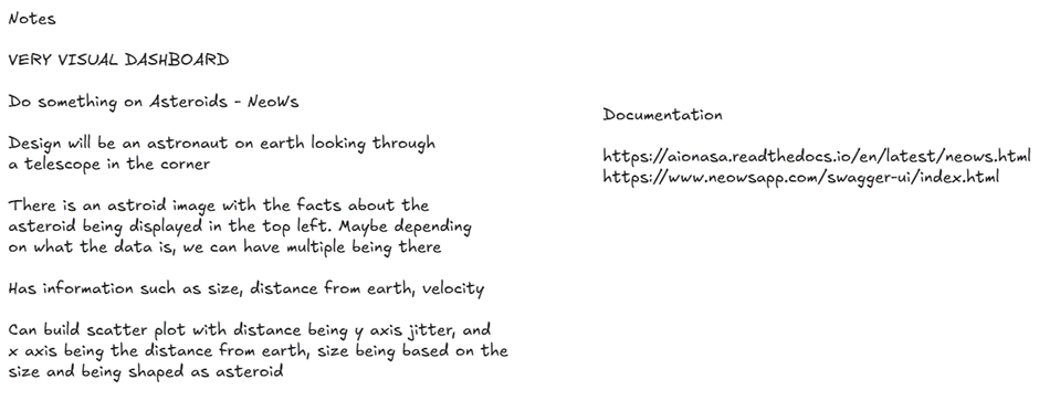
Yet again the first step for this challenge was to create a plan. I decided this time, I wanted to try and build a creative style design. This meant using less graphs but more visual cues in the charts.
Step 2 – Reviewing the API Data
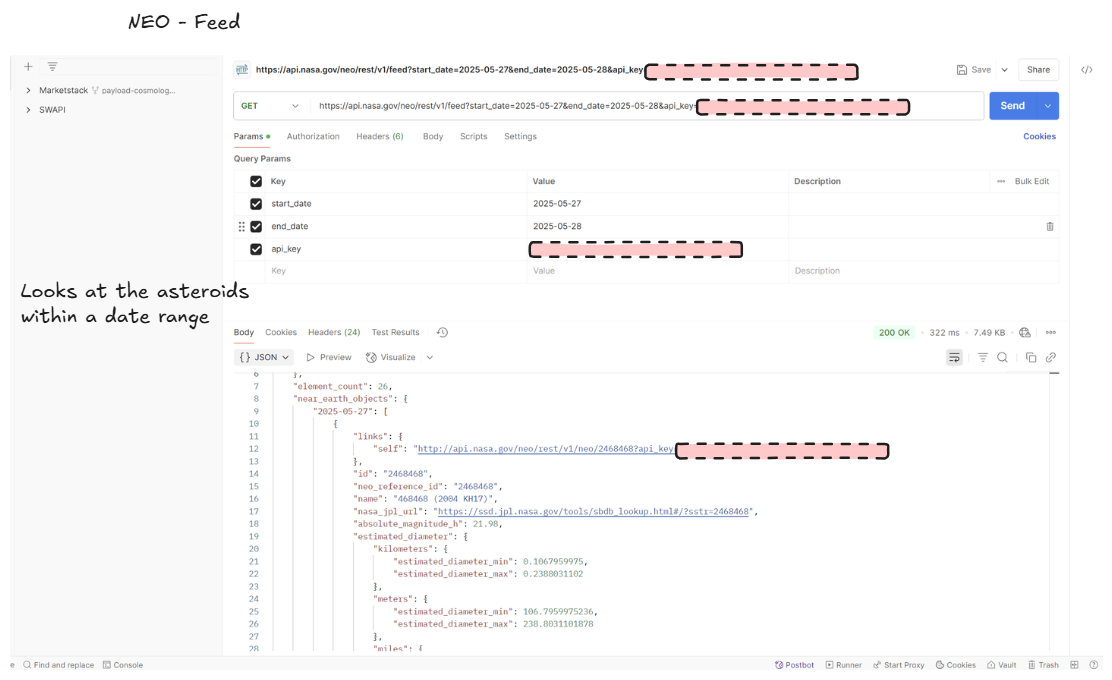
As it had been a while since I had used API’s decided to use Postmans to help run my first call, so I can get a basis of how the API should be called as well as what data would be returned.
I also used this time to identify what fields I want to use in my final dataset, as well as any cleaning I may need to do.

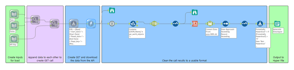
Step 3 – Creating the API call in Alteryx
After finding out how to make the call, it was time to actually do this in Alteryx. I creating separate inputs, 1 containing the dates I wanted to view, another with the url base, and the other with my login. I then did some parsing and cleaning of the data to then get the columns specified above.
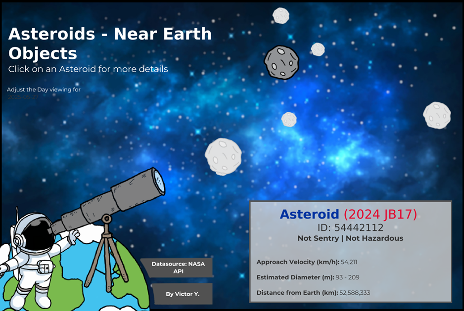
Step 4 – Designing the Dashboard
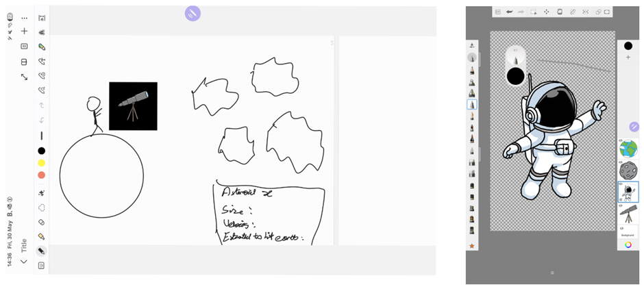
With the data now ready, I was time to finalise my sketch of the dashboard. As a note, this week I’ve injured my dominant hand so sketching was a bit more rough today (as I also decided to do this on my Tablet). With this however, I also thought it would be fun to draw some cartoon images along with my dashboard to help build the visualisation. This unfortunately took a bit more time (and the lines weren’t exactly straight) but I am happy with how it all turned out.
Step 5 – Building the dashboard
The final step with to build out the dashboard in Tableau. The main visuals were a scatter plot which represented the asteroids, as well as a pop up box (dynamic zone visibility) that opens when you select an asteroid which provides some more information about that specific asteroid. The link to the viz can be found here.
And that’s the last challenge for Dashboard week. This challenge was defiantly the most enjoyable one so ending on a high.
Thank you for reading