


DS55 are done with their training! The last two days of dashboard week have been focused on turning a Letterboxd list into an infographic dashboard. As a two day project, there pressure was on to get everything right but there was also more excitement to put all the elements we've learnt over the past 17 weeks into something that really tells a story
For this final project I looked at the Letterboxd Top 100 Most Liked Movies of All Time and my goal was to understand what makes a film loved by audiences.
Plan and Sketch
Thursday morning was mostly spent planning and creating deadlines for myself. We had begun web scraping for this project during refresher week so I wanted to have a look at what I had done so far. I also needed to create a sketch, find out what data I was missing, and then finish scraping the data by the end of the day. Then I could completely focus on building on Friday and making sure it all still related to the user story.
My user story was based on a film studio executive:
As a film studio executive, I need to identify the key characteristics that make films highly rated and widely loved, so that I can replicate successful patterns in future productions, by analysing insights across genre, runtime, and release era.
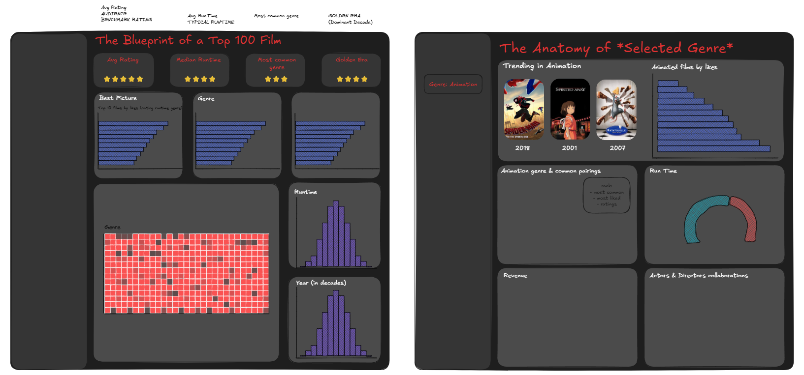
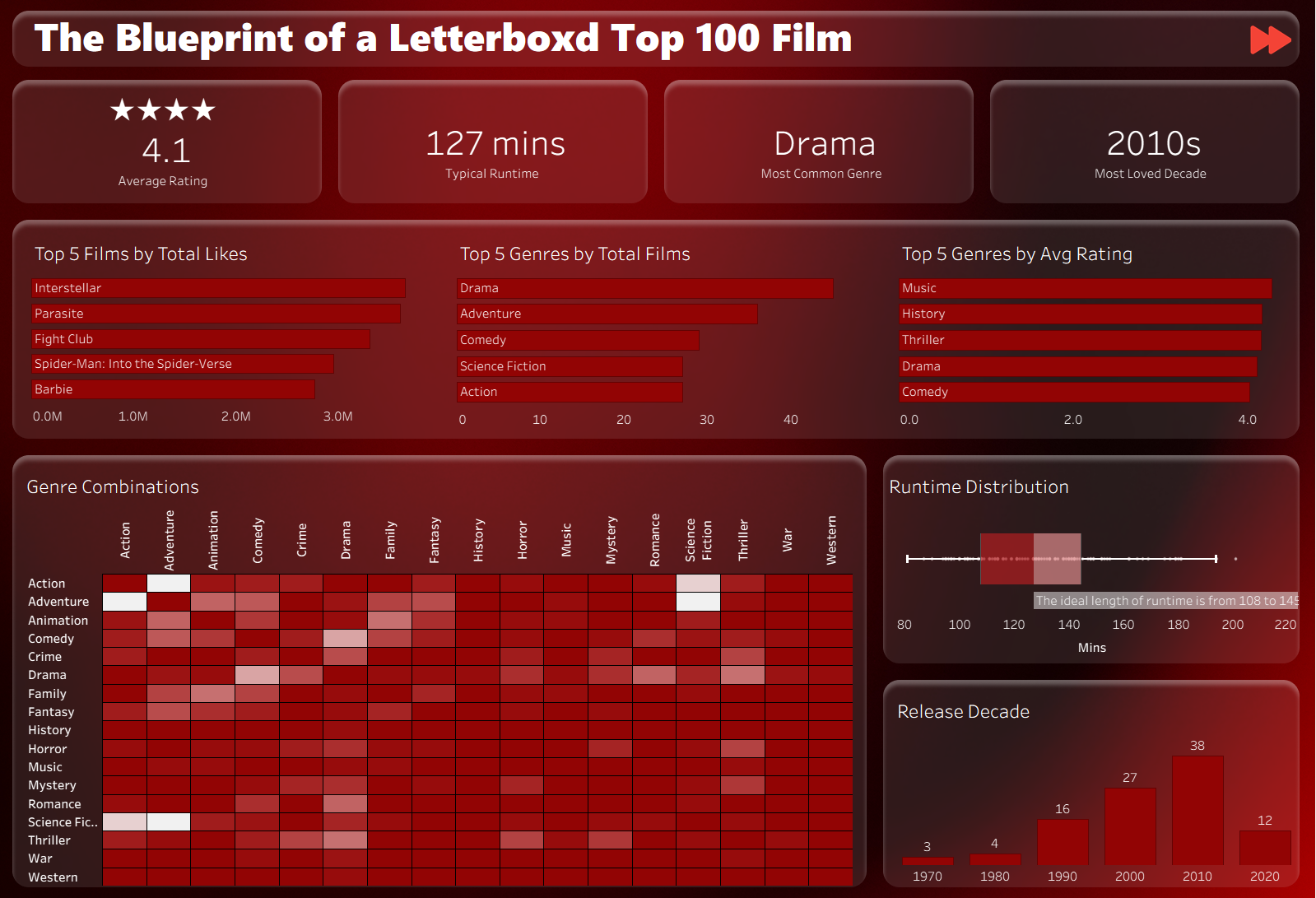
From this I ended up sketching two dashboards that were less about reporting data and more about uncovering a blueprint for a most-loved film. The first one was an overview of the films in the list and the second one had a parameter so you could get insights for a specific genre.
Data
During the web scraping session on Friday, I managed to get the list of the individual film URLs and had made a start on picking out the director and the genre. I started working on pulling out more data from the JSON such as the ratings, cast list, production company etc. but I realised that the output was starting to explode with multiple rows for one film. Before continuing I collated the film name, year, director, minutes, rating, and image URL into one main table where the granularity was just one row per film. Then I made the cast list, genre, production company, and directors into their own tables and outputted all of these as different sheets in one Excel file like this
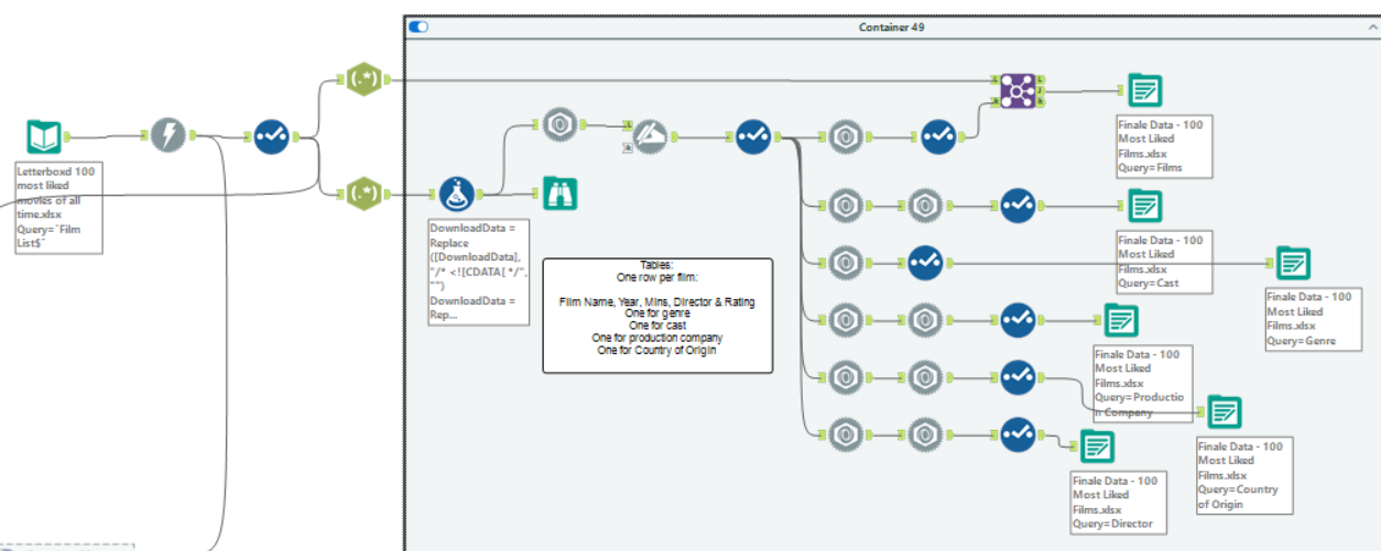
To get the revenue and budget data, I had to do a third download using TMDB links and that went into its own separate finance sheet.
Building the Dashboard
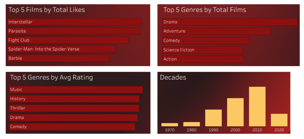
Friday morning was completely dedicated to building all the charts and the afternoon was for formatting. I started building the overview dashboard first with the many bar charts and histograms which looked like this:
I originally sketched a histogram for the runtime as well but changed my mind and wanted to do more of an area chart or density plot histogram but I couldn't get a smooth curved line so decided to deal with it later. I didn't have enough time to figure this out in the end but I'm glad I didn't get tunnel vision and managed to finish the other aspects of the dashboard.
For the genre combinations highlight table I duplicated the genre table and joined it to itself.
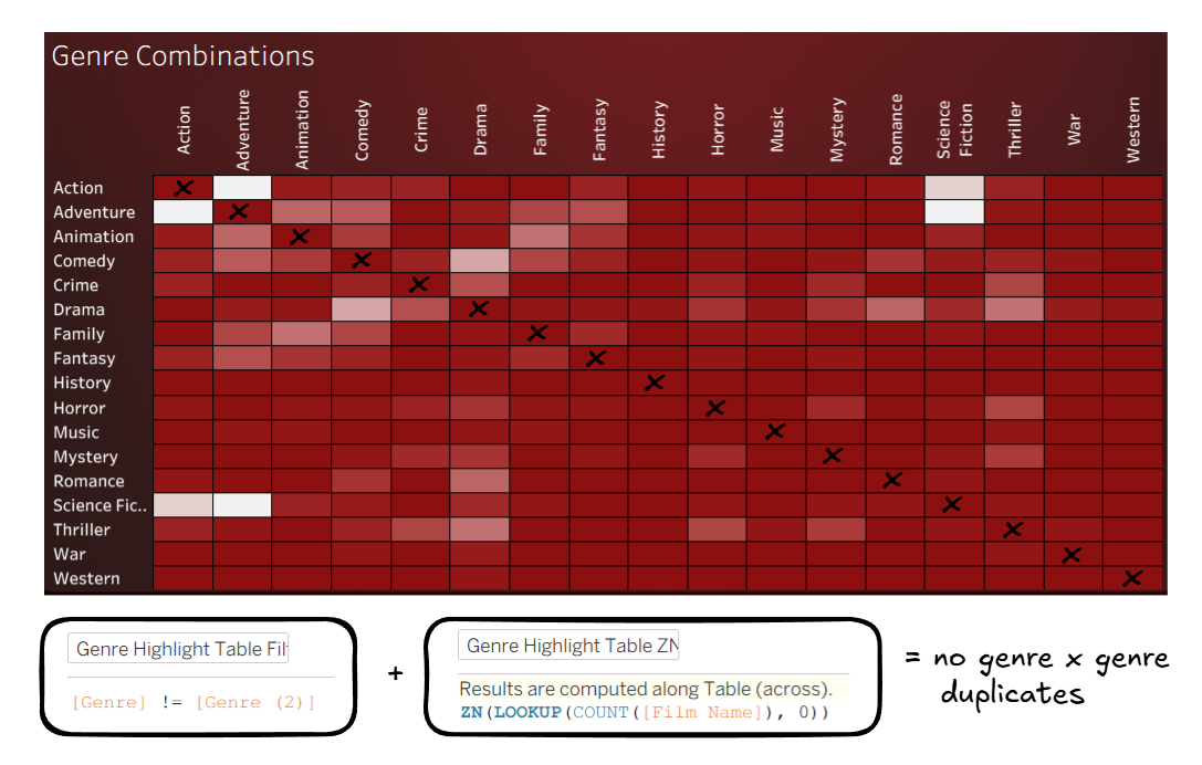
The lighter colours represent a higher number of films and I had a diagonal line where the genres were equal to each other so I made a calculation to filter out when genre = genre (2). I created a second calculation using ZN to fill in any nulls so that there wouldn't be any gaps in the table.
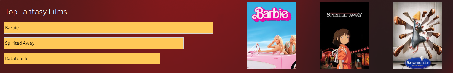
For the genre dashboard I made a genre parameter and started with the top 3 films (in the selected genre) bar chart, and also used the image URLs to show those 3 films.
Once I was done with building I put everything into containers the way I wanted to look and turned my attention to the formatting and design. I had spent my morning commute watching reels about how to make a background in Figma. With a couple hours to go before the presentation I felt confident enough with the videos and blogs I had found and started building a gradient for the background.
I used the free gradient generator to create the background colours and followed these steps to attempt the liquid glass look, giving me something like this.
Feedback and Next Steps
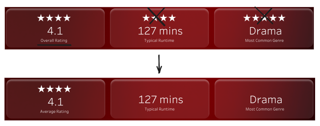
The feedback was mostly small adjustments. The first thing was that all my charts needed clear axes. Additionally, I’d added stars above all of my KPIs but they were only really necessary for the first one, and I also needed to clarify that the rating shown was the average across the list of films.
The last two things were more chart suggestions, so the runtime data (which I didn't end up formatting) could be visualised as a bar chart or box plot, and it would also be good to include something about the revenue (it was in the tooltips but it would be good to include some revenue context).
My next steps would be to implement the feedback (most of which I've done) and to also finish the genre dashboard as there were a few ideas I had that I didn't have time to finish. For example, I wanted to show common director/actor pairings so that would be nice to explore in the future.
This is what the dashboards look like currently with some changes made already.
Final Thoughts
This was the perfect project for the dashboard week finale, we got to incorporate so many things we've learnt and the stress levels were relatively low! I was also the most organised I've been so far, with the two day plan and also having folders for my calculations for each dashboard and also a dashboard for just the KPIs. Thank you Lorna for making our last week so enjoyable it feels like such a satisfying ending to our training!