


Last week we did a Makeover Monday in Tableau and then recreated it in Power BI. This blog is about how I planned and built this in Tableau but a future blog will go over the challenge of building it in Power BI.
PLAN
The first thing you need to do is look at your data.
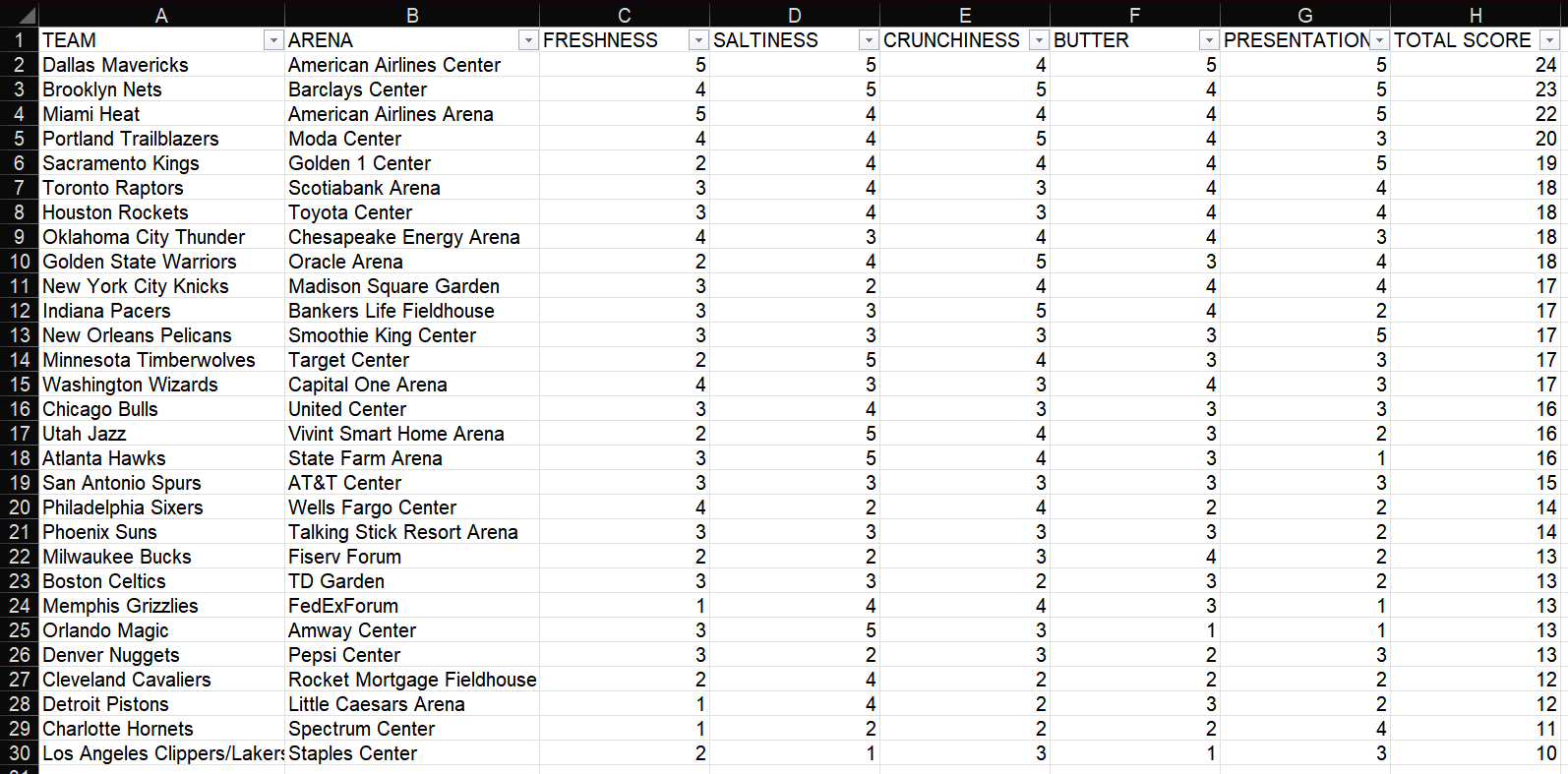
This dataset is to do with popcorn scores. It shows a list of NBA stadiums and their corresponding teams, along with a score for 5 different aspects of their popcorn (freshness, saltiness, crunchiness, butter, and presentation) and a total score.
After looking at the data I like to jot down a few thoughts about what's in the data, what kind of user stories there would be, and what charts would work and show the data well.
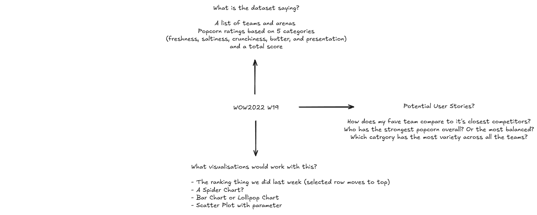
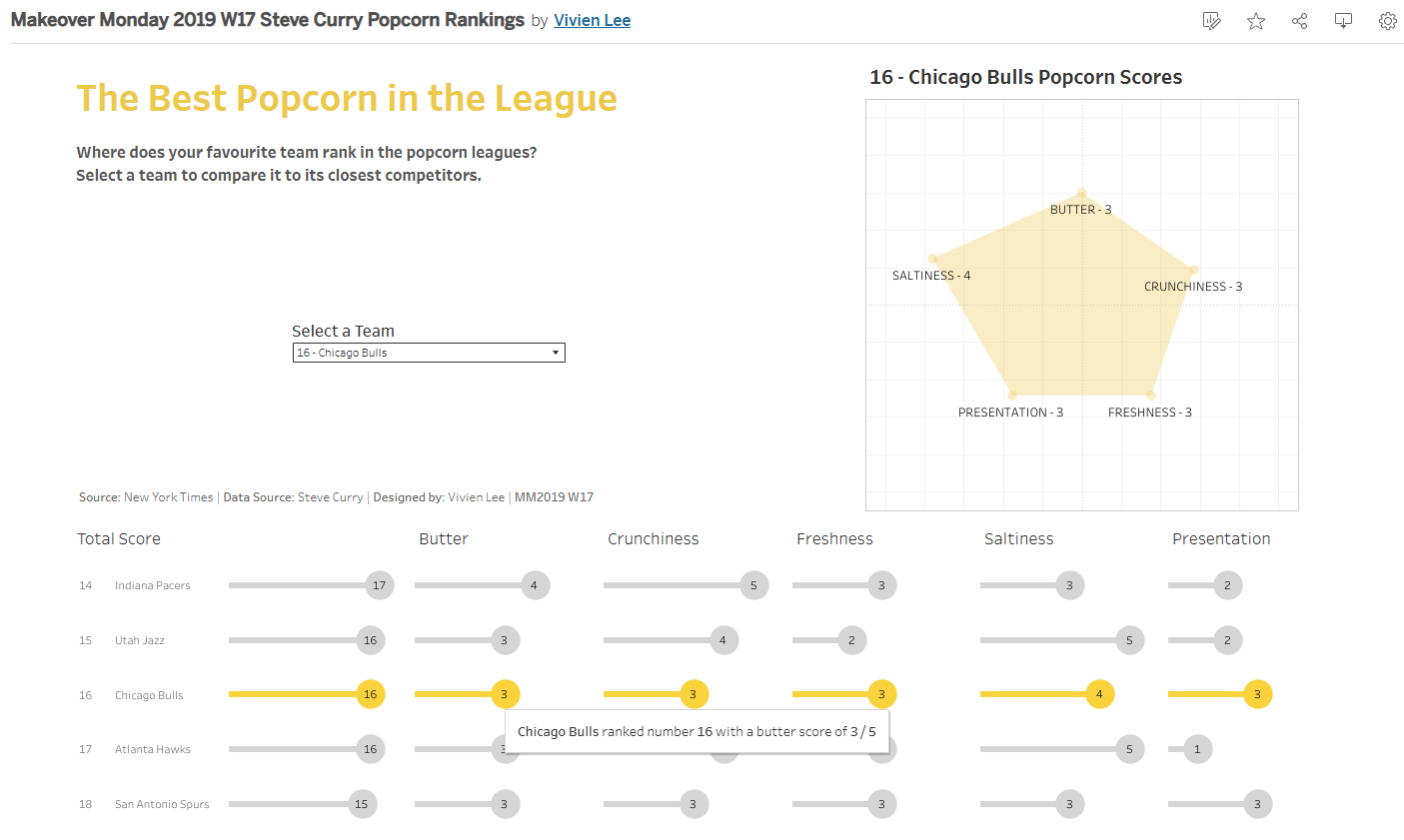
After this I came up with my plan: Lollipop charts and a spider chart (which I've now learnt is called a radar chart).
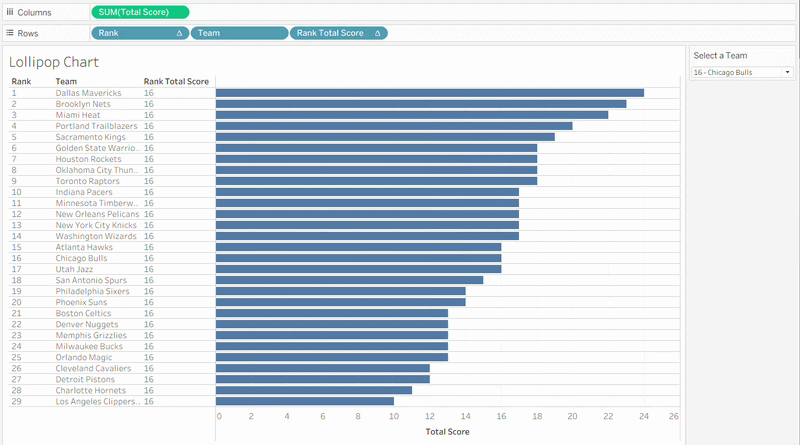
The lollipop chart will rank the teams based off their total score and shows their 5 scores for each category. I also wanted to practise doing the parameter action we did the previous week where if you selected a team for example in the parameter it would bring that team to the top and have the number they were ranked next to it.
The radar chart was more of a fun thing where you can see the shape change based on whichever team was selected.
Making the Lollipop Chart:
1 - Create a Rank Calculation
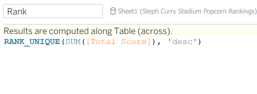
Even if two teams have the same total score, Rank_Unique ensures that they won't have the same rank, they will be one after the other.
2 - Build the First Chart
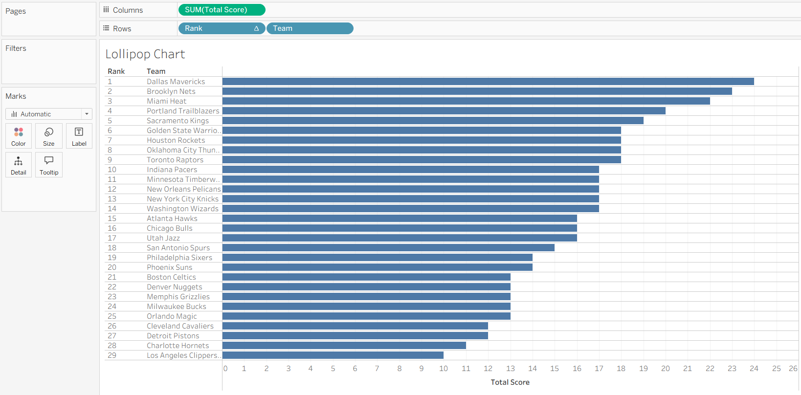
Total Score goes on Columns, and Rank and Team go on Rows. *Make sure your Rank calculation is discrete.
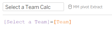
3 - Create a Parameter and the Parameter Calculation
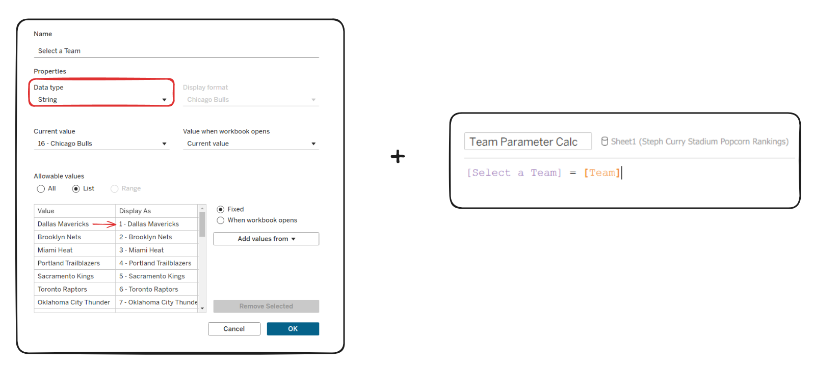
For the parameter, the data type needs to be a string and I've added the data as a list of the team names. I also changed what they're displayed as and added their corresponding rank number so that the user can see what rank the team is without having to count them.
4 - Create a Total Rank Calculation
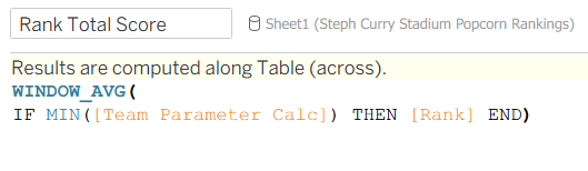
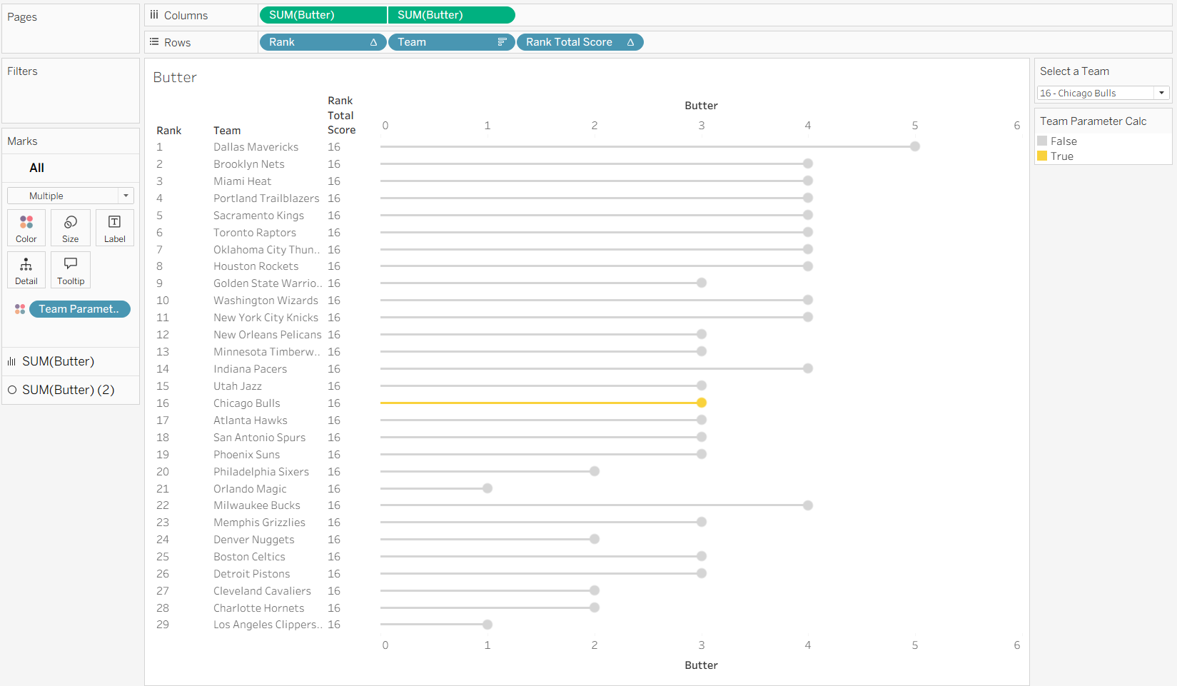
This is looking at what's in the view and returning the rank of the selected team for every row. If we add this to rows we can see what it's doing:
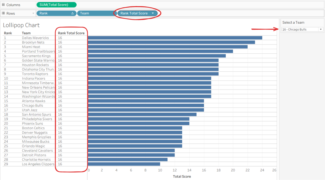
So here we can see the parameter is selected on 16 - Chicago Bulls, and our new "Rank Total Score" calculation is returning 16 for every row. This will help us later when we want to find the two teams that are above and below the selected team.
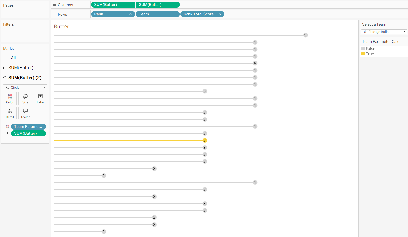
5 - Add the Parameter Action
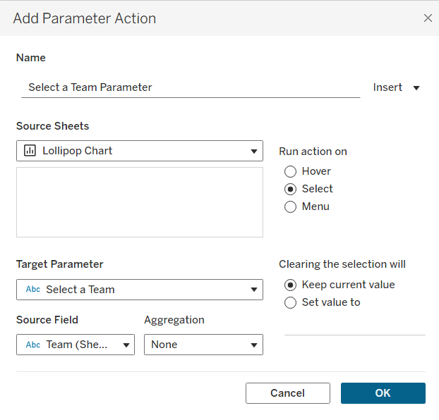
And now when you change the parameter, "Rank Total Score" will change with whichever team is chosen like this:
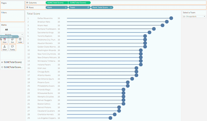
6 - Format the Lollipop Chart
To make the lollipop chart we just need to add Total Score to columns again and leave one as a bar and change the other one to circle. Then change the sizes to your liking.
7 - Add the Parameter Calculation onto Colour
When you add the parameter calc onto colour the ranking changes so you need to go into the table calculations to make sure they're ticked so that the rank doesn't just restart (it feels like the opposite of what it's supposed to be, surely unticking it should mean it won't restart). After that you can hide the Rank Total Score header and now all the hard work is done.
8 - Build the Remaining Charts for Each Category
Now 5 more charts need to be built for freshness, saltiness, crunchiness, butter, and presentation. To keep this blog short we're just going to look at how to build the butter chart.
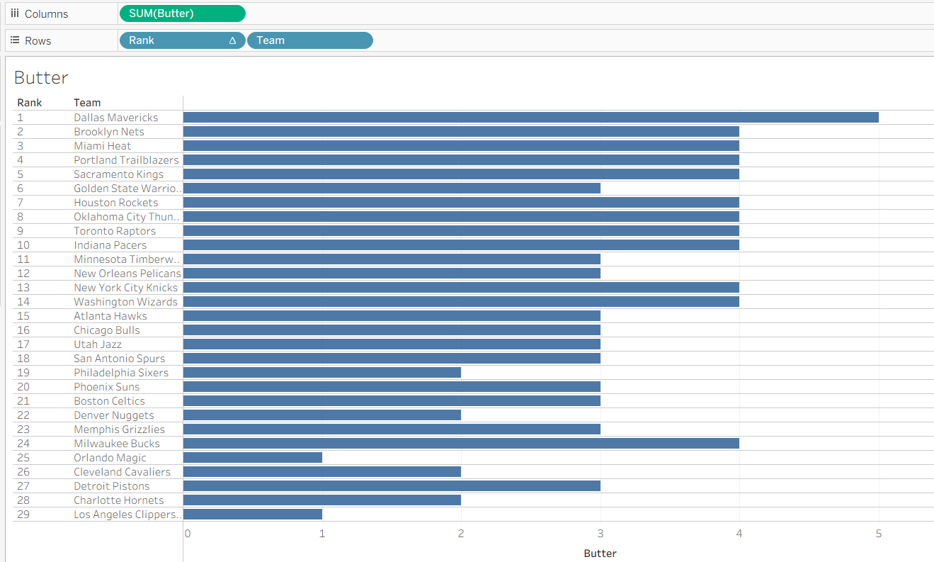
Butter goes on Columns, Rank and Team go on Rows.
9 - Format the Lollipop Chart
Add Butter to Columns again and change to dual axis, and add the Rank Total Score to Rows.
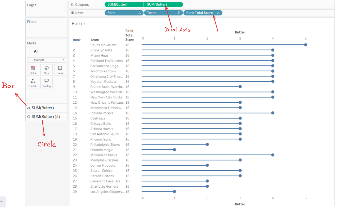
To format the lollipop chart repeat the steps from earlier by setting one chart to Bar and the other to Circle - then adjust the size.
10 - Setting up the Parameter Calculation
Add the Team Parameter Calc to colour again and edit the table calculations the same as before.
11 - Hide All Headers and Add Labels
Lastly we need to hide all the headers (including the Team) and add Butter to the label.
12 - Repeat These Steps for the Other 4 Charts
Duplicate (or remake) this chart and replace Butter with the next category.
Making the Radar Chart
For the Radar Chart I followed a fellow DS-er's blog: Making Radar Charts in Tableau so I would highly recommend reading that.
1 - Check the Data
In our dataset each of the 5 categories are their own individual columns. We need to pivot the data so that each of the names of the categories are in one column, and their scores are in another.
2 - Create the Calculations
- Stats Count: WINDOW_COUNT(COUNTD([Category]))
Returns the number of categories we have (5).
- Index: INDEX() - 1
INDEX() assigns a number to each row (literally like 1, 2, 3). The minus 1 will make the categories start at 0 - which is relevant for the rotation. The way that helps me understand is thinking about a circle (it has 360°) and doing INDEX()-1 means the first category starts at the top of the circle (at 0°), and the rest of the categories are evenly spaced around the circle like slices of a pizza.
So basically subtracting 1 lines up your categories nicely around the circle so the radar chart starts at the top and also it gives it a place to start.
- Degree: 360 / [Stats Count]
Calculates the angle for each category or each slice of the pizza.
- X Radar: SIN(RADIANS([Index] * [Degree])) * SUM([Score])
- Y Radar: COS(RADIANS([Index] * [Degree])) * SUM([Score])
Let's talk about this inside out. We understand degrees like 90°, 180°, 360°. Radians are needed for SIN, COS, and TAN functions (thank you A-level maths). So the inner part RADIANS([Index] * [Degree]) converts the angle from degrees to radians.
The SIN and COS part will determine the exact position of the X and Y points when building the chart. And overall multiplying this by the Score will change their distance to the center of the circle. Higher scores = further away.
(6. Parameter Calc)
If you have a parameter you will need a calc for that parameter.
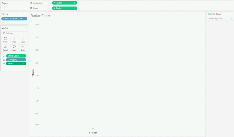
3 - Building the Chart
There's quite a few requirements to follow, I don't normally just list the steps out like this, but it seems easier to read in this case:
- The chart type needs to be a Polygon.
- X Radar goes on Columns
- Y Radar goes on Rows
- Both Category and Score need to go onto Detail
- Add Index to Path
- Add either your Parameter Calc onto Filters, or just Team depending on if you had a parameter and tick True.
4 - Check Table Calcs and Index
Right-click on Index and under Compute Using choose Category.
Then check the table calculations for the X Radar and Y Radar have Category ticked.
5 - Formatting
Last steps would be to add the scores to label and to change the colour.
Dashboard
Overall your dashboard may look something like this!
This Makeover Monday made me realise just how much we had learnt in these first couple months of The Data School. 8 weeks ago I couldn't even just plan this out in 90 minutes let alone build everything and have a functioning dashboard by the end of it.