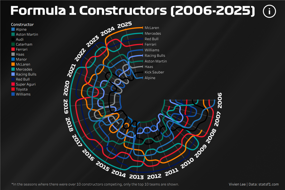
Having only created one bump chart during training, I thought it'd be nice to make another one but with a twist! Here's how my radial bump chart turned out. I used Formula 1 data from the past 20 years to track the rankings and total points of each constructor.
I've had Shreya Arya's Mind the Gap dashboard favourited for a while and feel like there's no better time to try to make something like it. I also heavily relied on this radial bump chart blog to help me through all the sigmoid functions so definitely have a read if you're thinking about building one.
Data
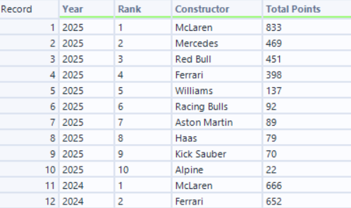
I started by collecting the rank and total points for each constructor from 2006 to 2025. This gave me 211 rows as there were some seasons where there were up to 12 teams competing. I knew the chart was only going to have 10 lines so I filtered the rows where the rank was less than or equal to 10, reducing the data down to 200 rows.
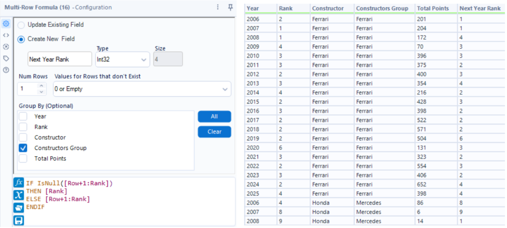
Another issue I was going to have later on was getting the lines on the bump chart to be continuous. A few constructors have changed names over time, e.g. Audi (2026) were Kick Sauber (2024-2025) and were Alfa Romeo (2019-2023) before that, so for this I manually created a field to group certain teams together.
To calculate the radius later on, I needed a field containing each constructor's rank in the following year. The "Next Year Rank" field was created using a Multi-Row Formula. By grouping on the "Constructors Group" field created earlier, it looks at the next row within each group and returns that rank. If there isn't a next row (for example, 2025 would be looking for 2026), the calculation returns the current rank instead.
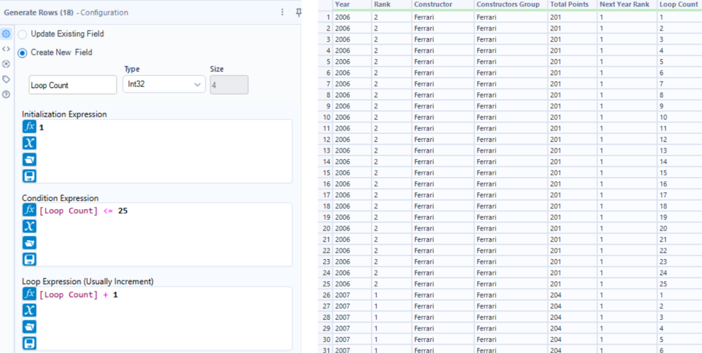
To get the shape of the sigmoid curves (the curvy S shaped lines), we can use the generate rows tool to expand the data, creating extra mini steps. Now instead of the data going from 2006 to 2007, it takes 25 smaller steps to get there which will help us plot a smooth and more gradual curve. This gives us 5,000 rows now because we have 25 records for each constructor and each year.
Making Sigmoids
You can finish the radial bump chart in Tableau, which I'd recommend if you want to make small changes to the way your chart looks (e.g. changing the angle or making the radius bigger). However, I stuck to Alteryx just so I could follow the same steps the next time I wanted to create one.
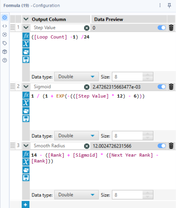
This is where the data felt more "trust the process" to me. Three more fields are needed:
- Step Value - this converts those 25 steps into a percentage which acts like a progress bar, representing where we are in the year.
- Sigmoid - this is the maths for the S curves that takes away the sharp zig-zags you would get if you went from rank 1 to 5. Using the exponential function, it forces the line to move depending on where we are in the year. The start and end of the year will be a flatter line and in the middle of the year, it will curve more towards the new rank.
- Smooth Radius - this calculates exactly how far from the center of the circle the constructors should be. It looks at a team's current rank and looks at their Next Year Rank, then uses the sigmoid curve to blend the two together.
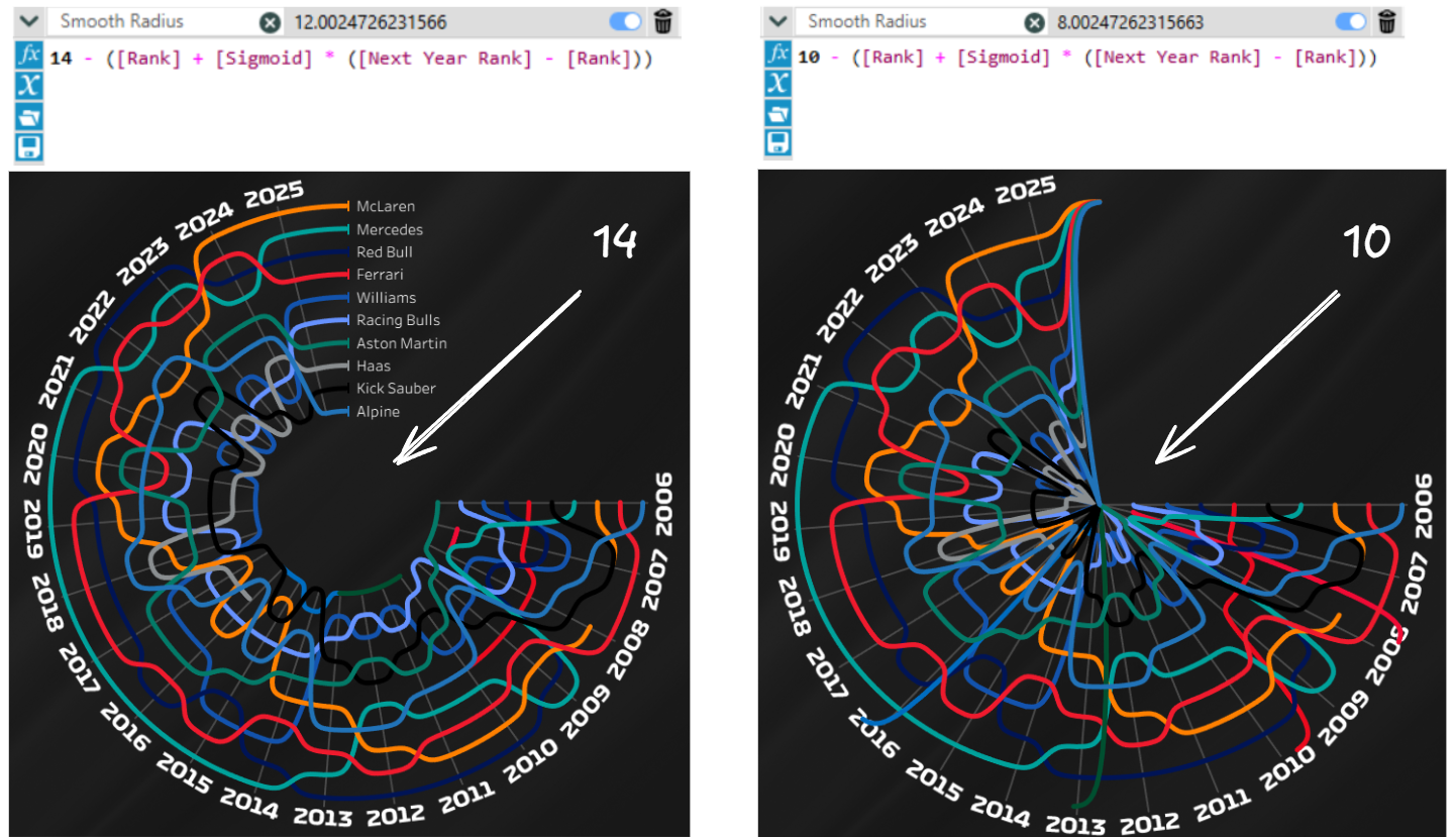
For my bump chart I used 14 for the Smooth Radius but you can use a smaller number if you want the empty space in the center of the circle to be smaller and for the lines to be more spread out. So below you can see on the right, if you made it 10 the lines will be more spaced out and there's no empty space in the middle anymore.
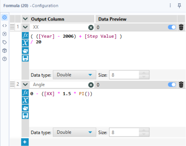
Next we want to create the calculations that will help us get the X and Y coordinates. While the Step Value column tracks the progress through one year, we need another column to track the progress through the whole 20 years.
- XX - this calculates exactly how far along we are from the very first mini step in 2006 to the final mini step of 2025. This normalises the 20 years into a single number between 0 and 1.
- Angle - this dictates how much of the circle the chart will take up. I wanted there to be a gap between 0 and 90 degrees (or "12 o'clock" and "3 o'clock") which is why I used 1.5* PI.
- Starting with 0 and minusing the formula makes the chart start at 90 degrees.
- If you wanted a full circle instead you can use 2 * PI.
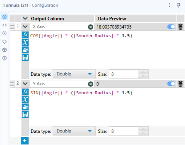
Lastly, to get the X and Y axes we can use COS and SIN and now we can start building in Tableau!
Build the Chart
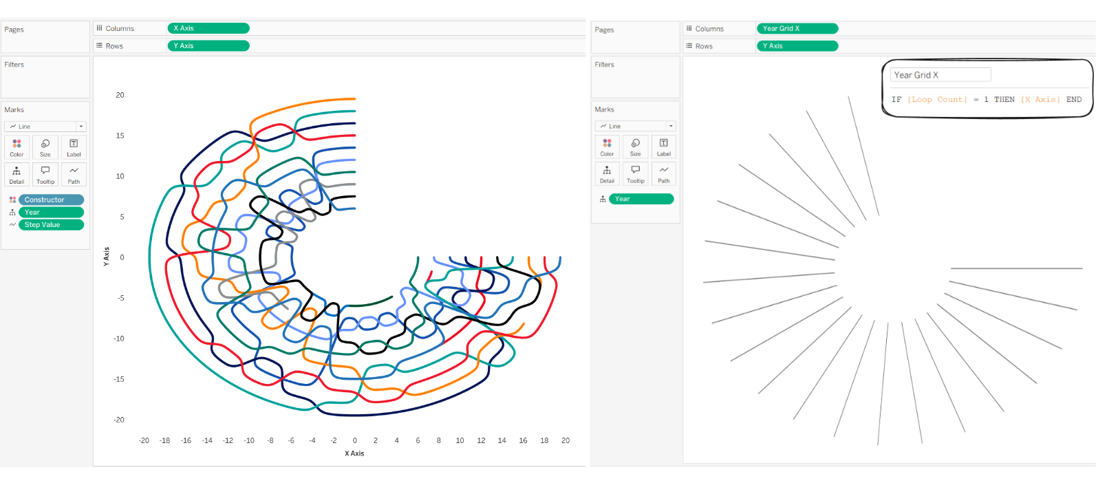
If you did all these steps in Alteryx, building this chart is the easiest part. The X axis goes on columns, the Y axis goes on rows, the Constructor goes on colour, Year goes on detail, and you can either put Step Value or Loop Count on path.
To get the lines in the background to show where each year is we can create a calculation IF [Loop Count] = 1 THEN [X Axis] END which basically shows the "starting point" for each year. Put this calculation on columns instead of the original X Axis field and put Year on detail.
Finally, with some formatting and highlight actions I've ended up with something that looks like this!