For the last two days of dashboard week, we were tasked with joining the #dataplusmovies challenge which provides partakers with IMDB's extensive dataset, to see what they come up with.
Once I had a brief look at the dataset, I started ideating. I was pleased to see that the dataset extended all the way to the very early 1900's as I recalled that a book I'm reading called "Empire of Things" mentioned that when cinemas first came out movies were marketed as a collection of short movies/the news/snippets of interesting things to keep an audience interested.
There were quotes of when the cinema changed to longer films that people would vehemently complain, unable to understand how they were expected to sit through such long things.
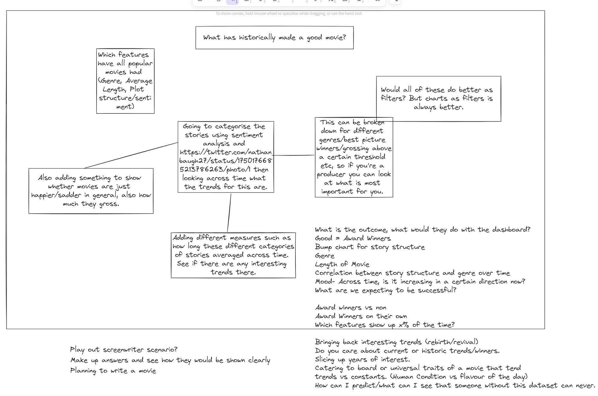
Thus, I decided to try and find any marked changes that occurred during different eras.
This is a very broad scope for a two day project so I began to try find a question I could focus on.
Some were:
- Which genres have dominated?
- What country was producing the most popular films?
- How have the lengths of movies changed across time?
- How have prize winners changed the approach to movies (length, genres, actors)
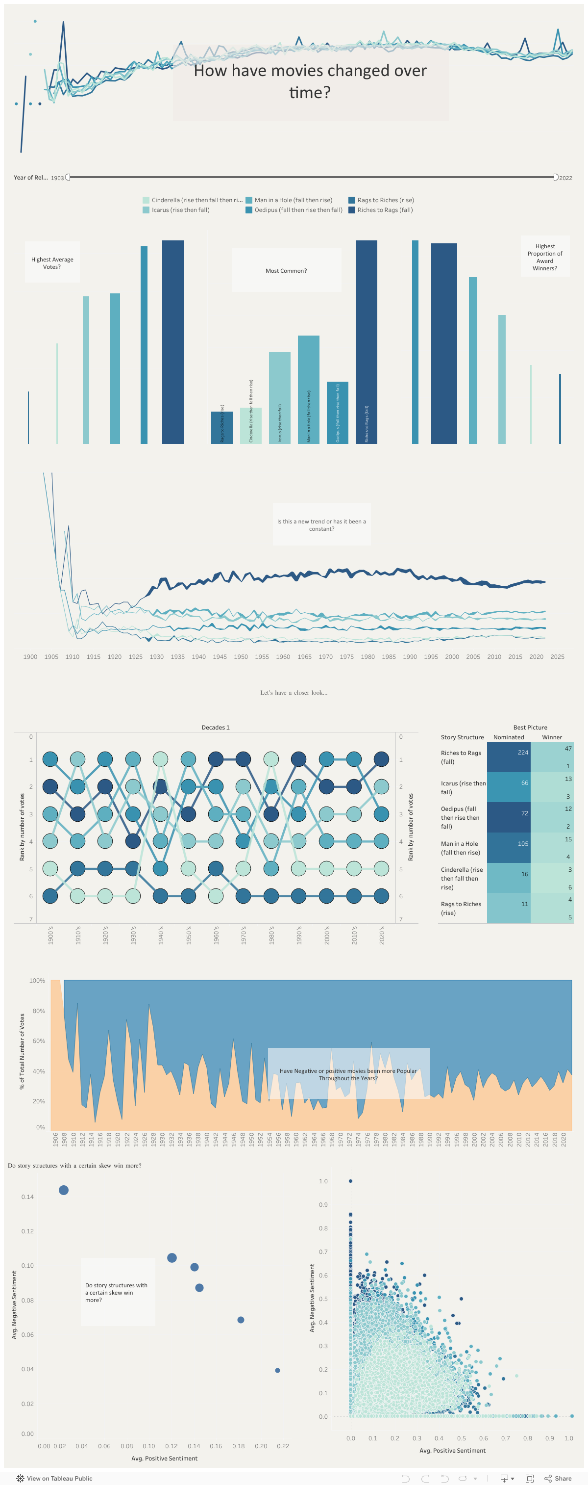
- How have the plots changed in structure, maybe using sentiment analysis and splitting the plot into 3 parts for beginning middle and end.
I ended up choosing the final question, finding it the most interesting, especially when supplemented with this categorisation of story structures which looks at the emotional arcs of stories:
In 2016, researchers at the University of Adelaide tested Kurt Vonnegut's theory that, "There’s no reason why the simple shapes of stories can’t be fed into computers."
— Nathan Baugh (@nathanbaugh27) January 24, 2024
They took the emotional arcs of 1300+ novels from Project Gutenberg, turned that into data, used modern tech… pic.twitter.com/TC96RGuzdn
I then expanded the idea to see which questions I could ask of the data to conduct an interesting investigation. Also putting myself in the shoes of a cinematographer who might want to use the dashboard to understand trends better than their competitors:
My next step was to make the dataset. I decided to use Alteryx and it's in-built sentiment analysis tool. The workflow looked as below:
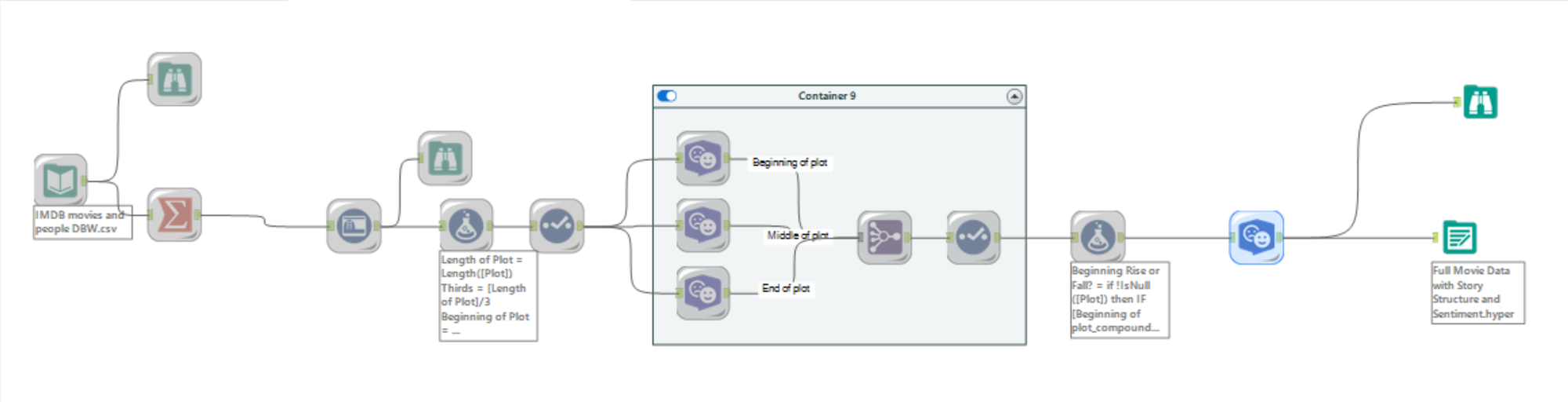
Due to the computational power needed for sentiment analysis alongside the 500 thousand rows I was asking my machine to perform it on. The full dataset took about 6 hours to run and 3 attempts (top tip: check your output is configured to overwrite if you've been running tests, before you run a 6 hour script!). Luckily, during client projects during training we have often worked without the full data. So I created samples of the data that took half or a quarter of the time so that I could still work towards how to present insights, and any small trends that might be revealing themselves whilst I waited for the full dataset.
Thankfully the full dataset loaded about 1 hour before our deadline. This meant that although I already had made a strong start towards creating the necessary charts, I didn't have the time to format the dashboard using best practices. However, the dataset I created was very rich with insights so this will be a project that I will keep working at outside of Dashboard week.
You can see the work in progress dashboard below: