I was provided with the following brief to create a dashboard that caters to user accessibility:
Brief 1: Consultant Needs Fast, Keyboard-Only Navigation
Scenario: Access London has hired an expert in accessible urban design to assess how inclusive the city's top attractions and transport links really are. They’re billing us £4.5k/day, but have a visual impairment and rely solely on keyboard navigation with screen magnification.
Data: The London Accessibility Dataset (Attractions + TfL Stations)
Output:
Upload to Tableau Public or Power BI Service. The dashboard must be fully keyboard-navigable, allowing them to:- Tab through borough-level filters, accessibility feature checkboxes, and attraction lists- View summaries with no mouse interaction- Highlight keyboard focus areas for fast analysis
🎯 Key Requirement:
Efficient keyboard-only navigation across filters, tooltips, and pages — no mouse dependency.
Why Accessibility Matters in Data Visualisation
As Ben Schneiderman once said, “the purpose of visualisation is insight, not pictures.” Accessibility takes that principle further, ensuring that the insight is available to everyone, not just those who fit the “default user” mould. This quote stuck with me.
When we talk about universal design, we mean solutions that serve as many people as possible from the start, not ramps bolted on after the stairs are built. The same goes for dashboards: inclusive design helps not only users with impairments but also neurodivergent audiences, older users, and even busy analysts who benefit from clarity and consistency.
So why make visuals more accessible?
Moral: It is simply the right thing to do.
Economic: Wider usability means greater adoption and fewer barriers.
Goodwill: Accessibility demonstrates care and professionalism.
Legal: Regulations increasingly require it.
The Data: London Attractions and Tube Stations
I was provided with two datasets:
London Top Attractions (with accessibility features such as step-free access, wheelchair hire, and toilets)
London Tube Stations (with details like lifts, ramps, and boarding gaps)
The join was made on Nearest Tube Station and Attraction Name, so every attraction could be evaluated alongside its closest transport link.
Design Decisions and Why They Mattered
Every choice was intentional and centred on the need for fast, keyboard-only navigation.
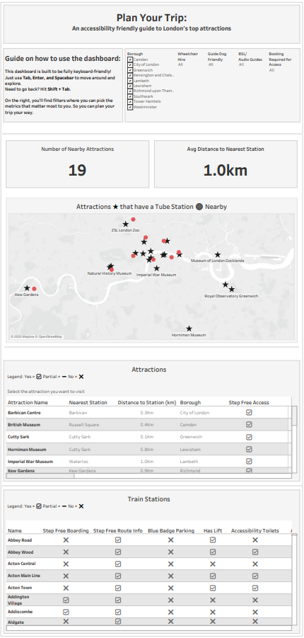
Control Pane Placement: Filters and controls were placed at the top and ordered left to right. This makes tabbing through options predictable and efficient.
Tables for Summaries: While Tableau visuals can be powerful, I leaned towards tables because they mimic Excel’s grid structure, which visually impaired users already finds easier to navigate.
Simple Symbols (✔ / ✗ / -): Instead of text-heavy fields, I used ticks and crosses for Yes/No/Partial. They are instantly recognisable and reduce cognitive load.
Consistent Colours and Layouts: Users should not have to relearn the dashboard on each page. Consistency helps both screen readers and human readers.
Shapes in Charts: Different shapes (not just colours) were used to distinguish series, which is especially important in line or scatter charts.
Captions and Instructions: Every chart included a caption to help screen readers, along with clear text instructions on how to interact (for example, “Use Tab and Enter to explore filters, Shift+Tab to go back”).
Descriptive Titles: Rather than ask questions in the titles (“Does this station have lifts?”), I gave the conclusions upfront (“This station has no lifts”).
Challenges Along the Way
Like any project, this one came with its own challenges:
Scoping: Deciding on what to include in the dashboard and how long it will take to build was quite challenging. I started off with a very ambitious plan but later had to reduce it due to time restraints.
Time Management: With only a few hours to deliver, every design decision had to be intentional. I had to balance ambition with pragmatism, prioritising features that best supported the end user's needs.
Symbols and Accessibility Choices: Finding the right way to represent accessibility status was trickier than expected. Unicode symbols and emojis behave differently across platforms, so testing and simplifying down to the most universal marks (✔, ✗, -) was important. I faced the issue of the symbols not rendering on the web once published to Tableau Public so I had to quickly come up with an alternative.
Accessibility by Design: Thinking beyond visuals to how a dashboard is used was a constant theme. We had to make deliberate choices about colour, shapes, tab order and captions to ensure the experience worked for keyboard users and screen readers.
The Result
The result is a keyboard-first dashboard where users can:
Tab through borough-level filters, accessibility checkboxes and attraction lists
Press Enter or Space to select options
Use Shift + Tab to move backwards
See insights clearly in tables and icons without needing a mouse
Takeaway
Designing for accessibility is not a limitation, it is an opportunity. By focusing on intentional, inclusive design, I created a dashboard that works not only for one user but for anyone planning an accessible trip through London.
Accessibility is not about doing more work. It is about doing better work, work that reaches more people, delivers insights more clearly, and leaves no one behind.
Click here to see the dashboard