


Anime View Statistics
Day 4 has arrived and this time DS52 has been diving into Anime view statistics! With Anime steadily growing in popularity across the West, it felt like the perfect opportunity to dig into data collected from myanimelist.net.
The dataset is a treasure trove, containing over 5,000 unique anime titles, 100,000 users, and more than 8,000,000 lists with ratings. The challenge for the day was simple but exciting: can you find a cool story in this data?
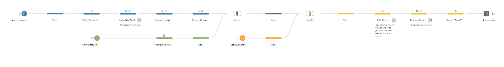
We had to use Tableau for the final build, but the data exploration, cleaning, and reshaping could be done with any tool of our choice. I stuck with Tableau Prep as I hadn’t used it in any of the earlier challenges this week and wanted to give it a proper go.
The Plan
- Profile the data – understand the structure and fields.
- Pick an angle – in my case, I chose to look at anime adapted from video games (and vice versa).
- Define a user story – who’s the audience and what value will they get?
- Sketch ideas – outline the charts and the flow of the dashboard.
- Prep the data – tidy things up and get it in the right shape for analysis.
- Build the dashboard – bring the sketches to life in Tableau.
- Write the blog – document the process and insights.
User Story
“As an anime and gaming fan, I want to explore how anime adapted from video games (and games adapted from anime) perform in terms of popularity and ratings, so that I can understand whether cross-media adaptations are successful with audiences compared to original works.”
- Audience: Fans, studios, publishers, or analysts curious about adaptation success.
- Focus: Video game - Anime crossovers.
- Value: Reveals if adaptations live up to the hype or fall flat compared to originals.
Data Prep
Although the dataset didn’t require extensive cleaning, I still needed to carry out some prep to make it workable for my analysis. Using Tableau Prep, I:
- Removed unwanted columns
- Changed data types where necessary
- Split certain fields for clarity
- Unioned tables to combine data sources
Here’s a screenshot of the Prep flow I ended up with:
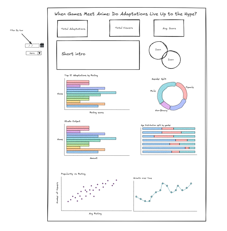
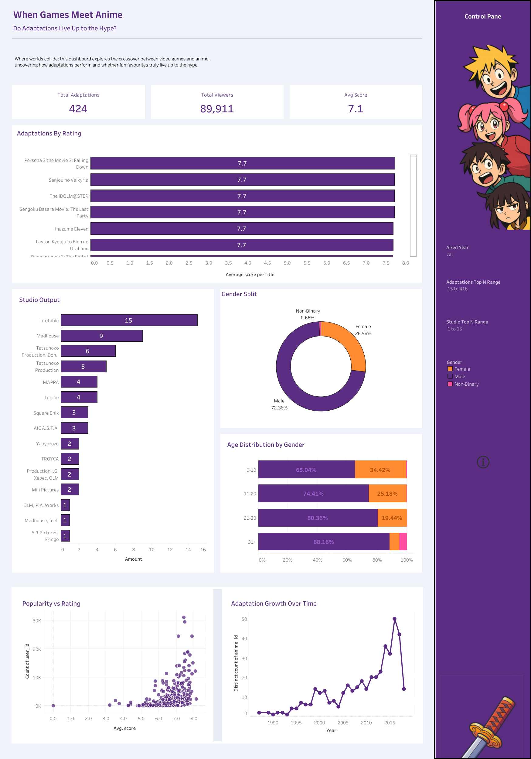
Building the Dashboard
Once the data was ready, I sketched out the layout of the dashboard and the key charts I wanted to include. I tried to stick to my sketch as closely as possible, letting the user story guide the flow.
The dashboard shows how these anime/game crossovers perform in terms of popularity and ratings, with a timeline view to highlight trends over the years.
Final Thoughts
Overall, this was a really fun challenge to work on. It combined two things I enjoy data and gaming. It gave me the chance to experiment with Tableau Prep as part of my workflow.
Click here to check out the final dashboard on Tableau Public