


NASA API Project
NASA has a huge library of free APIs with brilliant space data. You can explore satellite orbits around Earth, pull weather reports from Mars, or fetch the full set of Astronomy Picture of the Day images. The catalogue lives here: https://api.nasa.gov
For today’s Dashboard Week challenge the brief was simple. Pick one or more NASA APIs, bring the data into Tableau, Power BI or an Alteryx App, and build something interactive. Everyone should choose a different API unless there is a clear difference in focus. Astronomy Picture of the Day was off limits as we had already used it in training. Apart from the usual Dashboard Week rules, that was it. Presentations at three thirty.
I have always been fascinated by space, especially the way time behaves out there. I wanted to start with black holes, but there was no public API for that. So I moved to the next most thrilling subject. Asteroids.
Plan
- Explore APIs - (pick an interesting topic)
- Sketch ideas – outline the charts and the flow of the dashboard.
- Prep the data – tidy things up and get it in the right shape for analysis.
- Build the dashboard – bring the sketches to life in Tableau.
- Write the blog – document the process and insights.
The API I used
https://api.nasa.gov/neo/rest/v1/feed?start_date=START_DATE&end_date=END_DATE&api_key=API_KEY
| Parameter | Type | Default | Description |
|---|---|---|---|
| start_date | YYYY-MM-DD | none | Starting date for asteroid search |
| end_date | YYYY-MM-DD | 7 days after start_date | Ending date for asteroid search |
| api_key | string | DEMO_KEY | api.nasa.gov key for expanded usage |
I want to pull data in from the API between the date ranges of when we started TIL (06-06-25 to present day).
I used Alteryx to pull the data from the NASA API, then cleaned and shaped it, keeping only the fields I needed for the dashboard.
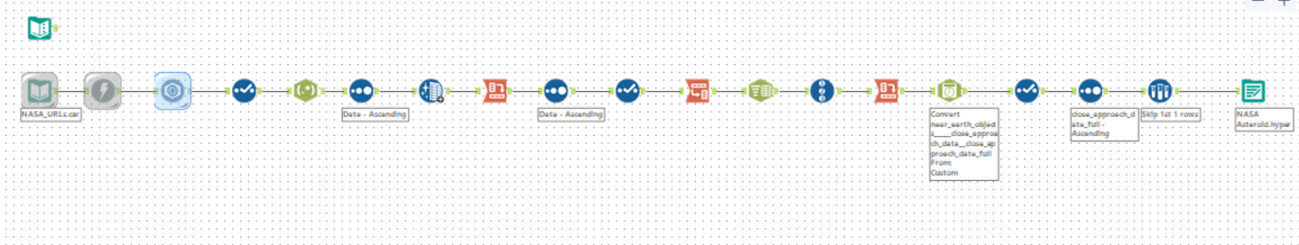
Building the Dashboard
Once the data was ready, I sketched the layout and the key charts I wanted. I stuck closely to the sketch and let the user story guide the flow.
The dashboard shows near Earth asteroids observed over time, with a timeline from when we started at TIL to the day of publication.
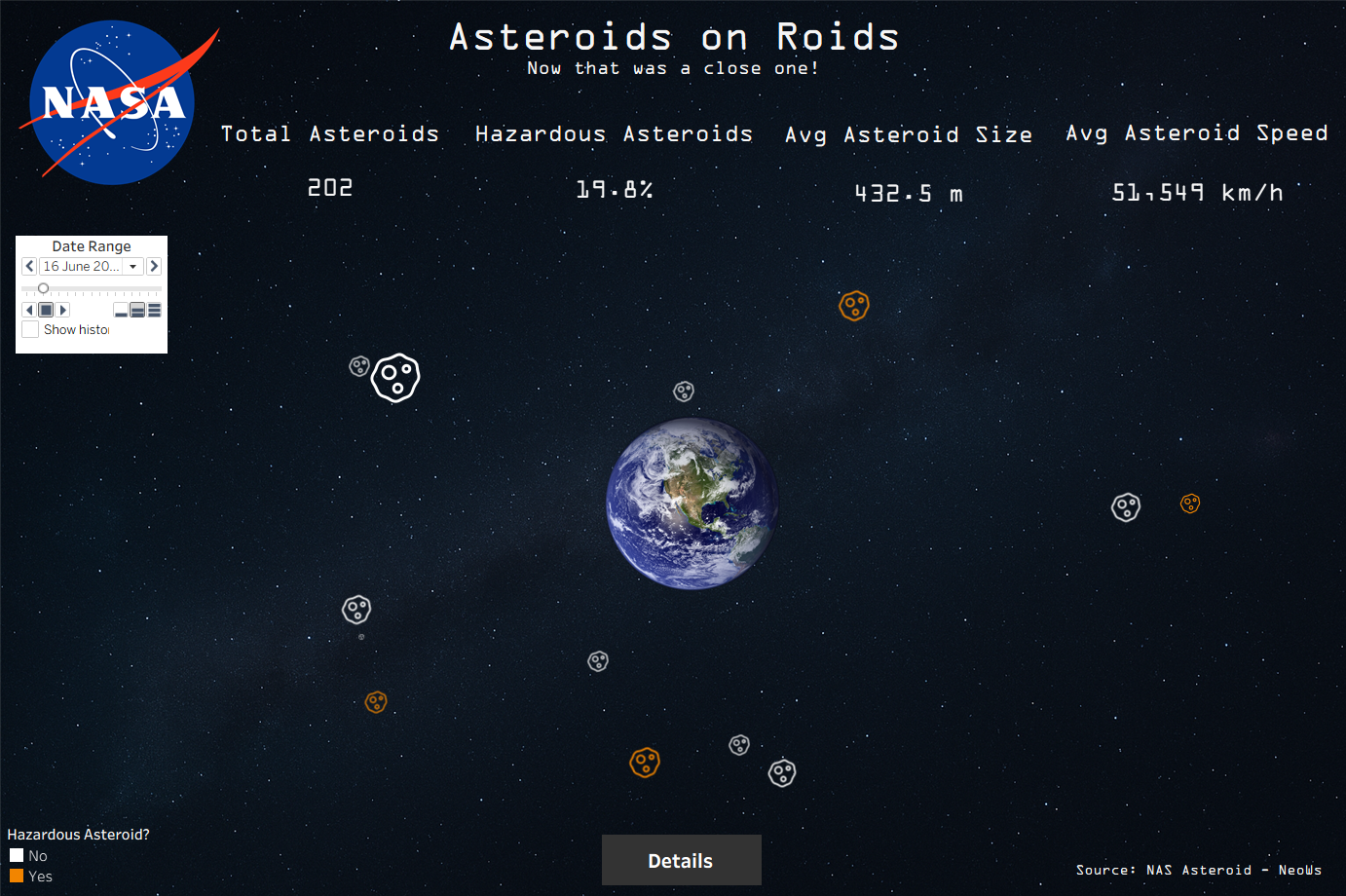
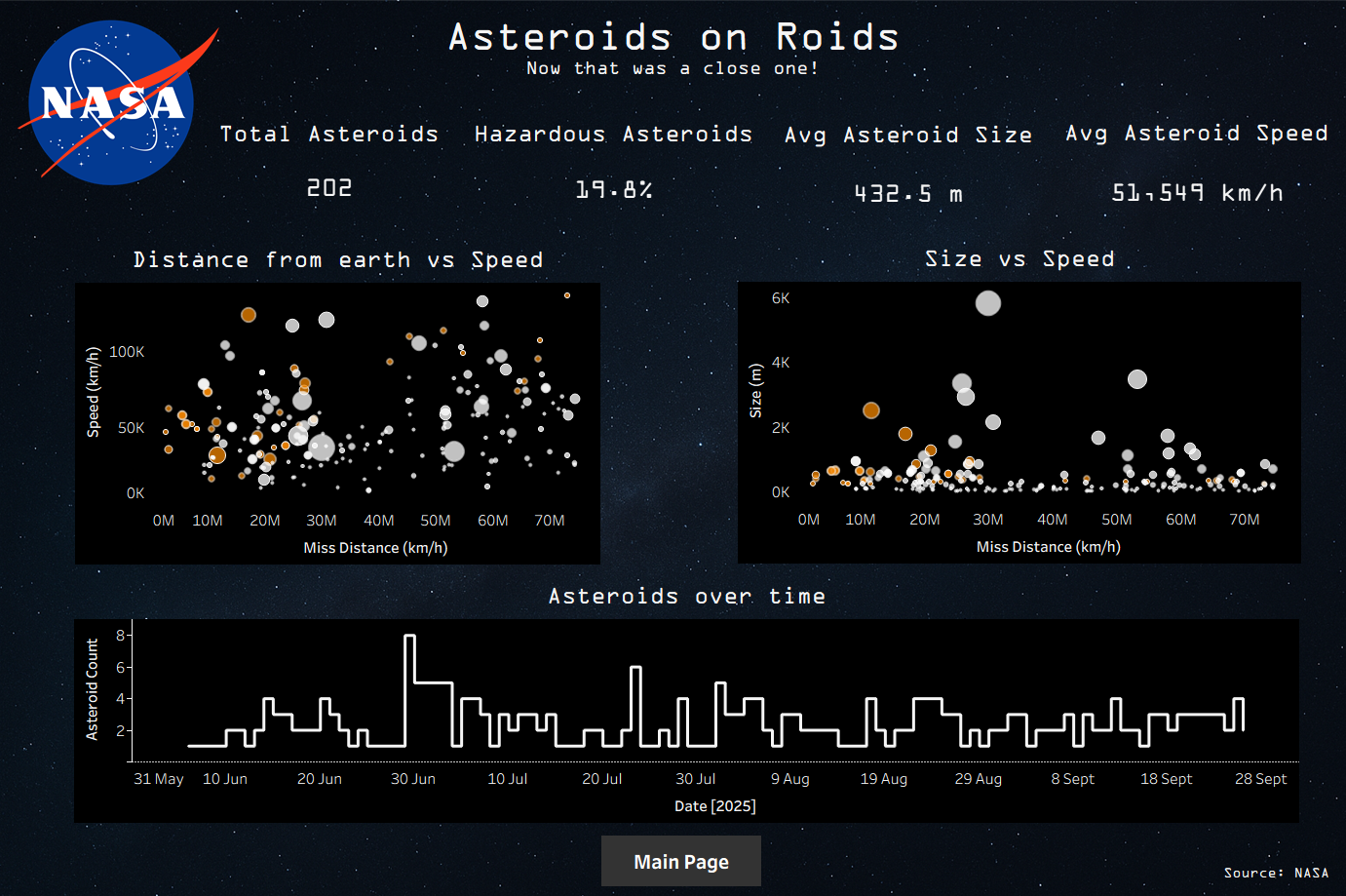
Overall, this was a very enjoyable project. I am genuinely passionate about the topic, so it naturally fuelled my curiosity. A great way to round off Dashboard Week.
Click here to check out the final dashboard on Tableau Public