Let me introduce you to a very cool feature in Power BI called Sparklines. These little guys let you add mini charts inside a matrix table. Yes, inside! Think of them as bite-sized trend visuals, perfect for showing performance over time without taking up tons of real estate.
Below, you'll find a simple follow-along tutorial (with screenshots!) to help you bring Sparklines to life in your own Power BI report.
Step 1: Load Your Data
Start by loading your dataset into Power BI. I’m using the good ol’ Sample Superstore dataset from Tableau (oops, did I just say Tableau?). Look, it's just an easy dataset to work with, don’t judge me!
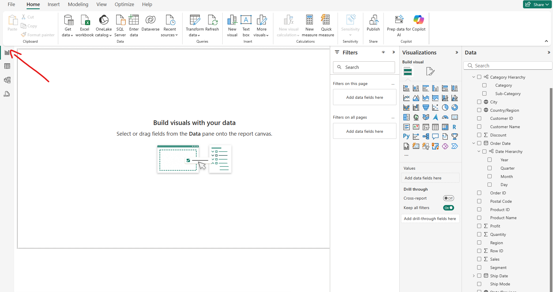
Step 2: Get into Report View
Once the data is in, make sure you're in the “Report View” . That’s the one on the far left. It kind of looks like a little bar chart icon. If you're seeing fields and tables everywhere, you're in the wrong tab, my friend.
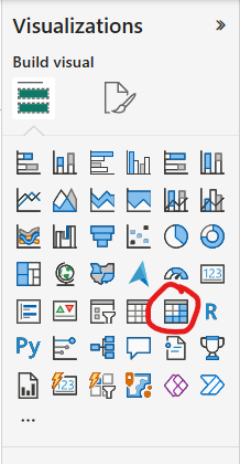
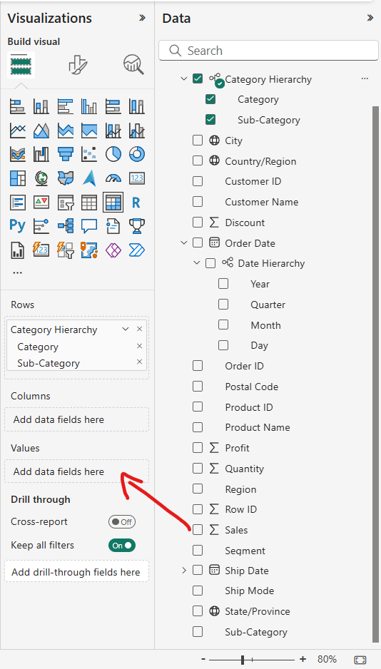
Step 3: Add a Matrix
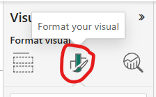
From the Visualisations pane (yes, I know the screenshot says "Visualization" without the "s" but we’re in the UK and I have standards), select the Matrix visual. This will drop a very basic-looking table onto your canvas. I know it’s not glamorous yet, but trust the process.
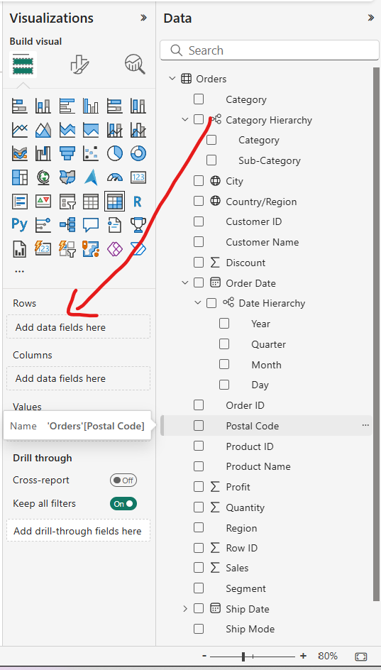
Step 4: Drag in Some Fields
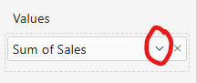
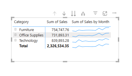
Now drag your Category hierarchy into the Rows, and Sales into the Values. Power BI should automatically sum up your sales.
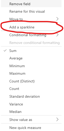
Next, click the tiny dropdown arrow next to "Sum of Sales". In the menu that pops up, you’ll see the glorious option called Sparklines, click it. It’s showtime.
Step 5: Create the Sparkline
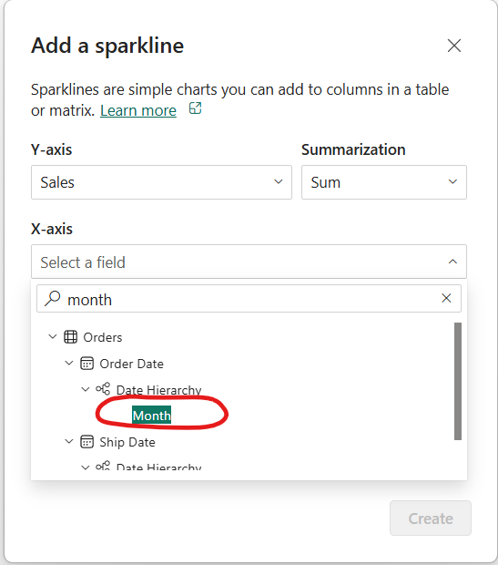
A popup window appears (you’ll know it when you see it). Search for "Month" or whatever time-based field you want to use for your Sparkline, and hit Create.
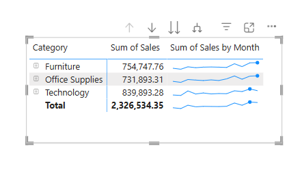
Boom! You should now see a slick mini line chart show up in your matrix table. Fancy, right?
Step 6: Add Some Spark(le)
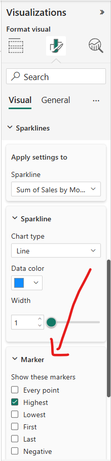
We’re not stopping there. You can enhance these Sparklines with markers which are little dots that highlight things like the highest point, the lowest point, the first value, etc. I chose to highlight the highest point because I’m all about peak performance.
Final Result: Voilà!
You've just created a Sparkline in Power BI like a pro. This is just the tip of the iceberg. There's tons more and I encourage you to play around with it and who knows what you might end up creating.