


Brief 2: Staff Accessibility for Cognitive Disabilities
Scenario: Chloe from the Mayor’s Office is interested in promoting inclusive tourism, but she’s open about her dyslexia and dyscalculia. She finds most city planning dashboards overwhelming or unusable, particularly those filled with icons, percentages, and colours that blur together.
Data: The London Accessibility Dataset — Attractions sheet (access features, booking policies, etc.)
Output:
Upload to Tableau Public or Power BI Service. Your version of the dashboard should
-Minimise cognitive overload (no heavy grid layouts or dense legends)
- Use plain English and icons with alt text
- Offer voice-over summaries or toggles for simplified views
- Show rankings visually rather than numerically when possible
Data Prep:
Data we were provided with was the following:
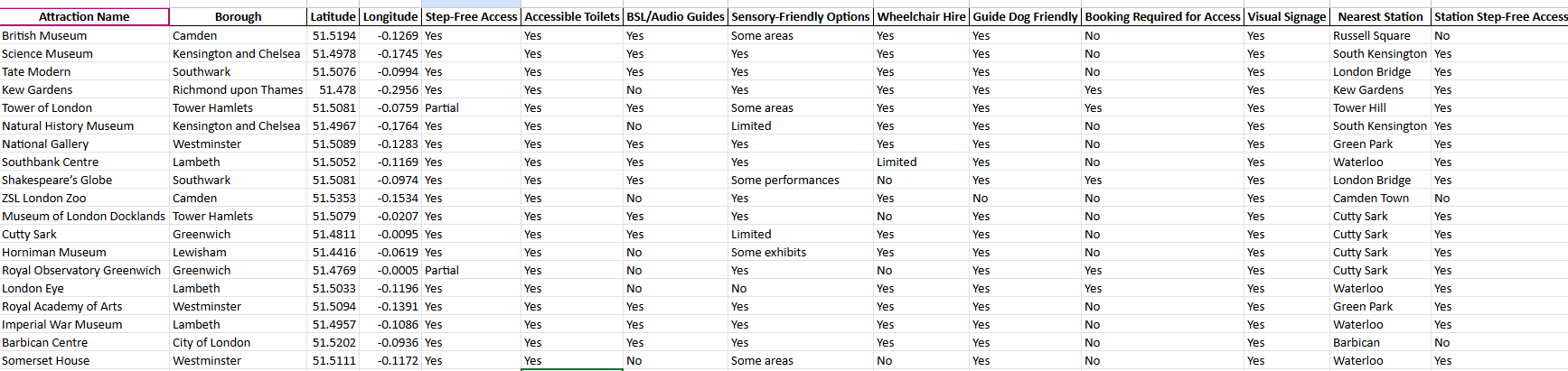
We were provided with data on the top 19 attractions, including their boroughs, accessibility features, and distances to the nearest stations.
Plan for user:
The user has dyslexia and dyscalculia; therefore, large amounts of text and numbers may be overwhelming.
Use the dataset to create a ranking system for each attraction based on accessibility features. Create a unique ranking system for each type of accessibility, since some categories go beyond simple yes/no responses, and certain accessibility features may need to be prioritised more than others so a weighted sum would be useful too in the calculation.
Sketch:
The main objective of the dashboard is to provide users with an overview of how accessible London attractions are, while also allowing them to drill down into the different accessibility types. This will help identify which accessibility features are lacking at certain attractions and highlight areas that can be improved.
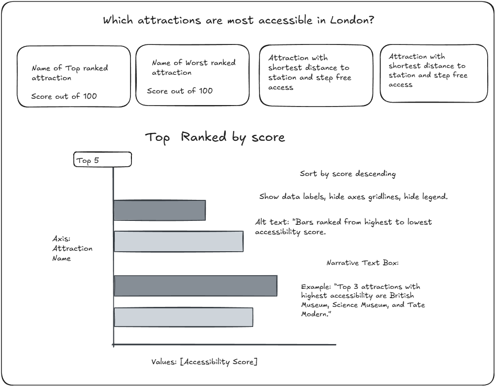
Overview sketch:
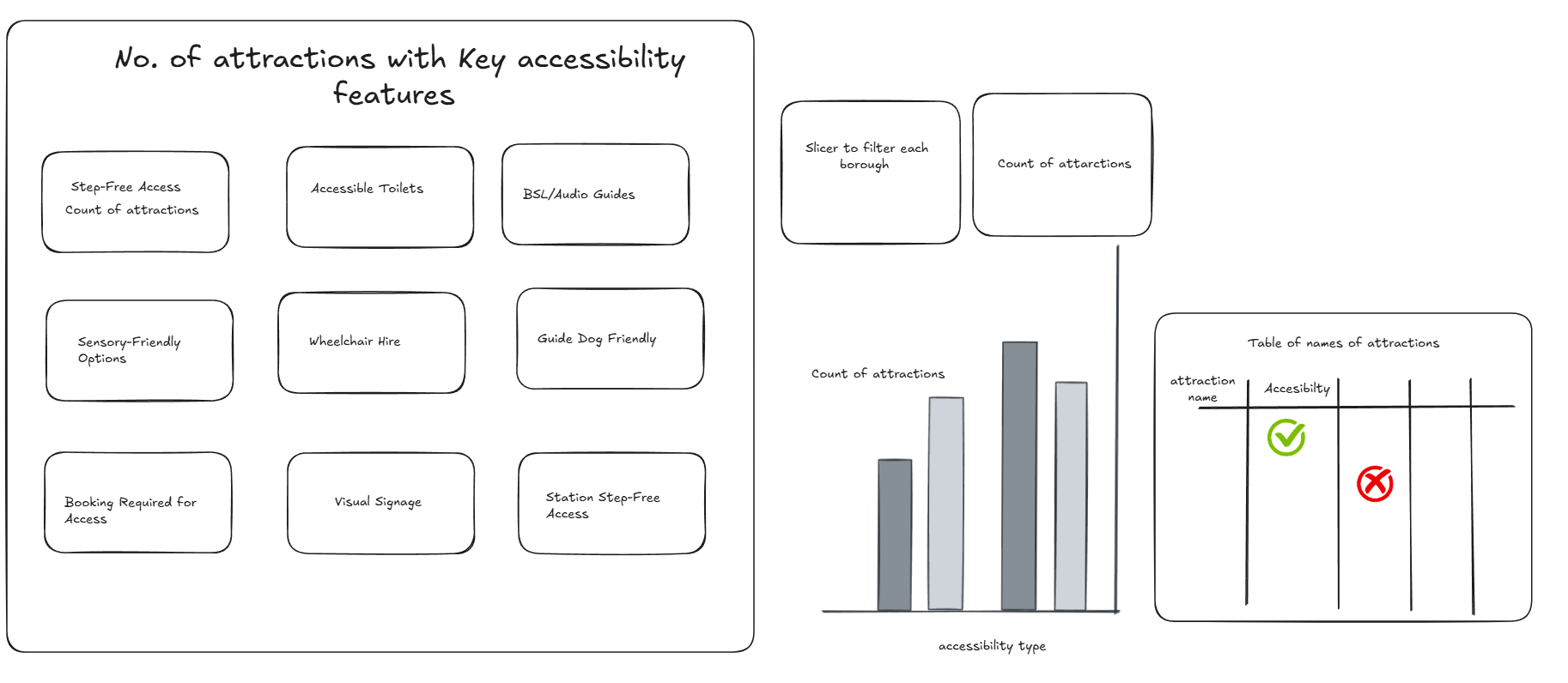
Accessibility breakdown sketch:
Challenges:
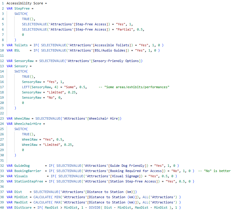
1)Accessibility Score
The ranking score, created using DAX calculations as a measure, took longer than expected. Instead of keeping it simple with a score of 1 for “Yes” and 0 for “No,” I decided to assign a unique score for each individual accessibility type. This incorporated different outcomes such as “Some” and “Limited,” and a hierarchy of types was developed to form a weighted sum for the final accessibility score.
Logic behind the DAX:
This measure turns each accessibility attribute into a simple numeric signal and (later) combines them into one score. Binary features like Accessible Toilets, BSL/Audio Guides, and Guide Dog Friendly score 1 for “Yes” and 0 for “No.” Features with degrees get partial credit: Step-Free Access gives 1 for Yes and 0.5 for Partial; Sensory-Friendly Options gives 1 (Yes), 0.5 (“Some”), 0.25 (Limited), 0 (No); Wheelchair Hire gives 0.5 (Yes), 0.25 (Limited), 0 (No). Two supportive cues—Visual Signage and Station Step-Free Access—contribute 0.5 when Yes (treated as lighter-weight positives). Booking Required for Access is inverted so “No” = 1 (no barrier) and “Yes” = 0. Finally, Distance to Station is normalized across all attractions so the closest venue scores near 1 and the furthest near 0 using :1 - (Dist - MinDist) / (MaxDist - MinDist)).
Weighted Sum component: This block turns the individual feature scores into a single percent-style index by (1) giving each component a weight that reflects importance—e.g., Step-Free (×2.0) and Toilets (×1.5) matter more; signage, station step-free, and wheelchair hire are lighter (×0.5); distance uses the normalized DistScore (0–1)—then (2) adding them up as WeightedSum. It then normalizes that sum by dividing by the maximum possible total (MaxPossible) and multiplies by 100 so every attraction lands on a 0–100 scale that’s comparable across filters.
2) Formatting in Power BI:
I found the formatting process to be quite time-consuming, as it has been a while since I last used Power BI. I spent time working on making the dashboard look cleaner and neater, as well as adding a button to allow users to switch between the overview and detailed views.