


In this post, we get practical.
We’ll rebuild a very common Tableau pattern in Power BI:
1) A Cluster selector (City, Region, Category, etc.)
2) A SubCluster selector that depends on the chosen Cluster
3) A bar chart that updates dynamically based on both
To keep the logic clear, we intentionally use one bar chart only. Once this pattern is understood, it can be reused across any visual.
What we’re building
Goal:
Show Total Events by a dynamically selected dimension.
User flow:
- Select a Cluster (e.g. City, Region)
- Select one or more SubClusters (e.g. London, Manchester)
- The bar chart updates automatically
This mirrors how Tableau parameters are commonly used.
Step 1: Create a Baseline Measure
Before adding any parameters or slicers, always confirm that your numbers are correct.
Go to Modeling → New measure:
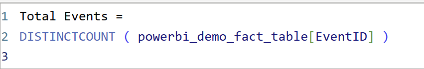
This is the core metric that all visuals will use.
Step 2: Build the Bar Chart (No Parameters Yet)
Bar chart
- Axis →
[City] - Values →
Total Events
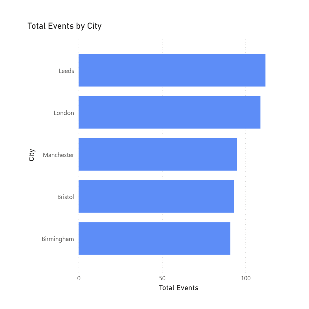
Why this step matters:
If values are wrong now, they’ll only get harder to debug once parameters are added.
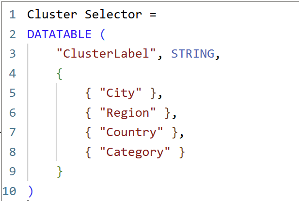
Step 3: Create the Cluster Parameter (Tableau-Style)
In Tableau, this would be a parameter.
In Power BI, we use a disconnected table + slicer.
Go to Modeling → New table:
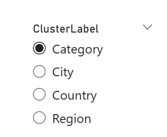
Add a Slicer:
- Field →
Cluster Selector[ClusterLabel] - Turn Single select = On
Step 4: Create the Sub-Cluster Table (Dependent Filter)
This is where Power BI diverges most from Tableau.
We must explicitly create a table that contains:
- which cluster a value belongs to
- the actual selectable values
Go to Modeling → New table:
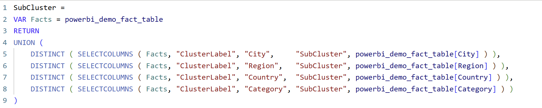
What this DAX is doing (in simple terms)
- Combines multiple columns into one list
UNION()stacks values from City, Region, Country, and Category into a single column called SubCluster. - Keeps track of where each value comes from
TheClusterLabelcolumn stores whether a value belongs to City, Region, Country, or Category. - Creates a parameter-like table
This table behaves like a Tableau parameter value list, even though Power BI doesn’t have native parameters for dimensions. - Does not filter anything by itself
The table is intentionally disconnected. Filtering only happens later via a measure usingTREATAS().
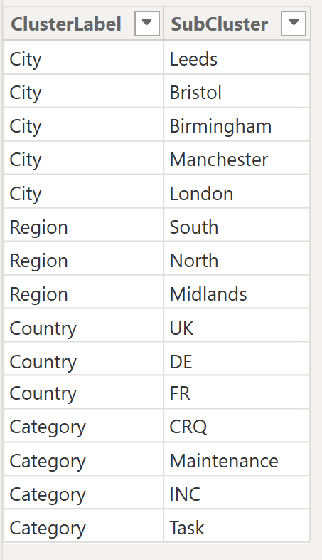
Put SubCluster[SubCluster] in a slicer.
3) Make SubCluster slicer dependent on Cluster Selector
Modeling → New measure:
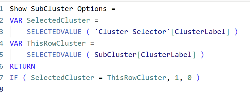
What this DAX is doing
- Reads the selected Cluster
It checks which Cluster the user picked in the slicer (e.g. City, Region, Country). - Checks each SubCluster row
Every SubCluster value knows which Cluster it belongs to. - Compares the two
If a SubCluster belongs to the selected Cluster, it is marked as valid. - Controls visibility, not data
The measure returns1(show) or0(hide), which is then used as a visual-level filter.
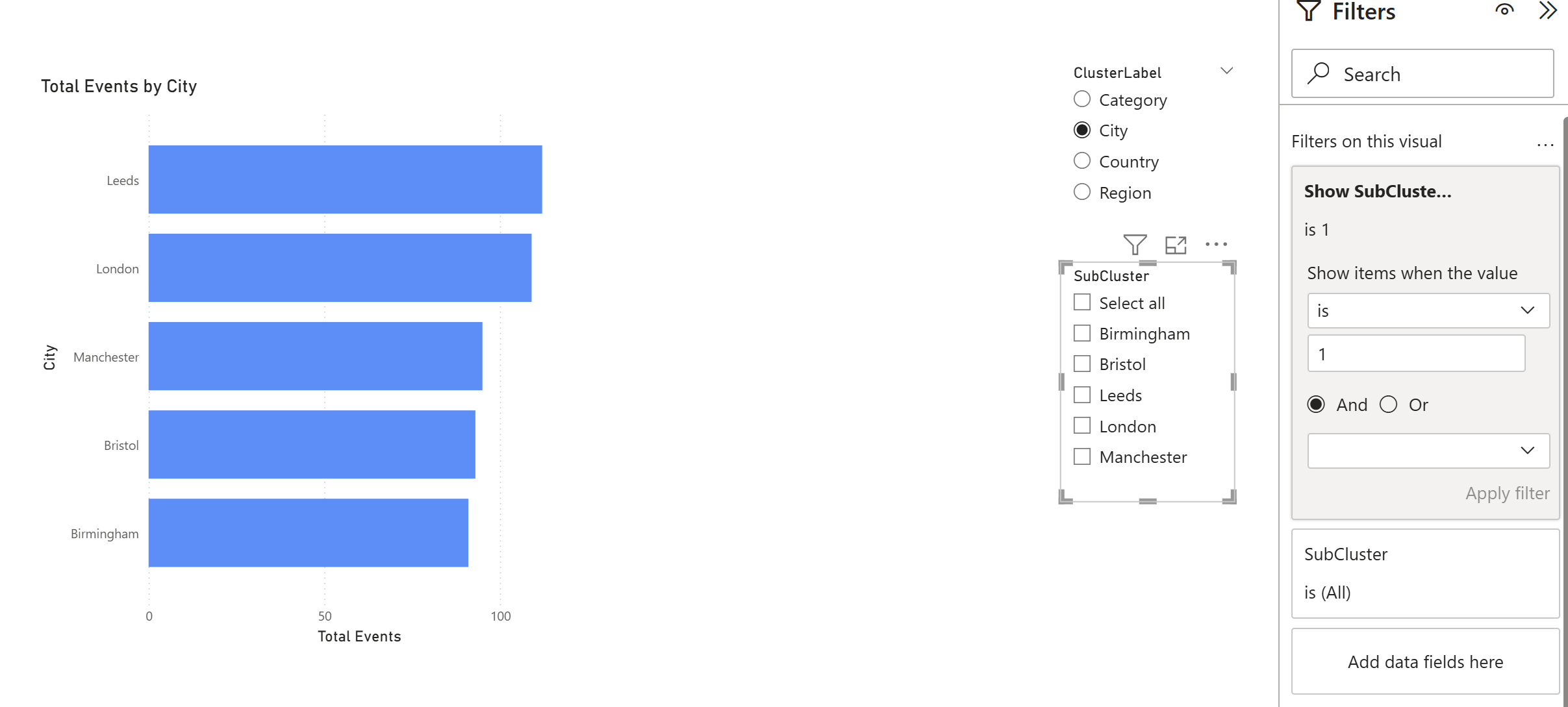
Now:
- Click the SubCluster slicer
- In Filters on this visual, add
Show SubCluster Options - Set it to is 1
✅ Now SubCluster slicer shows only values for the chosen Cluster.
4) Apply the selection to visuals (TREATAS measure)
We have already created the baseline measure in step 1
Now create the “Tableau-style parameter filter” version:
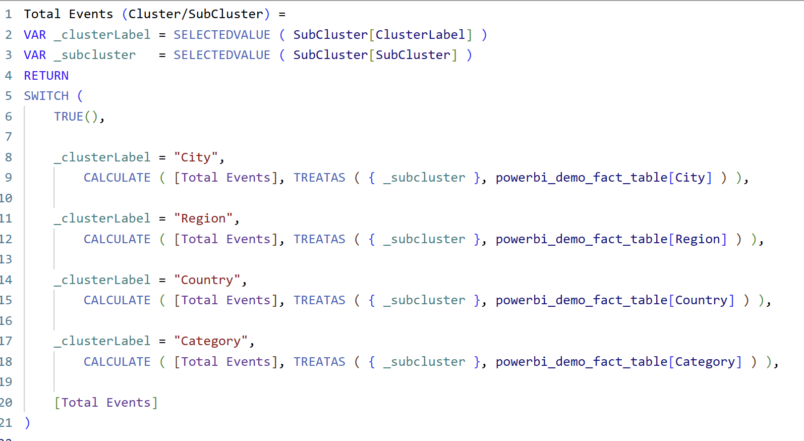
How this DAX works
1. Capture the user’s selections

Here we read what the user selected in the slicers:
_clusterLabeltells us which field the user wants to analyse
(City, Region, Country, or Category)_subclustertells us which value inside that field they selected
(e.g. London, North, UK, CRQ)
Think of this exactly like a Tableau parameter storing the user’s choice.
2. Decide which column to filter
This is a common DAX pattern that works like a series of IF / ELSE IF statements.
We check which Cluster is selected, and then apply the filter to the matching column in the fact table. So for the first part of the expression with "city"
This means:
“If the user selected City, treat the selected SubCluster value as a filter on the City column.”
3. Why TREATAS is the key
TREATAS is doing the heavy lifting here.
Because the SubCluster table is disconnected, Power BI would normally ignore it.
TREATAS tells Power BI:
“Pretend this value came from this column in the fact table.”
So:
- SubCluster = London
- Cluster = City
→ Power BI filterspowerbi_demo_fact_table[City] = "London"
This is how we recreate Tableau-style parameter filtering without relationships.
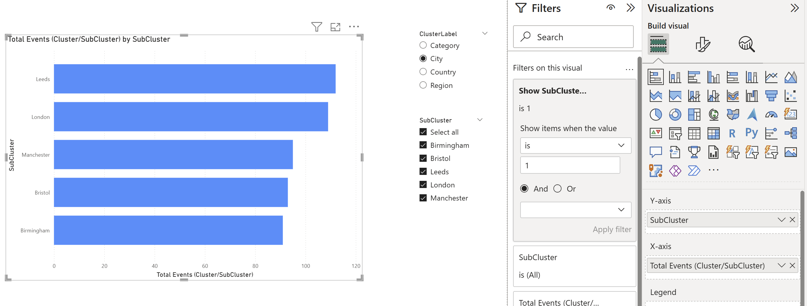
Final Step
- Replace
Total Eventsin your barchart withTotal Events (Cluster/SubCluster)and also replaceCitywithSubclusterfor all visuals. - Axis:
SubCluster[SubCluster] - Values:
Total Events (Cluster/SubCluster) - In Filters on the visual, add
Show SubCluster Options - Set it to is 1
You should now see:
- SubCluster options change when Cluster changes
- Bar chart updates correctly
- No relationships required
Key takeaway
In Power BI, parameters are rebuilt using disconnected tables + DAX measures.
Once this pattern is understood, it becomes reusable across any chart.
Next...
A very common requirement in Tableau dashboards is a Top N parameter. While Power BI does offer a built-in Top N filter, it doesn’t support slicer-driven interaction in the same way. In the next blog, we’ll build a dynamic Top N slicer that allows users to control the bar chart—bringing us closer to Tableau-style behaviour in Power BI.