


Learn how to use Tableau’s BUFFER() function to create distance-based zones around points, helping you analyse accessibility, coverage, and proximity.
Spatial analysis in Tableau has gone far beyond simple maps. With functions like MAKEPOINT, MAKELINE, and DISTANCE, you can already plot, connect, and measure locations. But what if you want to visualize areas of influence — for example:
- What’s within 10 miles of a hospital?
- Which schools are within 2 km of a student’s home?
- How many customers live within 15 minutes of a store?
That’s where the BUFFER() function comes in.
Creating Interactive Airport Buffers in Tableau
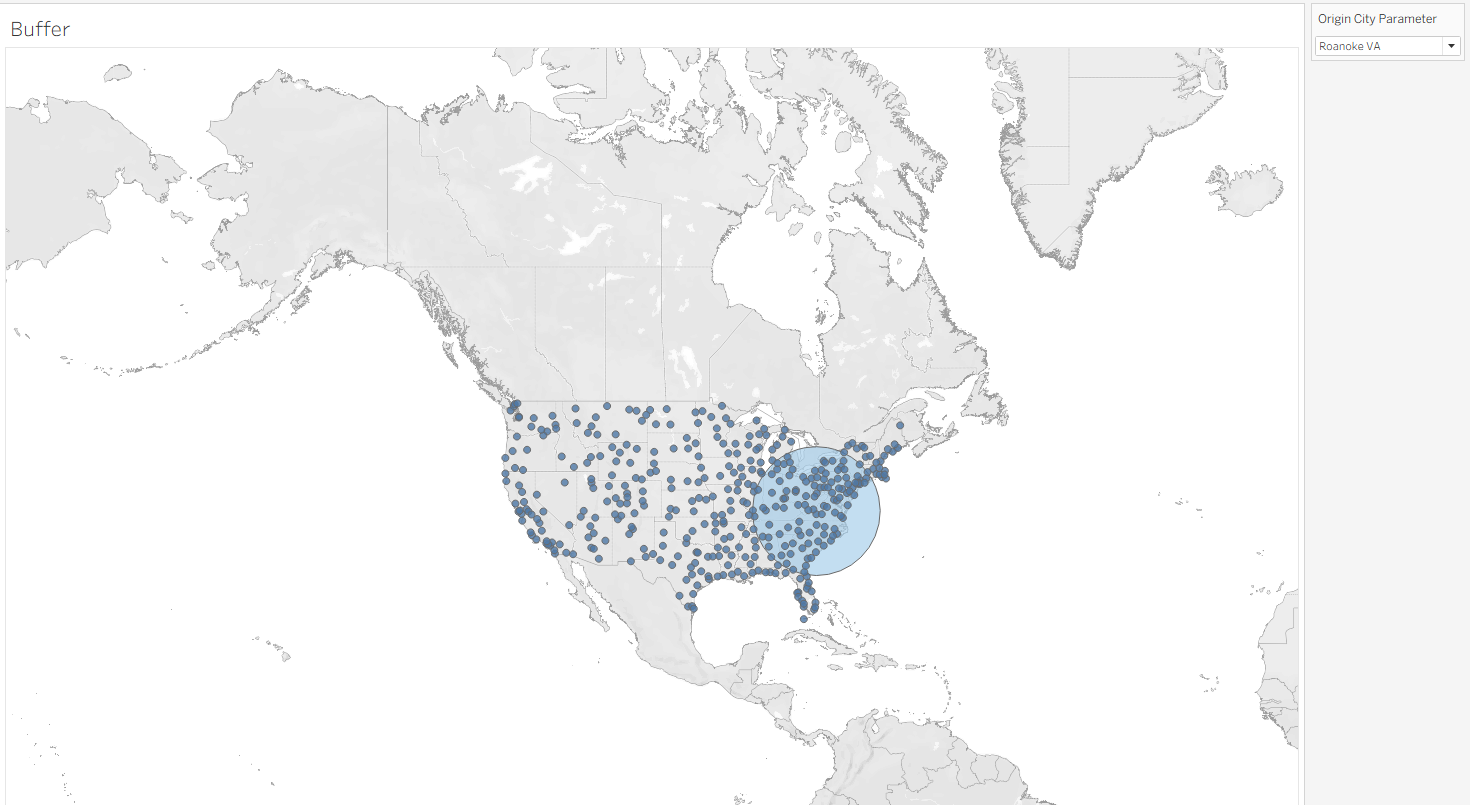
In this tutorial, we’ll build a map of origin airports across the USA and use a parameter to select a city. When you choose a city, Tableau will create a 500-mile buffer zone around that airport to show which other airports fall inside that radius.
Step 1: Build the Origin Airport Points
First, create a point from your airport latitude and longitude:
MAKEPOINT([Latitude], [Longitude])
Call this field Origin Airport Point.
This tells Tableau how to plot your airports as spatial points on the map.
Step 2: Create a Parameter for Origin City
- Create a Parameter called
Origin City Parameter. - Data type = String (or select from field values).
- Populate it with your list of airport cities.
- Show Parameter Control → this will be the dropdown users use to choose the origin airport.
Step 3: Write the Buffer Calculation
Now, create a calculated field to generate the buffer around the selected origin city:
IF [Origin City] = [Origin City Parameter] THEN
BUFFER([Origin Airport Point], 500, 'mi')
END
🔎 How this works:
IF [Origin City] = [Origin City Parameter]→ Only applies the buffer to the city you select.BUFFER([Origin Airport Point], 500, 'mi')→ Creates a 500-mile radius zone (polygon) around that airport point.
Result: A circular buffer around your chosen origin airport.
Step 4: Visualize the Buffer on the Map
- Drag Origin Airport Point to the map → Airports appear as dots.
- Drag the new Buffer Calculation to the map → Tableau draws the buffer circle.
- Layer both so you see the airport point inside the buffer.
Result
Now you have an interactive airport map:
- Choose an origin airport from the parameter dropdown.
- A 50-mile buffer appears around it.
- Other cities within that zone are instantly highlighted.
This is a great way to analyse airport coverage, flight planning, or regional accessibility.