


When analyzing data, most people start with averages (means). The average gives us a quick summary of the data, but it often hides important details. Two datasets can have the same average yet be very different in spread, variability, and outliers.
That’s where the Z-score comes in.
What is a Z-Score?
A Z-score tells us how many standard deviations away a value is from the mean.
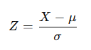
- X = the data point
- μ (mu) = the mean
- σ (sigma) = the standard deviation
If:
- Z = 0, the value is exactly the mean.
- Z = +2, the value is 2 standard deviations above the mean.
- Z = -1.5, the value is 1.5 standard deviations below the mean.
This makes data comparable across different scales and distributions.
Why Not Just Use the Average?
Let’s say we’re comparing exam scores for two classes:
- Class A: Mean = 75, Std Dev = 10
- Class B: Mean = 75, Std Dev = 25
If we only look at averages, both classes seem identical. But the spread is very different:
- In Class A, most students are tightly clustered around 75.
- In Class B, scores are much more spread out, with more extreme highs and lows.
This is where Z-scores shine, they adjust for variability.
Z-Scores and Box Plots
A box plot is already a powerful visualisation: it shows the median, quartiles, and outliers. But combining box plots with Z-scores makes comparisons even clearer.
For example:
- When plotting data in Z-score units, all datasets are scaled relative to their own mean and standard deviation.
- This allows you to directly compare shapes, spread, and outliers across groups ,even if the raw scores were on different scales (e.g., test scores out of 50 vs out of 100).
👉 Instead of saying “Student A scored 85, which is higher than the class average of 75,”
you could say:
“Student A scored +1.0 Z, meaning they are one standard deviation above the class average. Compared to Student B in another class who scored +0.8 Z, Student A performed slightly better relative to their peers — even though their raw scores can’t be directly compared.”
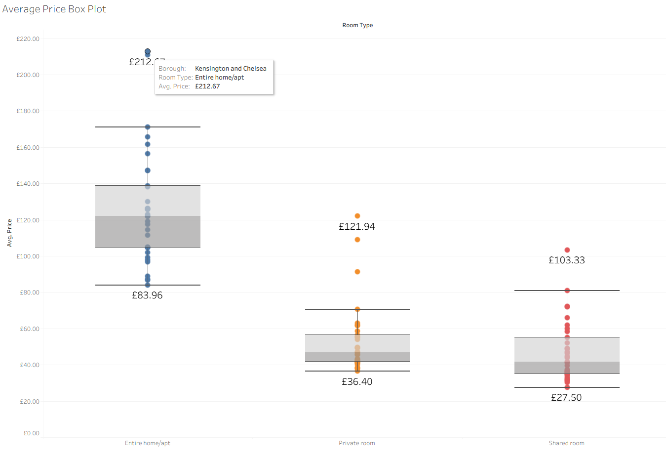
Case Study: Airbnb Room Types
Let’s say we have Airbnb listing data with three room types:
- Entire home/apartment
- Private room
- Shared room
If we only look at the average price:
- Entire homes/apartments → highest average
- Private rooms → lower average
- Shared rooms → lowest average
At first glance, this seems obvious , of course an entire home will cost more than a single room. But comparing averages here is misleading because the scales are completely different.
Box Plot with Z-Scores
Now let’s transform prices into Z-scores within each room type.
- A listing with Z = +2 means it’s very expensive relative to others of the same type.
- A listing with Z = -1 means it’s cheaper than most in its group.
When plotted as Z-score box plots, the three room types become directly comparable:
- We can see which category has more variability (wider spread).
- We can identify outliers (overpriced or underpriced listings) fairly across groups.
- A +1 Z-score private room is just as “pricey relative to peers” as a +1 Z-score entire apartment.
👉 This way, instead of saying “Apartments are more expensive than private rooms,” we can say “Private rooms and apartments both have listings that are unusually high-priced relative to their category — and Z-scores let us compare them on the same scale.”
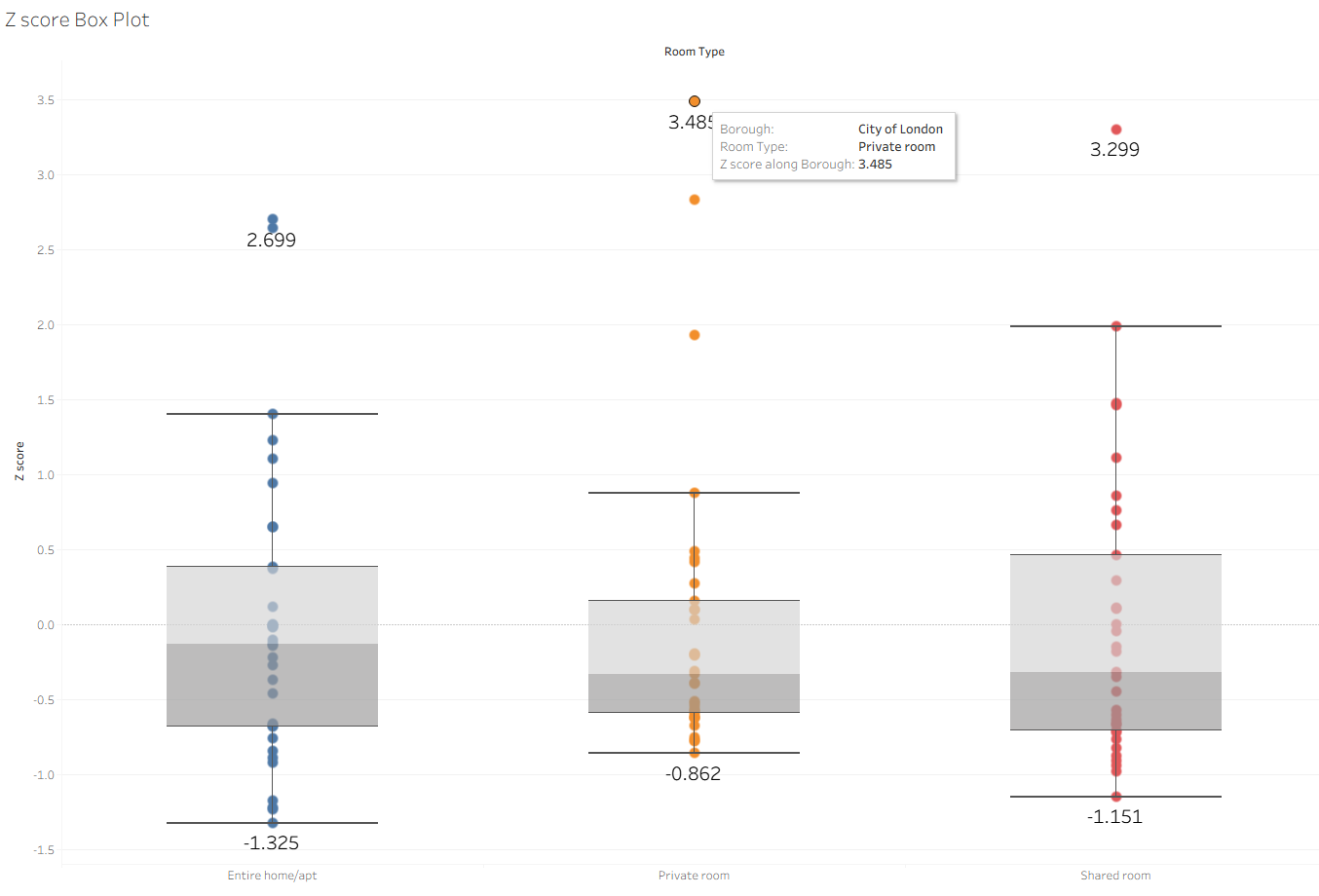
Interpreting the Z-Score Box Plot
- Private room: max Z ≈ 3.485
- Shared room: max Z ≈ 3.299
- Entire home/apartment: max Z ≈ 2.699
This means:
- The most expensive private room is priced at 3.5 standard deviations above the mean for private rooms.
- The most expensive shared room is about 3.3 standard deviations above its mean.
- Meanwhile, the priciest entire home is only 2.7 standard deviations above its mean.
In plain English:
👉 Even though entire homes have higher raw prices, the most overpriced listings relative to their category are actually private and shared rooms, not whole apartments.
If you only compared averages, you’d conclude:
“Entire homes/apartments are the most expensive category.”
But using Z-scores with box plots shows a more nuanced reality:
- Yes, entire homes cost more on average.
- But in terms of relative pricing within their group, some private and shared rooms are actually more extreme outliers than entire homes.
This illustrates the power of Z-scores:
- They don’t just compare categories by raw values.
- They allow fair comparisons of how unusual or extreme a data point is relative to its peers, regardless of category scale.