


Day 2 of Dashboard Week was focused on accessibility, a session where we learnt how to build dashboards ensuring we account for different types of impairments and needs.
Universal Access
My focus was on making a dashboard on COVID data, making it accessible to as many people as possible. Given the relatively short scope of the project, I had to assess which impairments to focus on.
Focus Areas
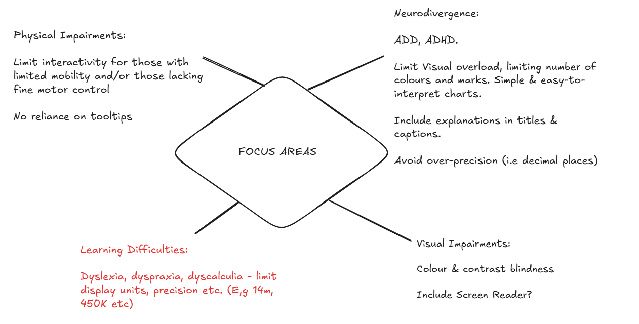
My focus was to make the dashboard as easy as possible to read, with no interaction such as hidden information in tooltips, chart interactivity and filters. I focused on ensuring things were easy to read, the layout was clear and insights were easy to pick out.
To accommodate for visual impairments I tested certain colours against each other, ensuring they were colour-blind friendly and had high contrast scores against each other. I also limited the mark types, keeping colours to a minimum and avoided being over-precise with decimal places, which helped me limit the overall visual overload.
Final Dashboard
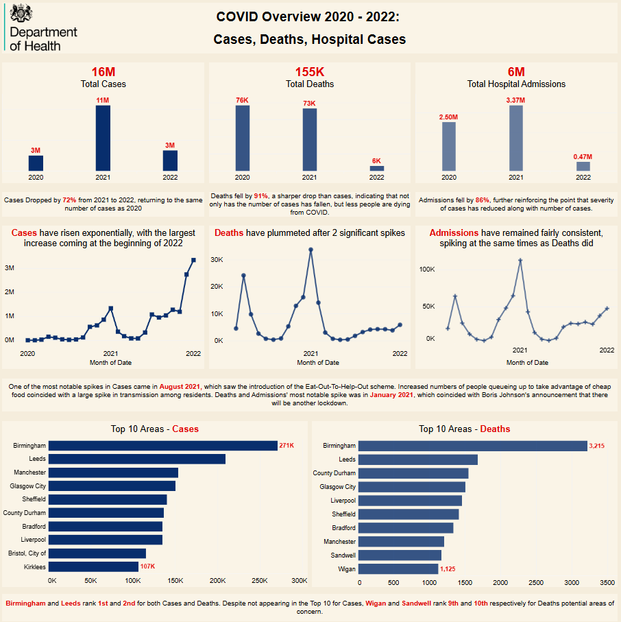
Overall, I was happy with the layout. On reflection, I would spend more time assessing alternative chart ideas, to give greater insights on things such as overlap between areas that appear in the Top 10 for cases and deaths. I'd also increase spacing between charts, possibly segmenting into sections defined by borders to enhance clarity.